Resolve to Redecorate: Aimee's Home Remodel, Part 1

When H&W co-founder Aimee Lagos decided it was finally time to make the changes she had long envisioned for her Minnesota Foursquare, she did so with pattern in mind. And while functionality was at the forefront of the year-long remodel of the 1908 family home, it's Aimee's airy, design-forward style that steals the spotlight in the final result. Follow along this month as we take you through this pattern-filled home transformation.
PART 1: MASTER BATHROOM
What inspired this space?
I wanted something that felt special and resort-like, a little escape from everyday life. Our old bathroom was one of my least favorite spaces in our house—it was totally devoid of design with 12-inch square travertine tiles on the floor and shower walls. It felt tired and blah. Manny and I both love Mexico and Costa Rica, so we wanted the bathroom to have a bit of that feel, without being “themed.” The main goals we had in mind were functionality and a light, airiness.
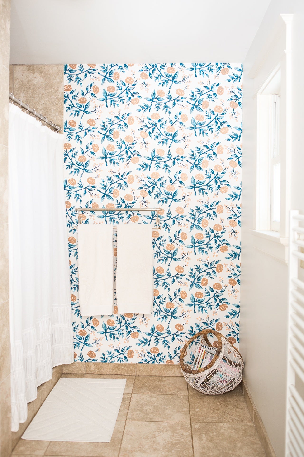 Aimee's master bathroom: BEFORE
What were your biggest pain points in this space and how did you address them?
The shower turn-on valve had been installed in such a way that you literally had to shoot yourself with cold water in order to turn the shower on (think about that on a January morning in Minneapolis!). It was just the worst. We were happy with the layout, and our remodeler was great with tips about how to stay within budget (moving toilets is very expensive, apparently), so we kept the general placement of all the fixed elements. Our remodeler was also great at finding space for a much larger shower and vastly more storage without making the room feel smaller. The entire back half of the room was completely re-envisioned and previously unused space now has a purpose. And now you turn the shower on in a way that you don’t get wet at all, which has improved my quality of life immensely.
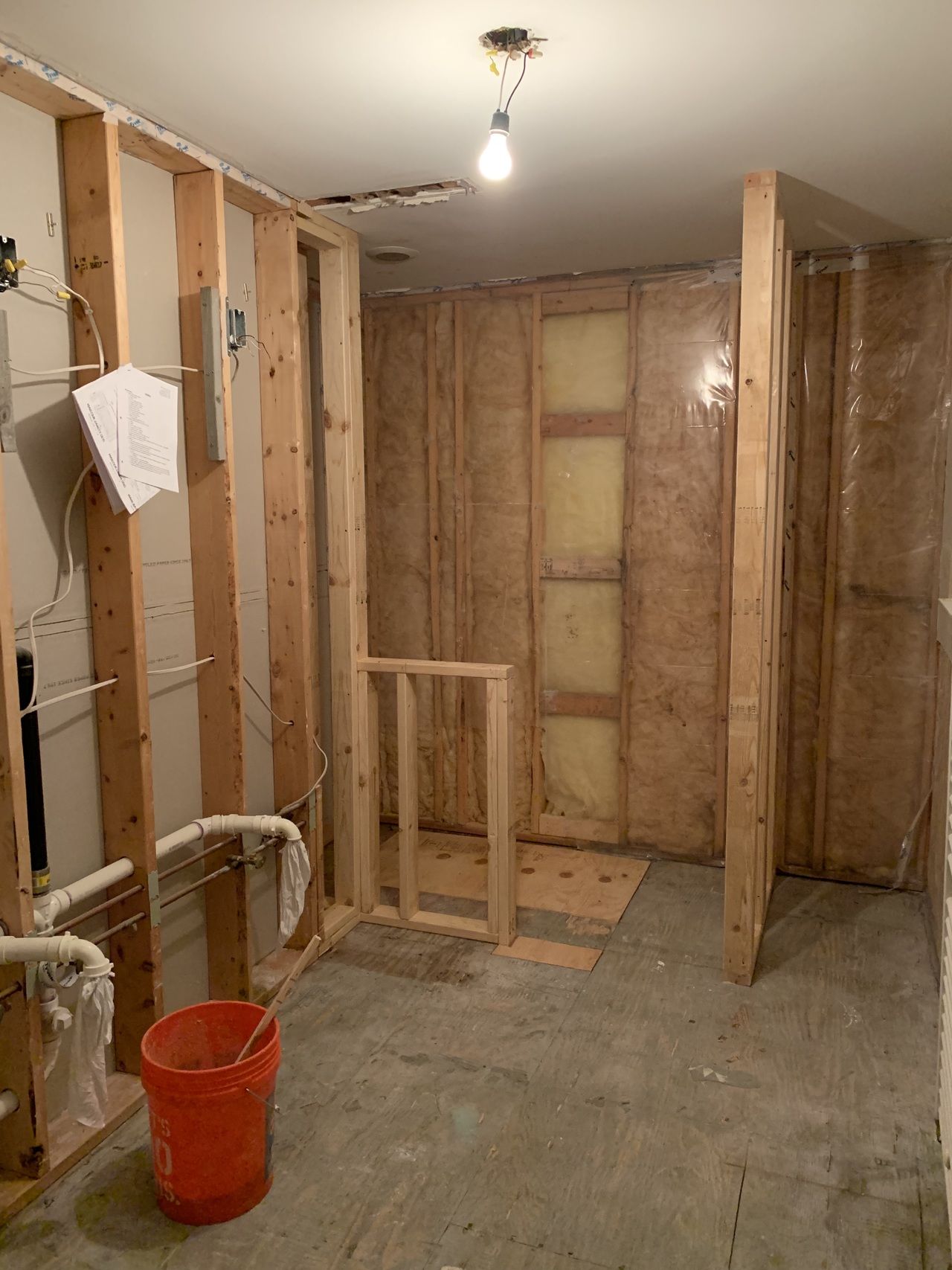 Aimee's master bathroom: IN PROGRESS
Which wallpaper did you choose and what did it bring to the space?
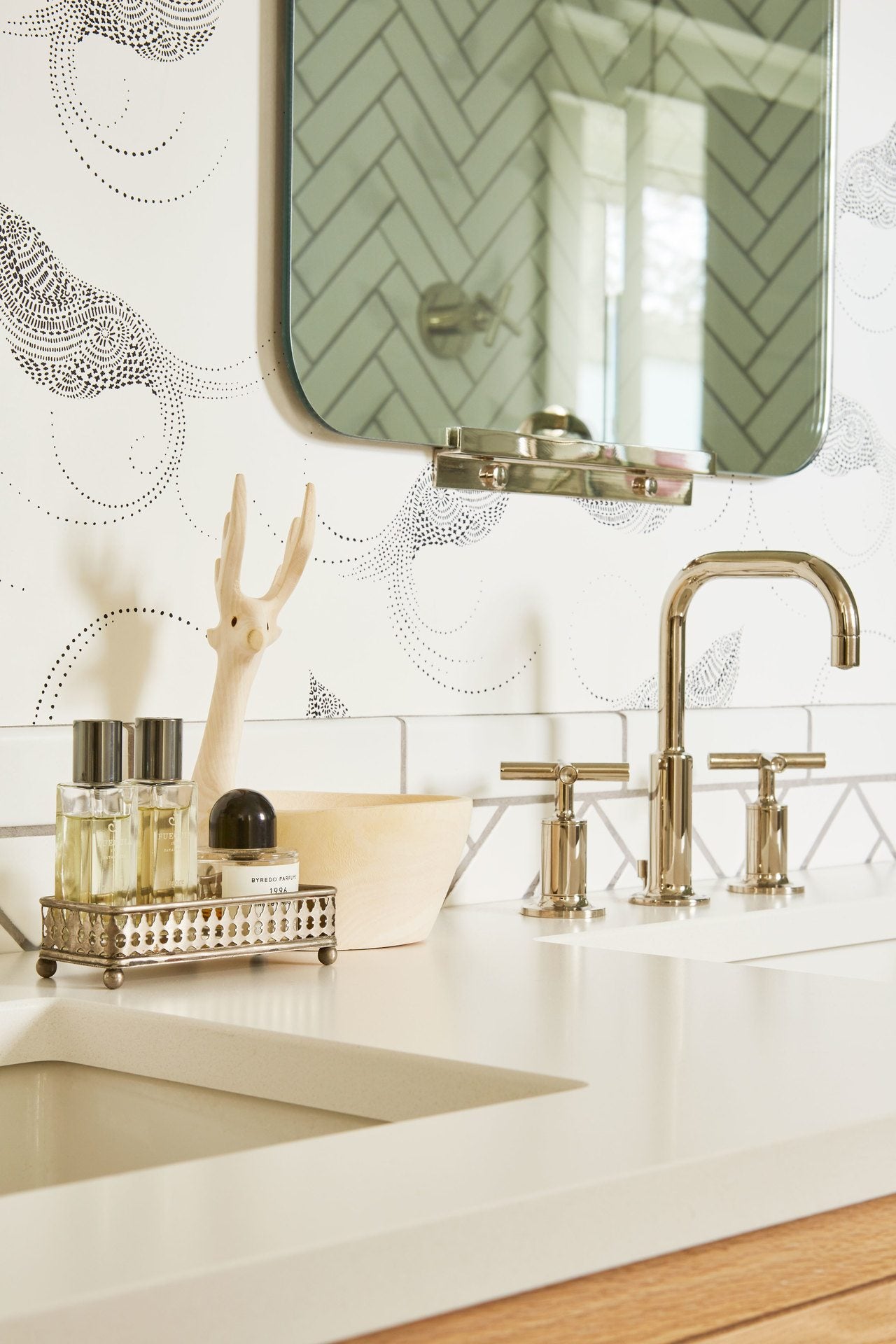
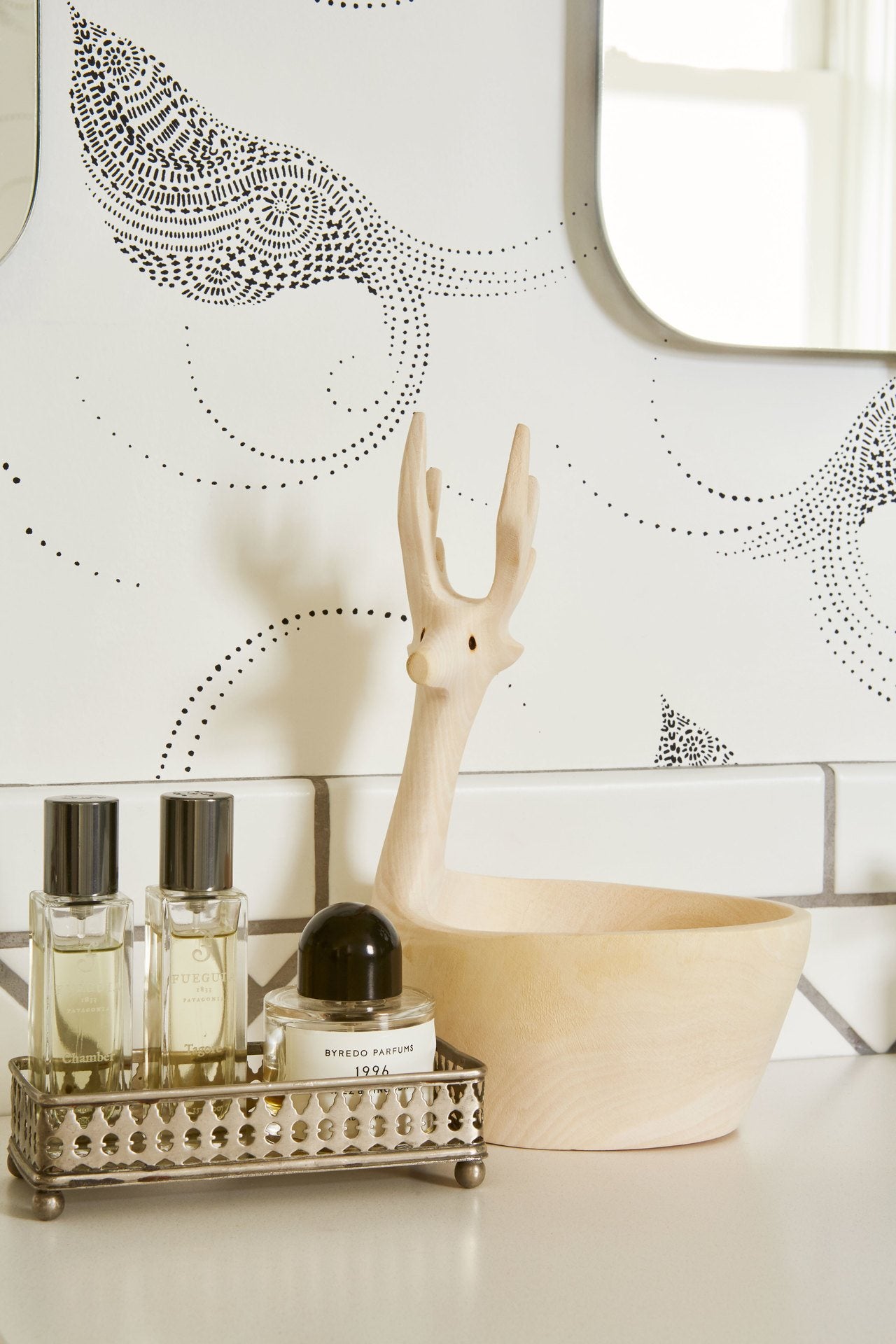
Wallpaper with my husband is always a delicate negotiation, but he immediately fell in love with Pajarito (Black)—it’s so delicate and subtle, but adds a really nice dose of personality to a space. I think that it ties everything together: the black and white of the tile and the circular elements in the hardware, lights, and mirrors. It also brings the space to life; I think the black and white would be too stark without it, and the pattern adds softness and charm.
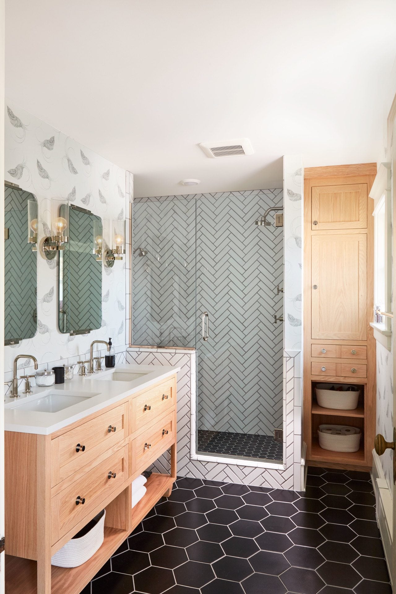 Aimee's master bathroom: AFTER
What was the single biggest challenge in this space? What was your biggest success?
Our biggest challenge was the budget. Bathrooms can get expensive real fast. We wanted the space to feel upscale and luxurious, but that was at odds with how much we wanted to spend. We made some small allowances (for example: the tile isn’t on all four walls, we scrapped our plans for a heated floor) and now that it’s done, we don’t even miss those planned elements. I think our biggest success is the shower. It’s just glorious! The glass door and partition keep the space really open and airy, and the tile is absolutely stunning. Terapan at Fireclay suggested the herringbone pattern and we could not be happier with how it turned out. It’s classic, but not boring. Our shower went from dark, underwhelming, and infuriating (ahem, aforementioned cold water blast) to one of my favorite things about the entire house.
What other elements need to be considered when choosing wallpaper specifically, and pattern in general?
Bathrooms are a great space for wallpaper, but due to the moisture levels, you have to ensure that you have adequate ventilation. We had never had an actual vent in our bathroom; instead we had a very tiny ceiling fan that mostly did the trick. But we now have the Cadillac of bathroom vents—it’s silent and you can actually see it pulling the steam out of the air as you shower. Another consideration in master bathrooms is how the color of the wallpaper can affect the lighting. It’s where I put on makeup, so I wanted to make sure the light stayed nice and clean.
How has the functionality of this space improved for you and your husband?
It’s improved in every single way! When we’re both getting ready in the morning, it’s such a great experience to be in a lovely, thoughtfully designed space. I think it improves my mood, too—I am not a morning person. We have significantly more storage now which helps the room function better, because things are organized and easily accessible. The only family member for whom the bathroom does not function as well is our cat Mikko—our remodeler had the cutest idea to make a built-in space at the bottom of the cabinets near the shower for his litter box. It worked perfectly—the litter box was easily accessible yet almost entirely hidden. But unfortunately, despite his above-average intelligence, we could not convince Mikko to wipe his little kitty feet properly and I got tired of vacuuming bits of kitty litter up off our black floor every morning.

At what point in the entire home remodel process did you begin to think about pattern?
Very early on—the design of some of the spaces was very tied to the patterns that I chose for them. We wanted our master bathroom to feel somewhat beachy—like you were in a bathroom at a nice resort. I knew immediately that I wanted to use our Pajarito (Black) to establish an airy, Mexican-inspired vibe in the room. Similarly, we knew that we would use wallpaper in our kitchen because it’s really the showpiece of the house. It’s also the room where we all spend the most time, so we wanted it to feel really special.
How does the end result of your home remodel compare to what you originally had in mind?
It’s pretty close to the initial plans! When I look at the mood boards and compare them to the final product, there are some small differences, but once we nailed down the plan with our builder (the wonderful McDonald Remodeling, who we cannot rave about enough!), we stuck to it for the most part.
MASTER BATHROOM RESOURCES
Countertops: Cambria in Whitehall
Faucets/shower hardware: Kohler Purist Collection
Floor tile: 8” hexagon in Basalt by Fireclay
Wall tile: 2x8 subway tile in Calcite by Fireclay
Mirrors: Yaquina Mirror by Rejuvenation
Sconces: Momo Single Sconce by Rejuvenation
Cabinet hardware: Patton Knobs by Rejuvenation
Wallpaper: Pajarito (Black) by Hygge & West
Builder: McDonald Remodeling
Want more? See the rest of Aimee's renovation here:


