Before & After: A Transformative Living Room Transformation
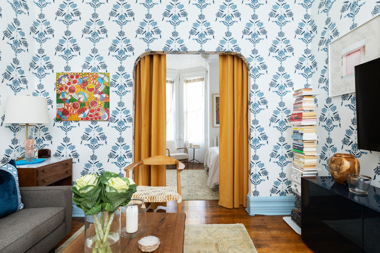
I was recently reading up on what snakes symbolize because I'm considering installing this Soldo (Navy) wallpaper pattern in my bedroom, but worried sleeping among snakes might not be the best Feng Shui move. I have great news! According to my Googling, snakes actually symbolize transformation. In fact, the shedding of their skin has represented change, rebirth, and transformation since ancient times. And, snakes actually slither into your life to help you focus on the present. All good things in our book, so consider H&W officially on board with snakes anywhere, anytime, including in this gorgeous living room designed by Megan Hopp. To fully appreciate the room transformation, let's look at the before images:
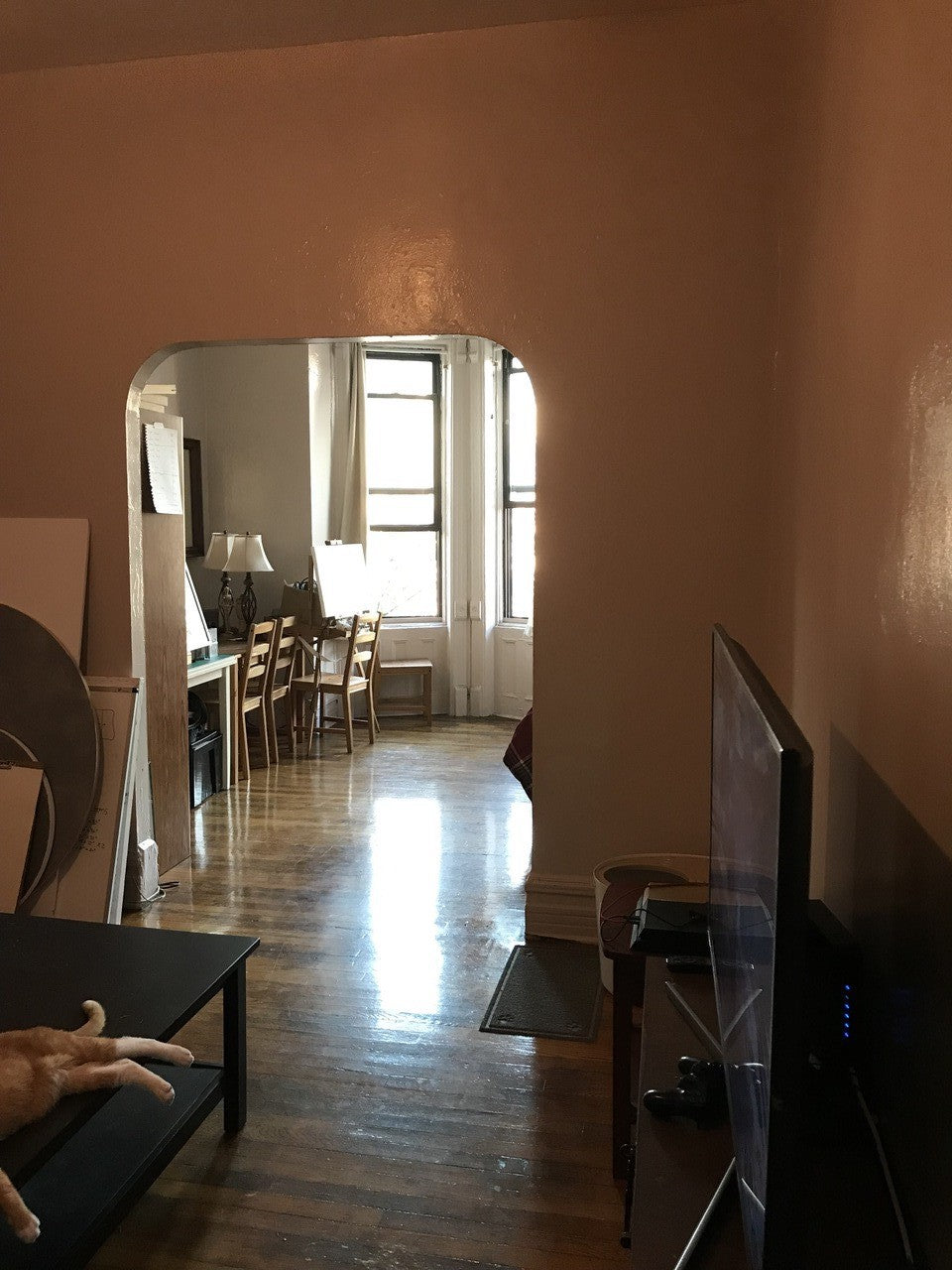
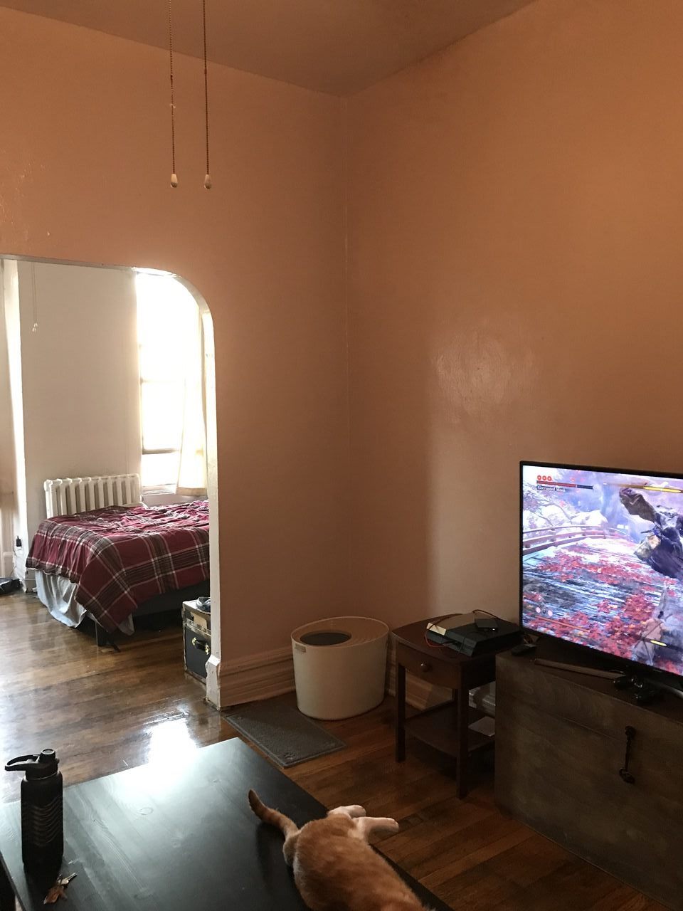
Kind of downer, no? Other than the cat, of course!
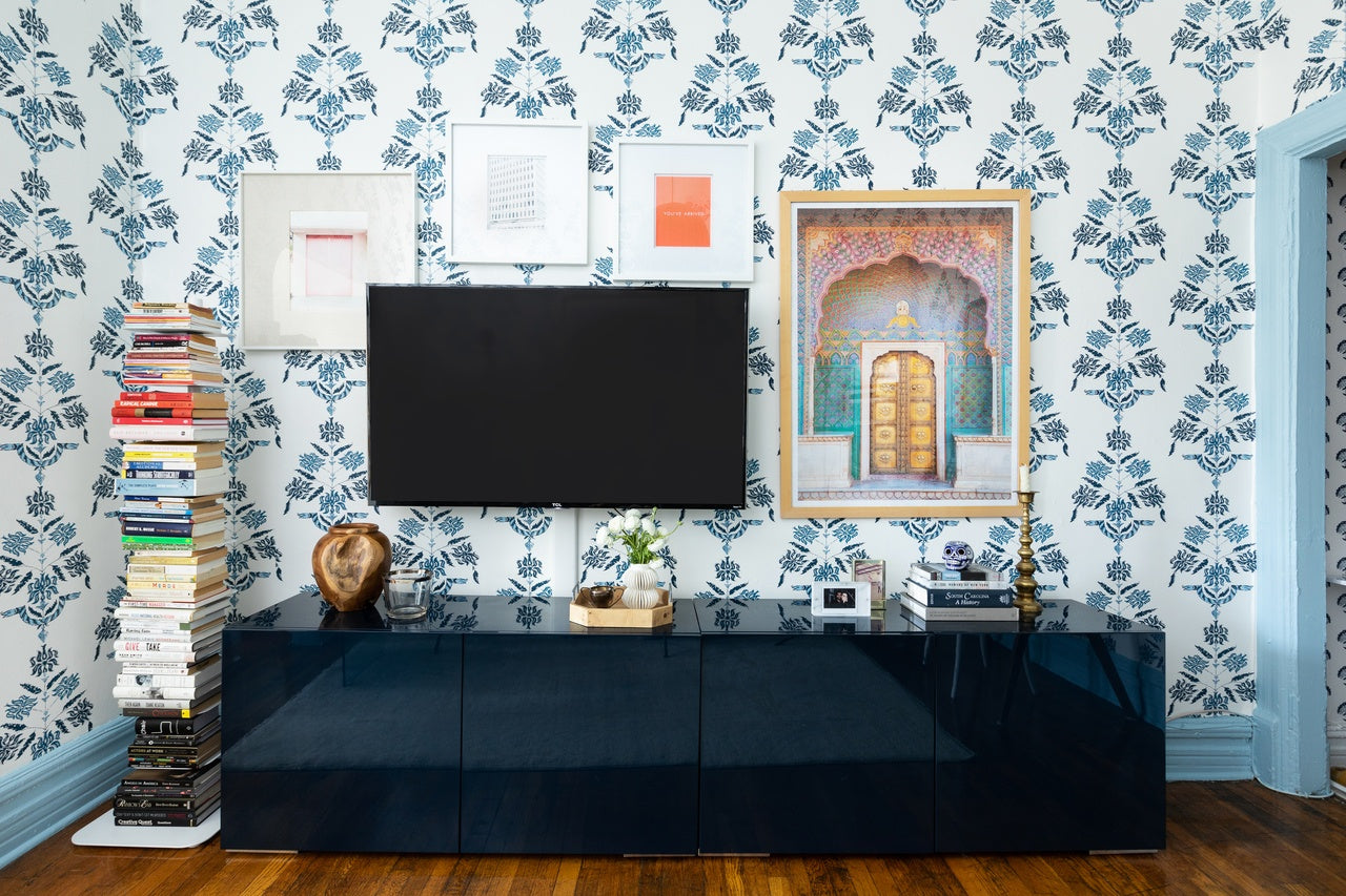
Voila! [All after images taken by Kelsey Ann Rose]
We asked Megan a few questions about designing her living room:
Why did you pick this pattern?
I was immediately attracted to this pattern for a few reasons. The scale for the size of the room was perfect, not too big or too small. I also loved the vertical orientation of the print to help grow my already tall ceilings even taller! I'm a blue and white addict, so that was a no-brainer. Finally, I liked the sort of reinvented traditional vibe this pattern gives off, which is very much how I think of my own style, inspired by the past while still casual, colorful, and whimsical, too.

What does the wallpaper add to the room?
What doesn't it add to the room!? Let's be real, the design of this room starts and ends with this paper. The living room is the center of one's home (and technically the very center of our railroad style apartment), and I knew I wanted to cover every square inch of it in a bold and chic pattern as the heart of the space.
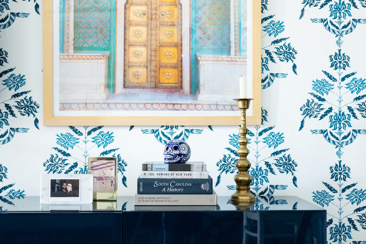
Any tips for choosing or placing art to work with wallpaper?
When it comes to art, I say don't overthink it, go with what you love, and pay as much attention to your framing as you do the art. Art is the biggest compromise in our house, as my fiance and I have very different taste in art and very different collections from our past that both mean a lot to us. The two large photographs of the Indian architecture are pieces we got together that we both love and hit right in our overlap section. We both love color, so it's something I've leaned into in designing our homes, which in turn opens up a lot of space to incorporate the variety of wall decor that needs to land somewhere in our space.

Any other design tips?
One of my other favorite elements of this room is the pale blue trim. Wallpaper with a color accented trim is one of the best looks in my opinion, and a combo I try to implement as much as possible with my clients. In general, every decision I made in the space worked around the paper; the glass desk/dining table is another good example of that. While I wanted and needed a table in the room for functional reasons, I also didn't want a piece that would obscure the wall too much, hence the glass table top was the perfect solution!
Thanks so much again, Megan, for making our Soldo look SO GOOD!


