Resolve to Redecorate: Aimee's Home Remodel, Part 4

It's the final chapter of our month-long reveal on H&W co-founder Aimee Lagos's complete home transformation. We're ending this series with the space that inspired the entire remodel: the kitchen. From cramped and closed-off, to spacious and seamless with the rest of the home, read on to see how Aimee created a kitchen that truly is the heart of her family home.
Catch up on or rediscover Aimee's home remodel Part 1, Part 2, and Part 3.
What inspired this space?
The kitchen was really what started the whole remodel process. I love to cook, we spend a ton of time in the kitchen, we entertain a lot, and our old kitchen just wasn’t great. It was a narrow, galley kitchen and because people always hang out there, I was always asking people to move while I was cooking so I could get to something in a drawer or a cabinet. At first, we thought we’d just make some small changes, get new cabinets, and do a refresh, but once we started talking to the remodeler, we decided that if we were going to do it, we might as well go for it.
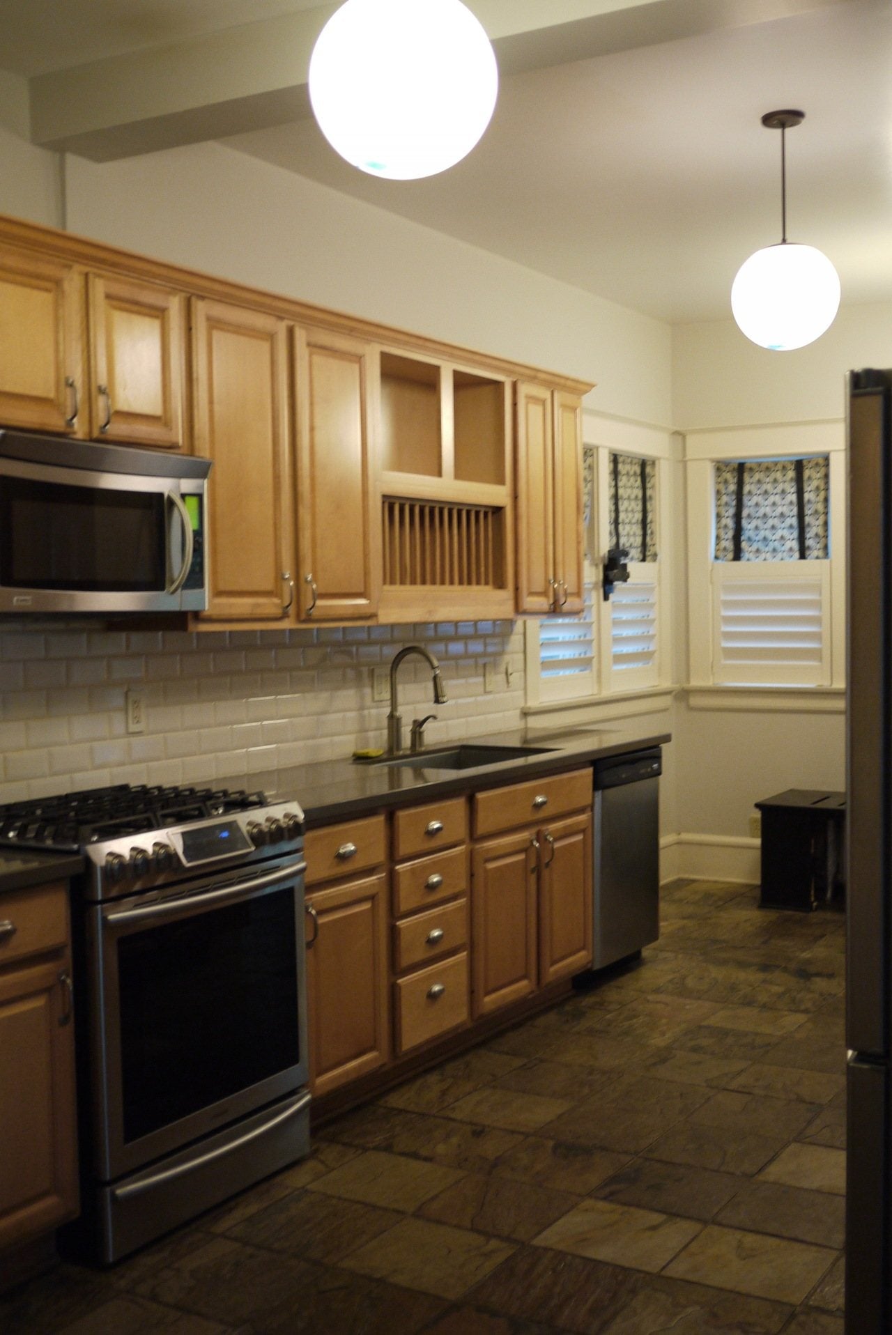 Aimee's kitchen: BEFORE
What were your biggest pain points in this space and how did you address them?
It was really tight. The space was narrow and didn’t naturally flow into the dining room. We moved some walls and took space from my office (I used to have a short hallway entry that was mostly wasted space), which gave us enough room to put in an island. This also made the opening between the kitchen and dining room much bigger, so the spaces feel connected now. The one thing that we really wanted to keep was the eat-in space in the kitchen; we enjoy having an informal, cozy place to eat. While keeping that as is meant that we lost potential cabinet and counter space, it makes our kitchen feel warm and it’s where we eat all of our meals as a family. The boys do their homework there, and Manny and I sit in the banquette and watch TV in the evenings. That little space is the heart of our house.
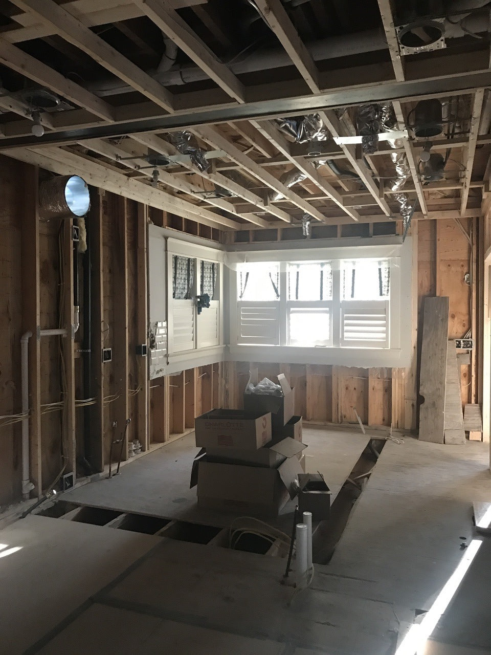
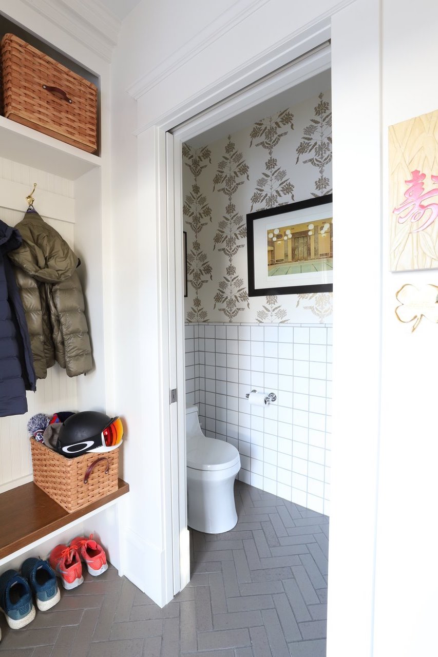
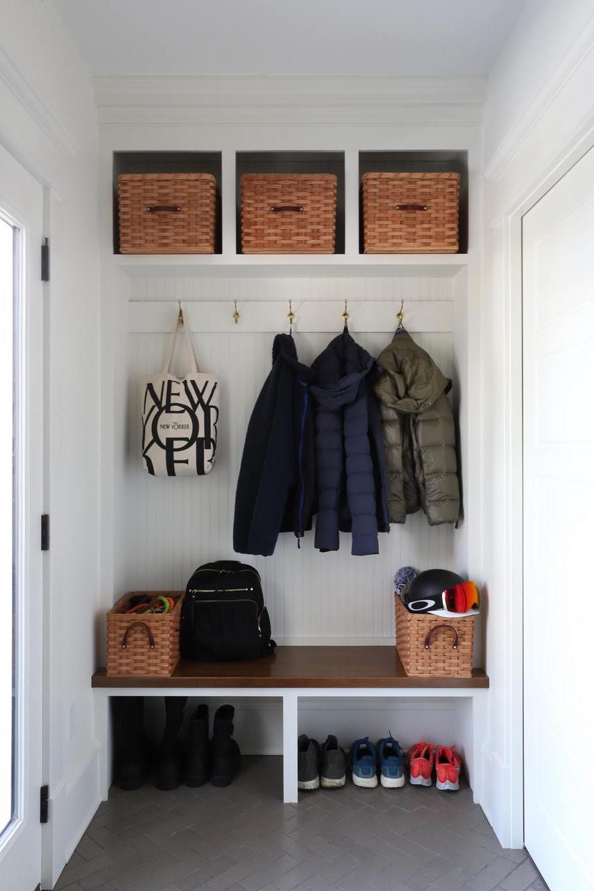
Our other pain point was the placement of the powder room. It was essentially right next to the table in the old kitchen configuration, and if you were at the table when someone would use the bathroom, well, let's just say it wasn’t super appetizing. When we addressed the back entry and powder room as part of the kitchen remodel, we wanted to create more separation between the powder room and the eat-in area, while keeping a small mudroom (the back entry is the main way we enter and exit the house). We simply pivoted the toilet and changed the orientation of the room, and then added a partial wall to separate the entry from the rest of the kitchen and it completely solved the issue.
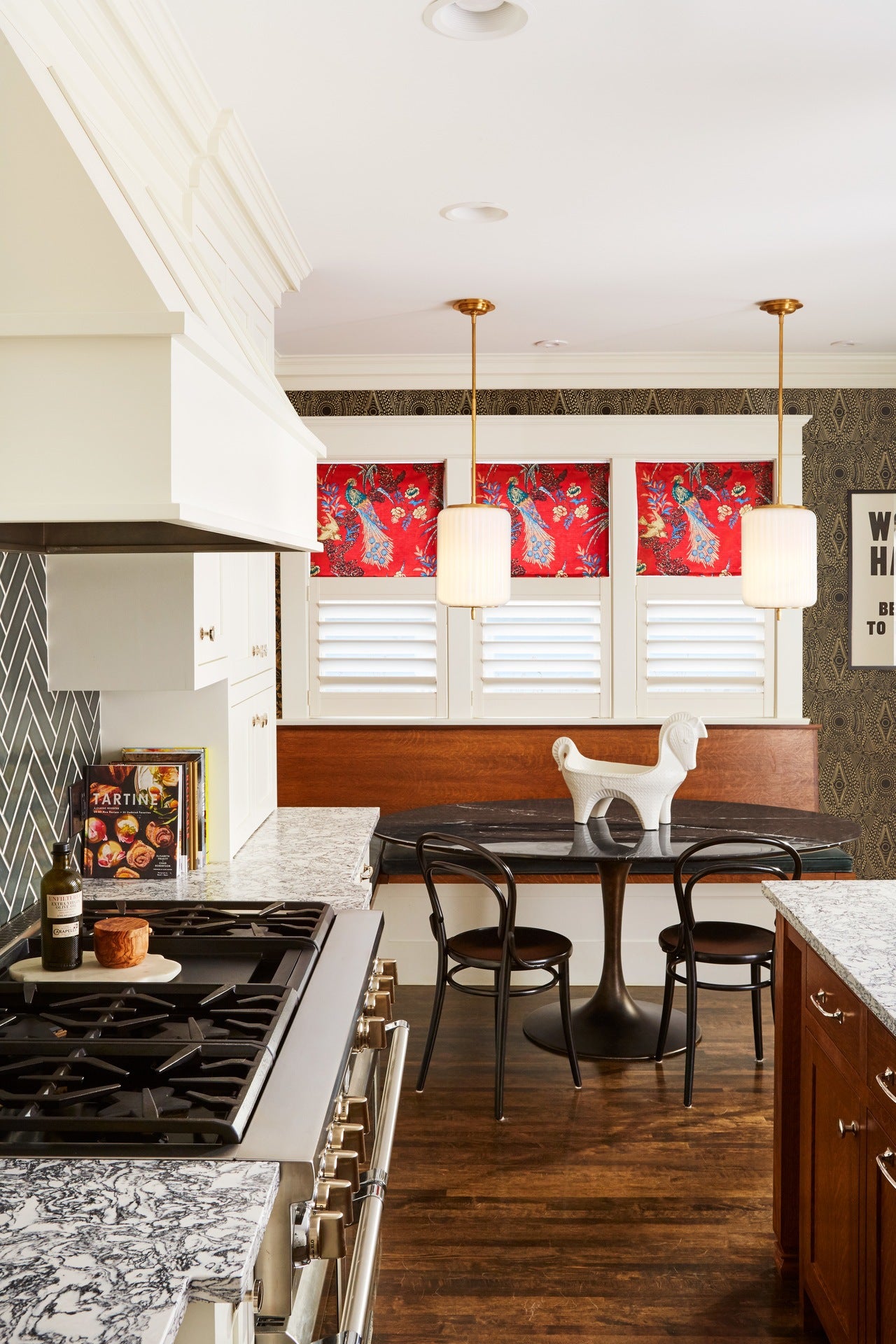 Aimee's kitchen: AFTER
Which wallpaper did you choose and what did it bring to the space?
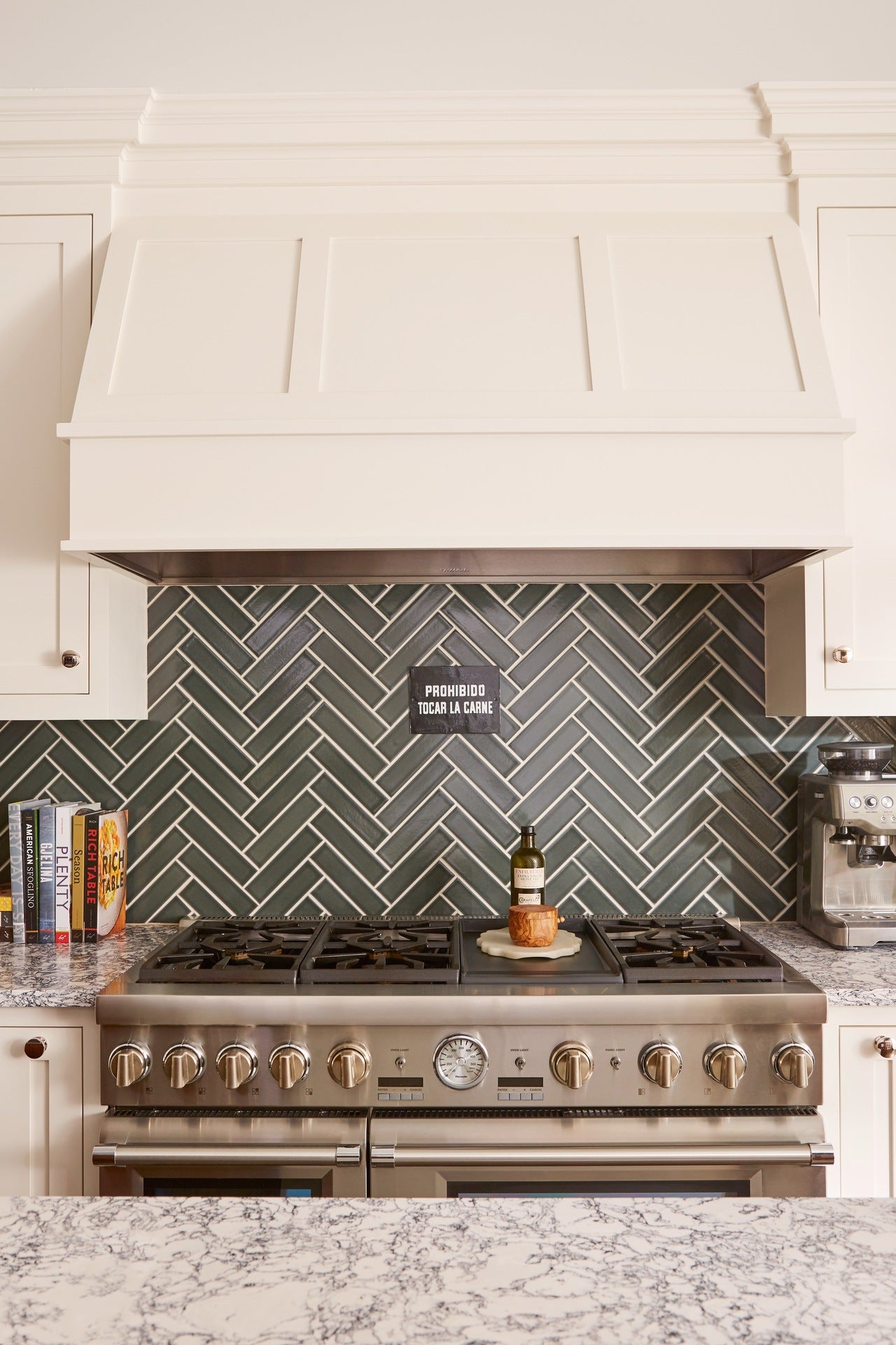
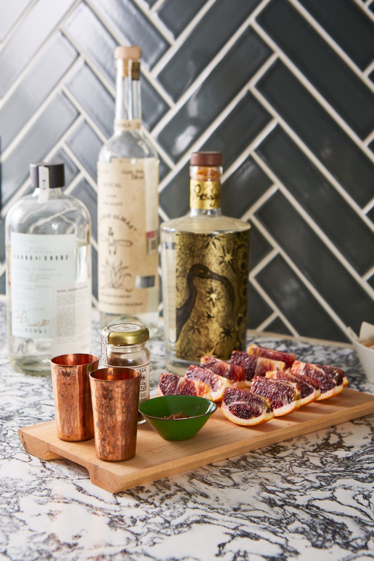
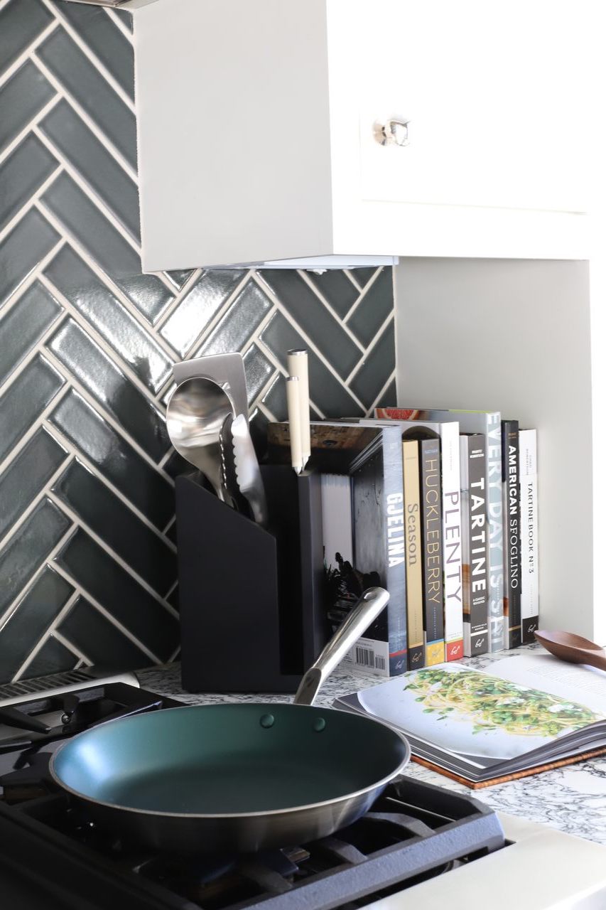
I used Diamante (Gold) in the kitchen. I was wary of the space feeling too white due to the white cabinetry. I’d fallen in love with a gorgeous greenish-gray tile from Fireclay and a really interesting black and white countertop from Cambria, so I also wanted to make sure what I chose worked with the color of the tile and didn’t feel too busy with the lovely pattern of the countertops. Black and gold immediately created depth and drama, and the pattern worked really well with the herringbone pattern of the tile. We found a great vintage sign in Buenos Aires, and the wallpaper, while inspired by our travels in Mexico, also has a great Argentine/Belle Époque feel to it, which fit nicely with the more traditional style of our house. I think the wallpaper unifies the other design elements and gives them all a direction and context. It adds so much interest and makes the space feel really special.
We have Soldo (Fawn) in the powder room. The space is tiny, so I wanted something lighter to keep it feeling open; plus, Soldo has been one of my favorite patterns since I first saw it. The gold accents play with the light so nicely. They also tie together the taupe of the Fireclay brick that we used on the floor. We used 4x4 square white tiles on the walls, so the fluid lines of the wallpaper keep the space from feeling too rigid and geometric. I just love a small room with wallpaper on all four walls, and this little powder room does not disappoint.
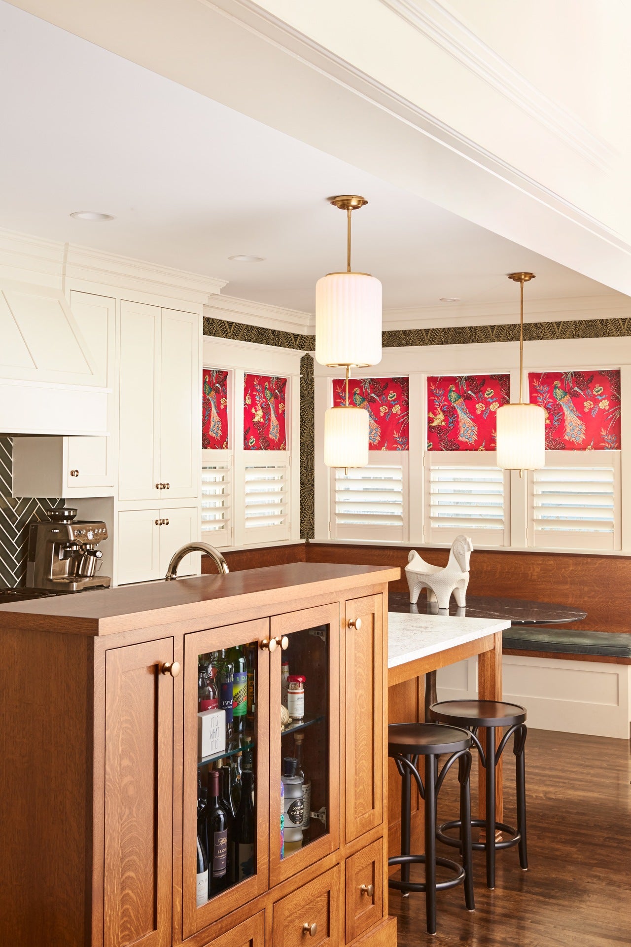
What was the single biggest challenge in this space? Your biggest success?
The biggest challenge was the sheer number of elements that had to work together. We have a lot of different finishes and textures, and I wanted things to feel cohesive but not matchy. Our cabinet hardware and faucet are polished nickel, but our light fixtures are beautiful brass and white glass pendants from Circa Lighting. We have white cabinets, but the kitchen island is quarter-sawn oak, which matches the original (from 1908!) built-in buffet in the dining room. Layer the look of the space over functionality and there is a whole other set of considerations. Our remodeler was an amazing resource and had so many great ideas for the space that I never would have come up with on my own. I think our biggest success is the bar. Initially we thought we would need two support columns, which is where the idea for the bar originated. It would be a resting spot for the columns, but it would also function to keep people on the opposite side of the island and out of my “cooking zone”. We decided to make it taller than the rest of the island for two reasons: to obscure the view of the sink (and dirty dishes) from the dining room, and also provide a little counter for people to lean up on and visit. After demo, our remodeler decided that if we put in a steel beam, we could do away with the support columns. We decided to keep the bar, though. I’m delighted every time someone comes over and leans up on it—it’s exactly the most comfortable height, and it’s as though it beckons to people.
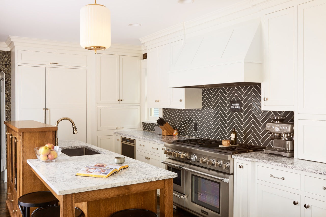
What tips did you implement or learn during the remodel process for adding pattern into a kitchen?
There are so many different surfaces and patterns in a kitchen, it’s hard to create a cohesive yet interesting space. I think that it’s tempting to just keep everything in the same color or finish, and I can see how my approach might not be everyone’s cup of tea. I wanted the different elements to compliment and contrast with each other but still feel like they belonged together. I think that keeping everything pretty classic helped. And then I looked for overlapping or related motifs within each different element to connect the various pieces into a whole.
How has this space improved for how you and your family use it?
It was always where we spent the most time, but now it’s where we most enjoy spending time. For me personally, it’s really a joy to cook in this kitchen. I love my range so much and have cranked out meals for up to 50 people with it on a regular basis. I think that best thing we’ve done with it so far was the prime rib roast we do at Christmas—it comes out perfectly done, something I was never able to achieve before. The space was really meant to be full of people. Before the remodel, the kitchen felt cramped and crowded when we had friends or family over. Now, people are at the island and bar visiting, nibbling on snacks, pouring glasses of wine. The room comes alive and has great energy.
What were you willing to be flexible on for this home remodel and on what were you firm?
We each had different things. Manny wanted a huge fridge. I don’t know why but it was his thing, so I let him have it. I did not want to lose the seating area in our kitchen even though it meant that we were losing potential storage space. We tried to be firm on the budget as well—things add up so quickly that we were really conscious of making changes once we approved everything and made sure it fit within the budget. And we learned to be flexible about things that we couldn’t control. After we nailed down a plan, it turned out that the back door had to be moved six inches, which was an additional cost. We had to change the sink and toilet we’d chosen for the upstairs bathroom because they were too big and would have been in violation of code.
What was the biggest challenge you had to overcome with this home remodel?
I think that the biggest challenge was just committing to do it, both financially and to the disruption of our life while it was happening. It was a big investment, so it was hard to decide whether it was the right thing to do. Now that it’s done, we’re so happy we did it. It’s completely changed the way that we live, and every day I am grateful to have such a beautiful home.
KITCHEN RESOURCES
Tile: 2x8 in Loch Ness by Fireclay
Countertops: Rosedale Matte by Cambria
Lights: Eden Large Pendant by Circa Lighting (not in stock; click for similar option)
Wallpaper: Diamante (Gold) by Hygge & West
Range: 48-Inch Pro Grand by Thermador
Sink faucet: Artesso by Brizo
Table: Tulip Pedestal Oval Dining Table by Williams Sonoma Home
Chairs: Era Chair by Michael Thonet for Design Within Reach
POWDER ROOM RESOURCES
Wallpaper: Soldo (Fawn) by Hygge & West
Light: Graydon Double Bath Light by Circa Lighting
Floor tile: Wind River by Fireclay
Wall tile: Calcite by Fireclay


