Pattern Players: Exploring the Highly Symbolic Works of Ceramicist and Artist Michele Quan of MQuan Studio

Michele with her daughter, Elsie
One of the most fun parts of shooting a new collection is styling. Not only is it a thrill to see the patterns come to life in our fantasy spaces, but we also get to play around with the latest products and creations from our favorite brands and makers. While we're always on the hunt for something new and special, there are certainly those resources we return to time and time again because we love their aesthetic and quality—and MQuan Studio is definitely one our top go-tos when it comes to goods we want in our shoots and our homes.

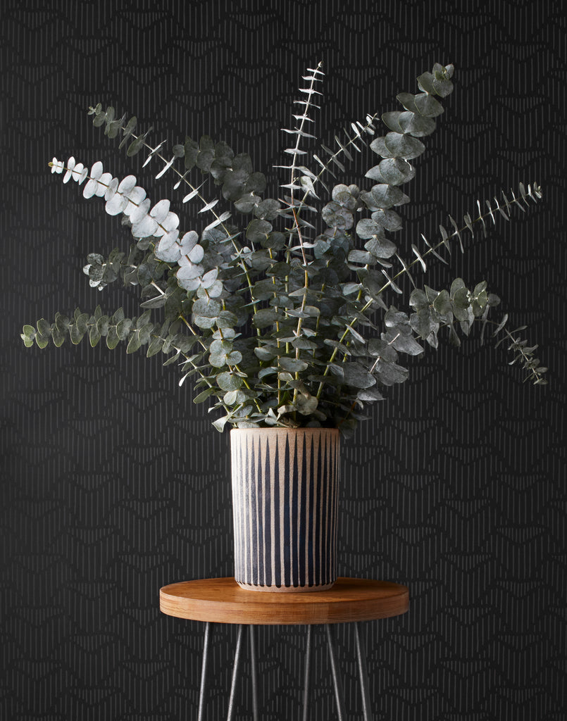
A beautiful MQuan Studio vase paired with Palma (Ebony)
Originally from Vancouver and currently living with her husband, daughter, and dog in NYC, Michele Quan is the unstoppable talent behind MQuan Studio. Michele designs and sculpts her handmade ceramic art and objects for the home and garden, which then become a canvas for her love of drawing, painting, text, and color. Much of her work is rooted in the visual symbols of Eastern iconography and nature, and Michele's deft hand and careful eye have made many of these symbols synonymous with her work. We caught up with the artist to pick her brain about her ideal MQuan Studio + Hygge & West product and pattern pairing, what inspires her design process, and what hygge means to her.


Hygge & West: Tell us a little bit about your background and how MQuan Studio came to be.
Michele Quan: In the early 1990s I took a ceramics class at the 72nd Street Y in NYC and then in 2002, spent a year of Saturdays at Adrienne Yurick’s studio in Brooklyn making pinch pots. These classes were on either end of 12 years of jewelry making. Then, a couple of years later when my daughter was 14 months old, I took a class at Greenwich House Pottery that turned into two, then three, then four… and three years later I moved into my own studio in Brooklyn. And here I am.


H&W: Your work features a lot of symbolism, such as Eastern iconography, the eye, and nature and sky elements. What do these symbols mean to you and why is it important to include them in your work?
MQ: Many of the symbols that I am drawn to relate to the idea of connection, reverence, impermanence, and illusion (and the slaying of). The visual symbolism of Eastern iconography has long been a cornerstone of my work that I feel speaks to our universal experience of the world, to our selves, and to others. The sun and the moon are probably the oldest symbols there are, connecting us to time from the very beginning of the turning of the Earth with its moon around the sun to our present day! Mind-blowing, so beautiful, yet simple and direct. And we all still experience this turning daily; it’s both sacred and available to everyone.

H&W: How would you describe the MQuan Studio aesthetic? Other than the symbols mentioned above, what else inspires your work?
MQ: I think of my work as quite simple. Lines are sharp and edges are raw, but finished. I strive to work the clay but keep a freshness of hand to the surface. The shapes are not visually complicated and used as a canvas for images.

An iconic MQuan Sudio ceramic object in a tablescape with Sycamore (Cream)
Words spark my imagination. I have a long document of quotes, excerpts from books, poems, movies, interviews, and songs that have inspired me over the years. I love words and how they resonate and spark. A few that immediately come to mind are ‘Yes’ by Yoko Ono, ‘Live your life, live your life, live your life’ by Maurice Sendak, and the Zen Koan—‘The finger pointing at the moon is not the moon.'


H&W: Although you also create jewelry, t-shirts, and bags, you're most known for your inimitable clay work. What is it about this material that you're drawn to?
MQ: Clay is a very responsive material that lures you in. There is a visual and tactile beauty in each state of its transformation from wet to its completed fired form. Squishy malleable earth that can hold shape, then be fired to permanent stone. The process is seemingly simple in the beginning but then it becomes a puzzle in how to get it to do exactly what you want, when you want. It’s pretty spectacular.

H&W: What product and pattern pairing did you choose and why? What is it about this particular product and the pattern you've chosen that makes them work so well together?
MQ: I paired Palma (Ebony) with my Half the Sky (Large): New Eye White ceramic object. I love lines and the vibrations they create! This dark and subtle Lawson-Fenning wallpaper is like the deep night sky with my half sky painted with the Eye which gleams with a glazed full moon disc.

H&W: Hygge is about finding comfort in life's smallest pleasures and simplest joys. What brings hygge to your everyday world?
MQ: Fluorescent pink tape, my ‘good knife,’ an organized studio, hosing down the floor, walking out of the studio to the birds chirping and the trees rustling, a good podcast, hugging my daughter, my wiggly dog, Sparrow, greeting me at the door, the smell of rice cooking, breathing :)


