Pattern Players: Exploring the Intersection of Food and Design with Melissa Coleman (a.k.a. The Faux Martha)
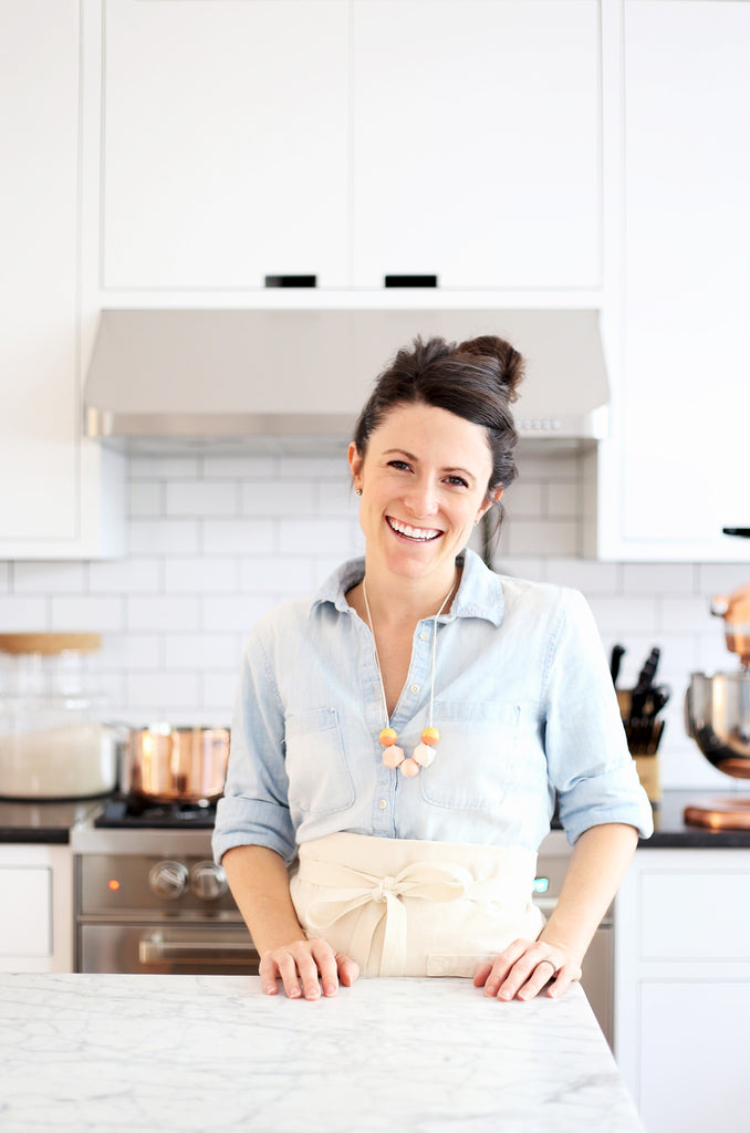 Food and design have an inextricable connection, and a symbiotic relationship of sorts, where each influences the other in a thousand, subtle and not-so-subtle ways. It's no wonder then, that so many of the designers we admire love to cook, and so many of the chefs whose food we lust after have also created stunning homes and environments to enjoy their food. Melissa Coleman, otherwise known as The Faux Martha, is a perfect example of what happens when food and design coexist.
The Faux Martha is a food blog with a distinctly design-centric twist. Melissa's food, much like her home, is crave-worthy, yet attainable; simple, yet complex. In addition to drooling over her mouth-watering recipes, we've also been closely following the renovation of her home, which she's dubbed 'The Faux House,' and have been salivating over every update. We caught up with Melissa about her use of our wallpapers in her cozy minimalist home, the connection between cooking and designing, and her favorite warm weather recipe.
 Hygge & West: Tell us a little bit about your background, your work, and what led you to where you are today.
Melissa Coleman: In middle school, I drew sketches of my adult house and begged my dad to buy me a 3-D design program. He did. In high school, I painted. And in college, I studied graphic design. In 2007, I started working as a designer straight out of college. A year later, I got married, moved away from home, and did what everyone did: started a blog. A post or two in, it turned into a food blog with a subtle design influence. I fed my food blog by night, worked as a designer by day, and read home and DIY blogs religiously - never food blogs. Three years ago, we moved to Minneapolis and ended up building a house - the one we plan to live in forever if you ask me. In some ways, the building process was a collection of my many interests. I blog full-time now about food, our home, and cozy minimalism.
H&W: People often confuse comfort with excess. However, your work - from baking and cooking to graphic design and interiors - always has a cozy, yet minimalist vibe. How do those two things go hand in hand?
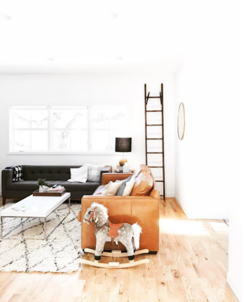
MC: "Stuff" has always been a stressor for me. I notice it when getting dressed; when digging through my kitchen drawers; when shopping at the grocery store. Too many options strips the happiness out of things for me. Ive always been this way. In our home, especially, Ive tried to get rid of the unnecessary things (though not to the point of austere) and fill it with the things that make us happiest. Ive also tried to really get to know and understand the purpose of each space and design for that. Our living room is our therapist. It holds us at the end of the day and on weekends. Its the place we play games, relax, make messes, and have long conversations the good ones and the hard ones. The room was designed around that. The dining room is our cozy cafe. Its our favorite restaurant to eat dinner. I wanted that room to feel special, yet comfortable. The graphic designer in me craves the collision of form and function. Having one without the other feels like an unfinished project. To keep things minimal but cozy, I like to mix clean lines with old, vintage objects. I like to layer with warm wood tones, natural fibers and textures, pops of semi-muted colors, and graphic patterns. Keeping plenty of white/negative space gives the cozy accents significant impact without being overwhelming.
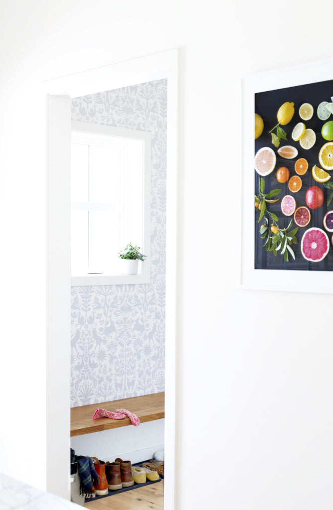
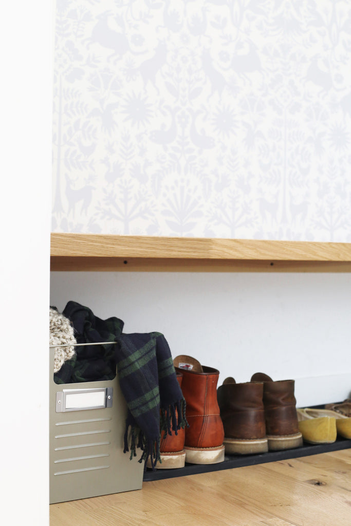
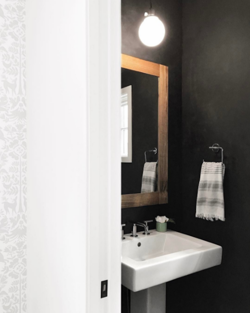
H&W: Last summer you did a quick mudroom makeover using our Otomi wallpaper in Pewter. What was it about that pattern and colorway that drew you to it, and what do you think it brings to your space?
MC: Adding color to our house has been so much harder than I ever expected. With a semi-open floor plan, all the rooms have to tie together visually (at least in my head). Instead of always opting to add color to infuse personality, I decided to try using playful, neutral patterns. Thats what I found in the Otomi Pewter wallpaper. It also masked a big problem. Our tiny mudroom is a highly trafficked area. The white wall was aging with scuffs at a rapid pace. I decided to go with a removable wallpaper to both hide the scuffs better and be easily replaceable when/if needed. A year later, and it still looks brand new. I wallpapered this wall myself with my pastry bench and an X-Acto knife. If youre new to wallpaper, like me, start with removable.
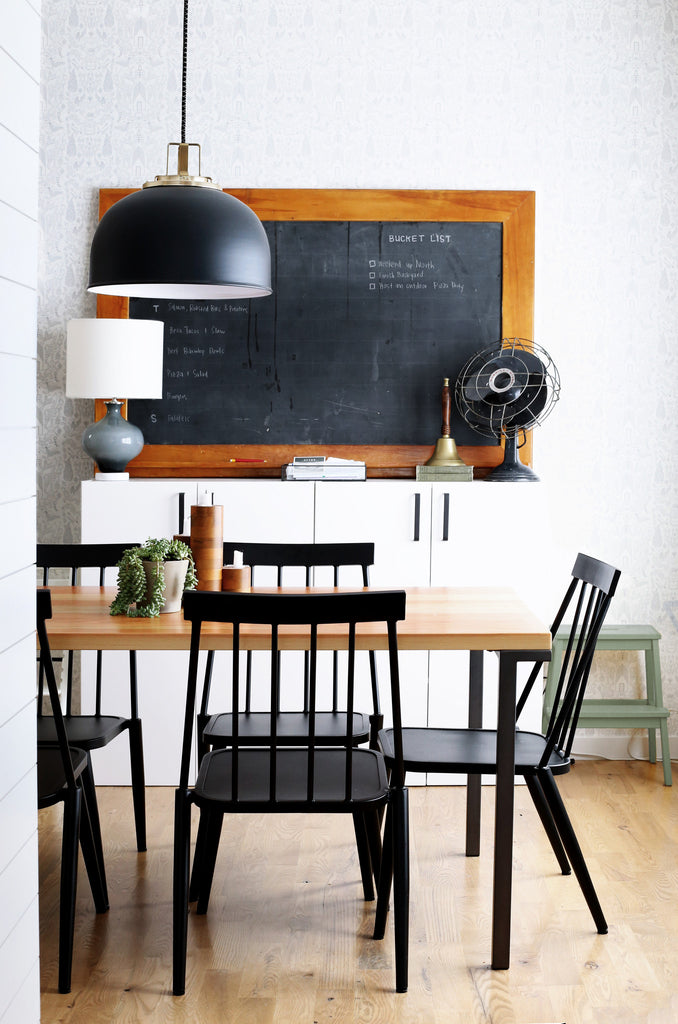
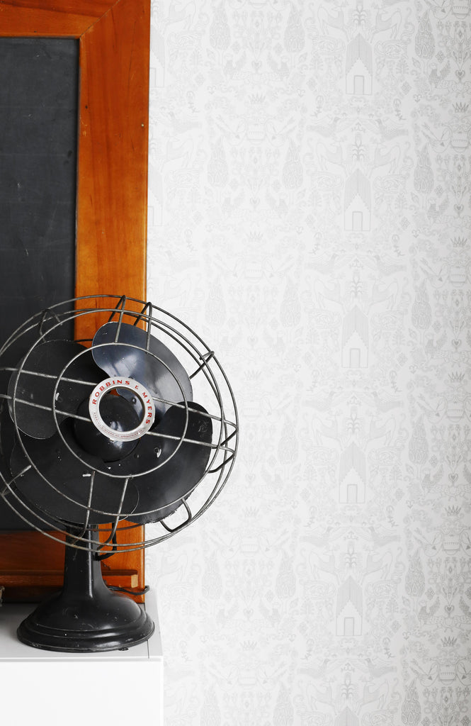
 H&W: You've also used Nethercote in your dining room. What about that pattern and colorway felt special to you and how (if it all) has it inspired other parts of the space?
MC: We did the Otomi wallpaper first, and I fell madly in love with it. So much so, I wanted to add it somewhere (everywhere) else in the house. Im a minimalist and have a bit of decision paralysis. When I find something I love, I buy it in multiples. For example, we used the same white subway tiles (in different sizes) all throughout our house. But eventually, I talked myself out of repeating the same wallpaper and decided to look for a nice cousin. After seeing the Nethercote on the walls at The Bachelor Farmer in Minneapolis, I fell in love all over again. The Gray colorway mimicked the quiet, neutral tones and playful pattern of the Otomi, while having a life of its own. I love that it makes our dining room feel like were dining out. It feels special. To keep it cozy, Ive added warm wood tones and an old schoolhouse chalkboard that functions as our weekly menu and bucket list.

H&W: We love following your progress of your modern urban farmhouse, The Fauxhouse, in Minneapolis. What role does pattern play in your definition of 'cozy modern living' and how has it made your house feel like home?
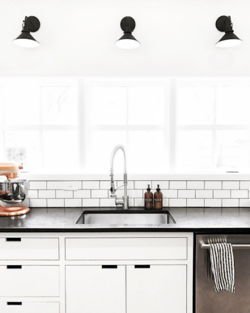
MC: Adding color has been so much harder than I expected. Neutrals patterns are another way to infuse personality without marrying a bold color. My style errs on the side of minimalism, which naturally has the tendency to feel cold. Pattern has the power to diffuse the austere with cozy warmth.

H&W: Your recipes are comforting, classic, and approachable, yet they still feel special. They also tell a story. How does this same approach translate to design and interiors?
MC: When were all done designing the house (my husband questions if such a day will ever arrive), I hope strangers feel as theyd know us after a quick walk through. My favorite quote and huge source of inspiration goes like this: Pare down to the essence, but don't remove the poetry. (Leonard Koren, Wabi-Sabi: For Artists, Designers, Poets & Philosophers) Poetry is personality. Im simple, yet quirky. I love to create and work, but I also love to relax. I love to make food and eat it. I think youll find those things in my approach to both recipe creating and designing. I think theres so much importance in getting to know yourself and then being yourself. Thats easier said than done, but I think thats where we all shine.
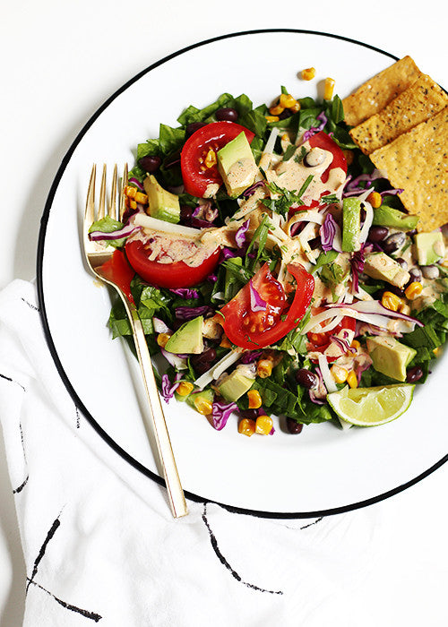
H&W: After the heavy, comforting foods of winter, we're so looking forward to the lighter fare of spring and summer. What's one of your go-to warm weather recipes?
MC: Now that winter is behind us (I think), I'm looking forward to making and eating huge salads served family style. The kind of salads that require very little cooking, if any at all. The Tex-Mex Chopped Salad is a favorite. I have a slight obsession with serving meals family style right now. Maybe it's a summer thing? Or maybe it just means I don't have to get up from the table as much. Either way, there's something special about picking up a pile of food with salad tongs and serving everyone from the same bowl.
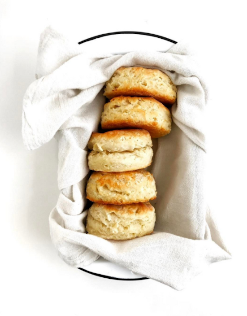 H&W: If you could cook a meal for any person - dead or alive, real or fictional - who would it be and what would be on the menu?
MC:My moms dad over a plate of homemade biscuits. I never got to meet him. He died when my mom was in high school, but everyone talks about his biscuits. They were epic and made without a recipe. Id make him a batch of mine and beg him to make me his.
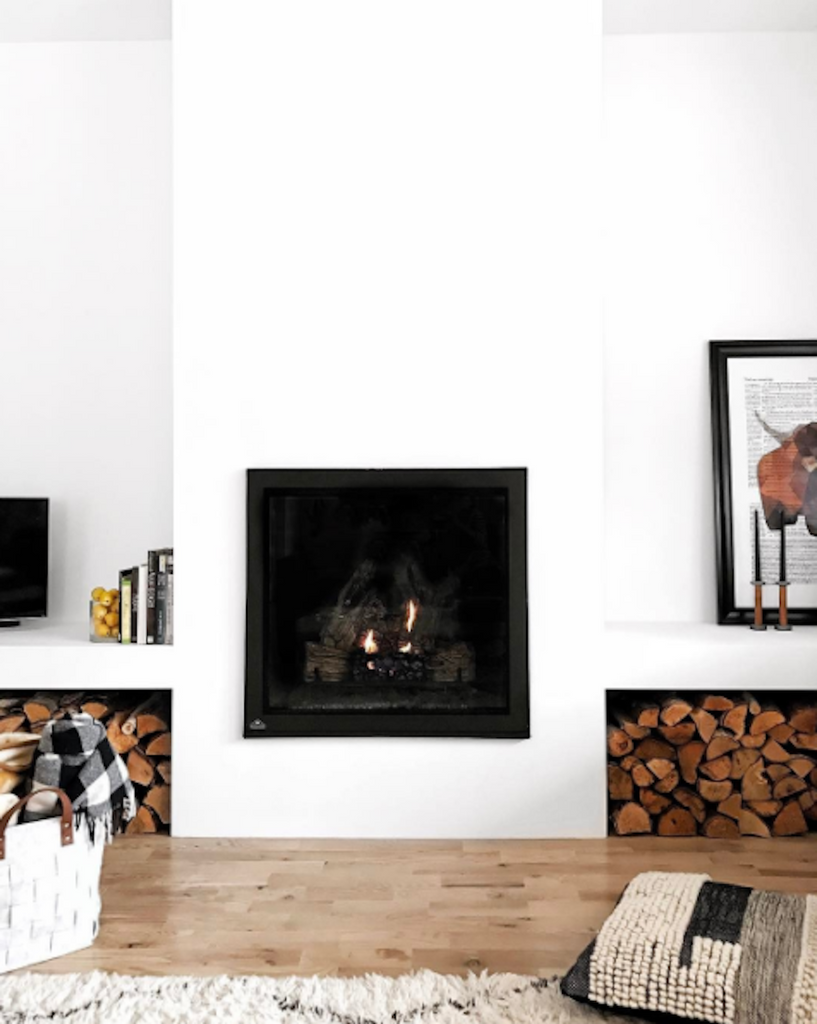
H&W: 'Hygge' loosely translates to the Danish concept of coziness. How do you create a sense of hygge at home?
MC: Hygge is a popular practice during winter. With a fresh coat of snow, winter is magic. But it can also be long, cold, and dark. It needs all the hygge it can get. We light candles, keep a fire running, and add an extra afternoon cup of coffee. Since we live in Minnesota, where the winters are long, Ive designed the house almost exclusively for winter, to feel cozy when were inside most. Zooming out a bit, hygge is finding joy in the simplest of things, during any season. Its creating a thoughtful rhythm to otherwise ordinary days. I think hygge goes back to the idea of knowing yourself well, knowing what lifts your mood, and implementing happy-making rituals into your day. During the summer, hygge looks like afternoon iced coffee, early happy hours, and Friday night homemade pizza.


