Inside H&W: Meet H&W Graphic Designer, Ola Supernat
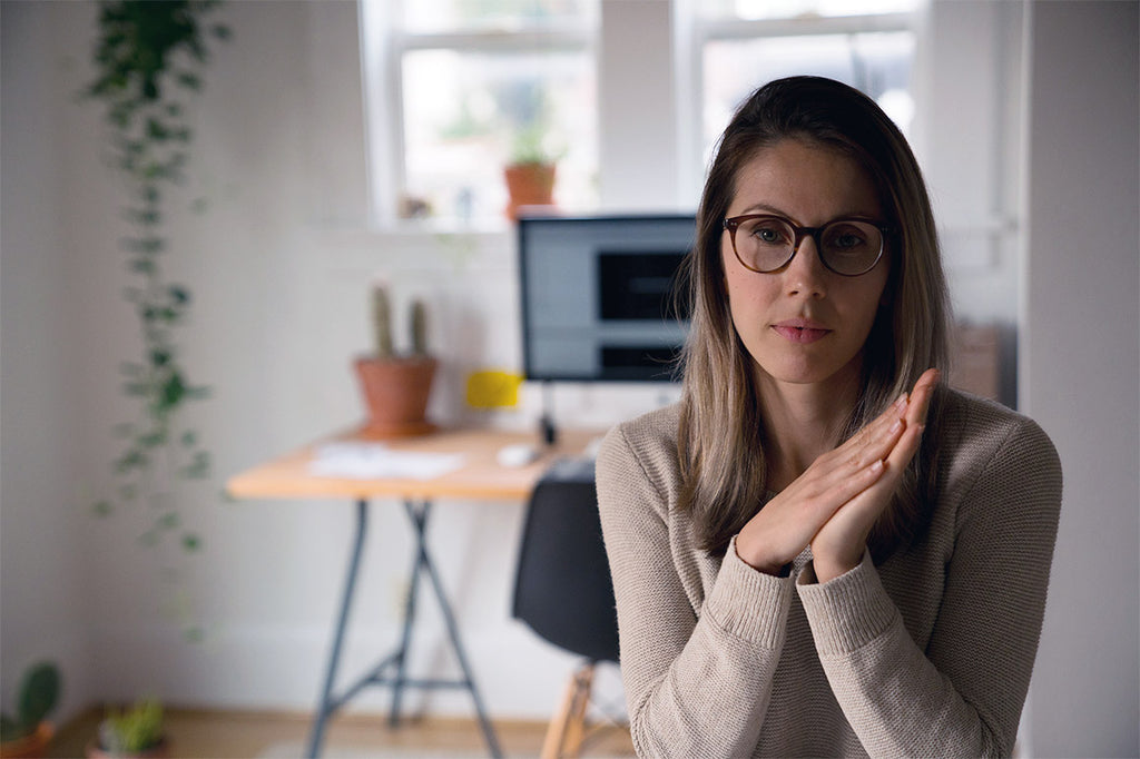 As business owners, we've learned that finding great people to join your team is not always an easy task. So when youcome across someone who is not only immensely talented, meticulous, and conscientious, but also just an all-around great person, you hold on tightly. And our amazing graphic designer and one of our newest team members, Ola Supernat, is just that type of person.
Aimee met Ola many years ago when they both worked at a branding agency in Minneapolis, and the two became fast friends during their tenures there. Ola's talent and work ethic really impressed Aimee,so she was an obvious choice to reach out to when it was time todevelop our branding for Hygge & West in 2008. Now, years later, we had the opportunity to work with Ola once again, and we jumped at the chance. We can't wait to see all the beautiful things she creates for Hygge & West!
 Hygge & West: You have an incredibly impressive roster of clients from all industries. What is your design process like, and how, if it all, does it vary by client/niche?
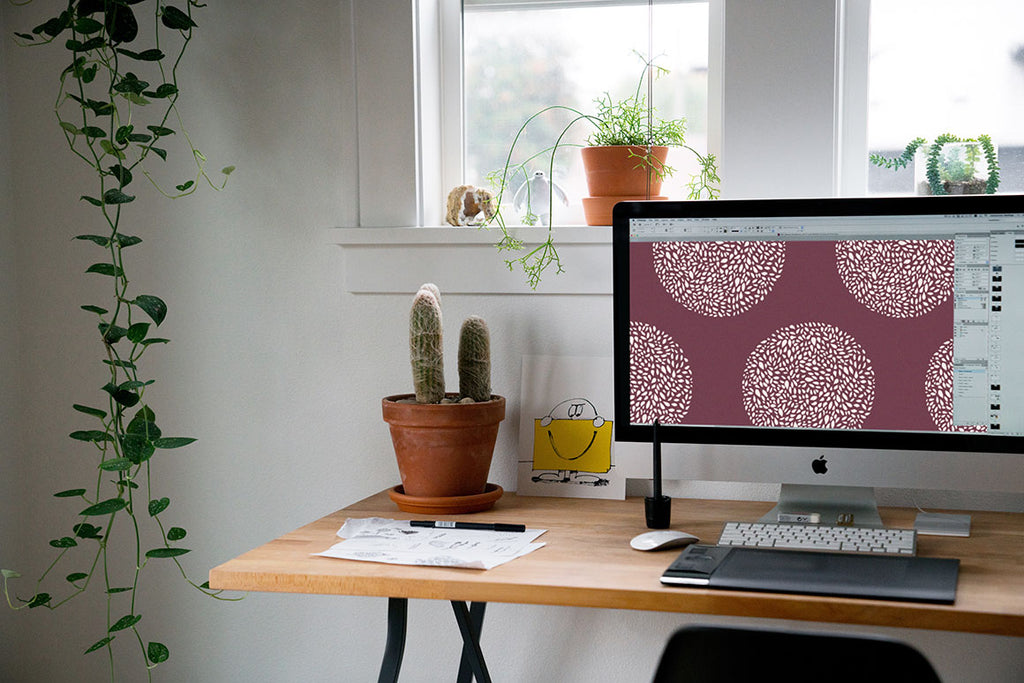
Ola Supernat: For the most part, the way I tackle each project is fairly the same. I like to get to know the client and their industry as well as I can. I immerse myself in their world. Then, I like to take a break to let all the new information settle in my brain. Next, I reread the brief/project ask and dive in. If it's logo or icon work, I start with sketches; for new brand work, I start with a general mood board, but for existing brands or digital work, I might jump right to the computer; for multipage layouts, I start with a book map; for patterns, I start by pulling inspiration imagery (if not already provided) and then sketch. I've been lucky enough to work with visual people, so a lot of the time, I show pencil or digital sketches first to make sure we are aligning. Sometimes you get it right away, sometimes you go through a few rounds of refinements. Every project provides its own challenges and I welcome the growing experiences.
H&W: You're originally from Poland and currently live in Portland, OR. How have those two places affected your design aesthetic? Are there any differences or similarities in the way those two places use pattern?
OS:I came to the States when I was 16 as part of a high school foreign exchange program. I ended up staying for college and then some. Before moving to Portland, I lived in North Dakota (where I spent a year on a dairy farm), Minneapolis (where I met Aimee!), and Chicago. At this point, I have lived in the States longer than I did in Poland. Ever since I was a kid, I was infatuated with American culture, so for the longest time I pushed away my Polish roots in favor of the world I grew up watching on TV. It's only within the last few years, probably as I'm getting older, that I've started to be more nostalgic towards Polish culture.
For me, the common thread for Poland's and Portland's pattern inspiration is nature. Design in Poland has been very progressive, but I tend to be drawn to the simple, folk-style art I remember from my childhood - in book illustrations, my grandma's house, and holiday decorations. In Portland, I feel pretty spoiled to be able to be by the ocean or in the mountains in pretty much the same amount of time it would take to leave the city limits in Chicago. My boyfriend and I like to get out of town as much as we can and I always take photos of plants and textures we come upon during our adventures for my inspiration bank.
H&W: Much of your work has a clean, minimalist vibe that gives your designs plenty of room to breath. Why is this important in your work? Does this aesthetic translate into your home?
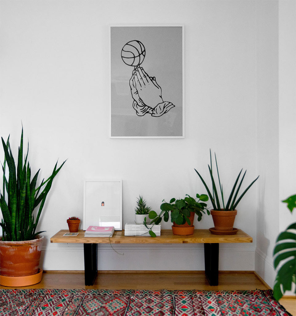
OS:I tend to create minimal work to let the message take center stage. That aesthetic definitely translates into my home! My boyfriend and I bought our house close to two years ago and the first thing we did upon moving in was paint all the walls white. It created a great backdrop for showcasing art and favorite objects, plants (lots and lots of plants), and my Moroccan rugs. Both of us have moved around quite a bit (16 times in 16 years for me!) and never accumulated a lot of stuff, so we very much value bringing into our home only items that are necessary or meaningful. 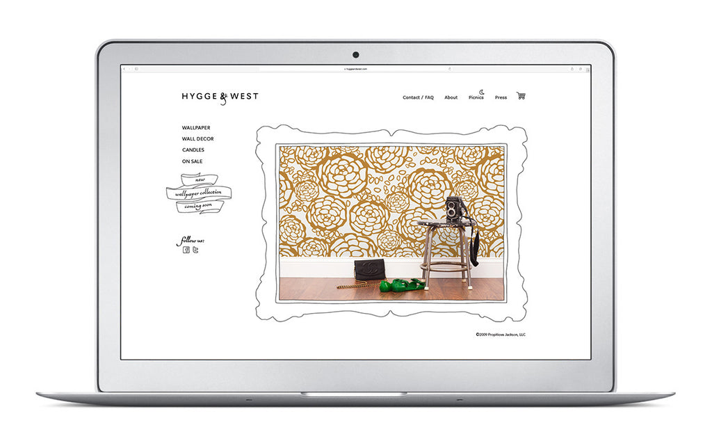
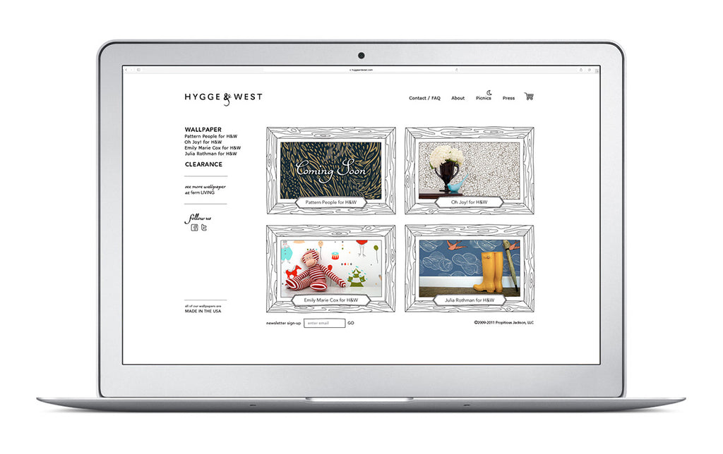
Hygge & West website and branding circa 2009
H&W: One of the first projects we worked on with you was the development of our current logo and branding. How do your designs capture the essence of the Hygge & West brand? How did the design evolve as you were creating it?
OS:From the beginning, there was a clear idea of what you wanted for the brand. We kept everything simple and sleek with hand-drawn touches as a nod to the designers and artists and to keep the brand approachable. The primary colors are black and white so the patterns really stand out.
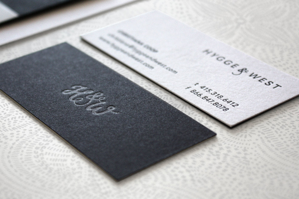 Over the years, the H&W branding hasn't really changed much. We've kept true to making sure the beautiful product is given the most prominence. What has evolved the most is probably your digital appearance - remember this website version from around 2009?!
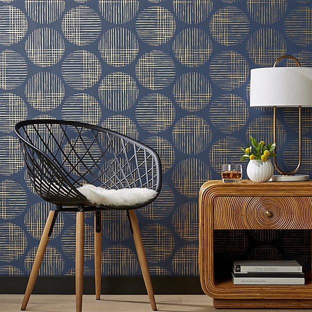
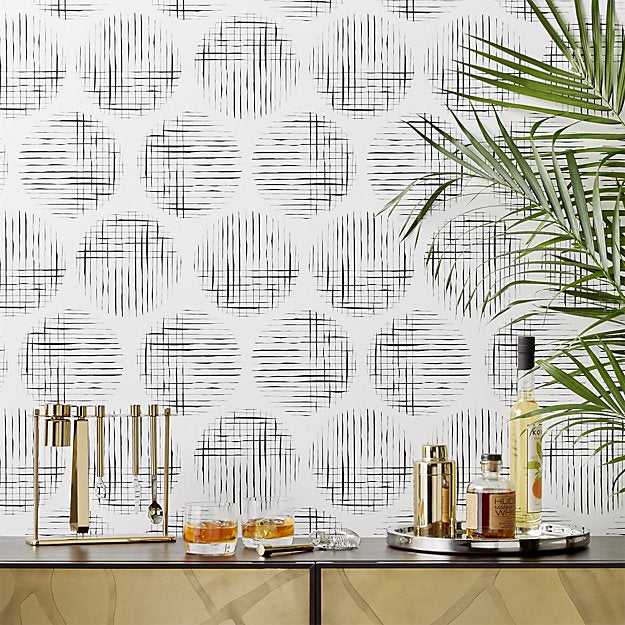
H&W: Most recently, you helped us create our Cross Hatchy wallpaper for CB2, and also helped turn Kate Arends' inspiration into a beautiful Wit & Delight x Hygge & West collaboration (coming this January!). How are you able to so perfectly translate ideas and feelings into real-life designs? Do you have any tricks or special processes for doing so?
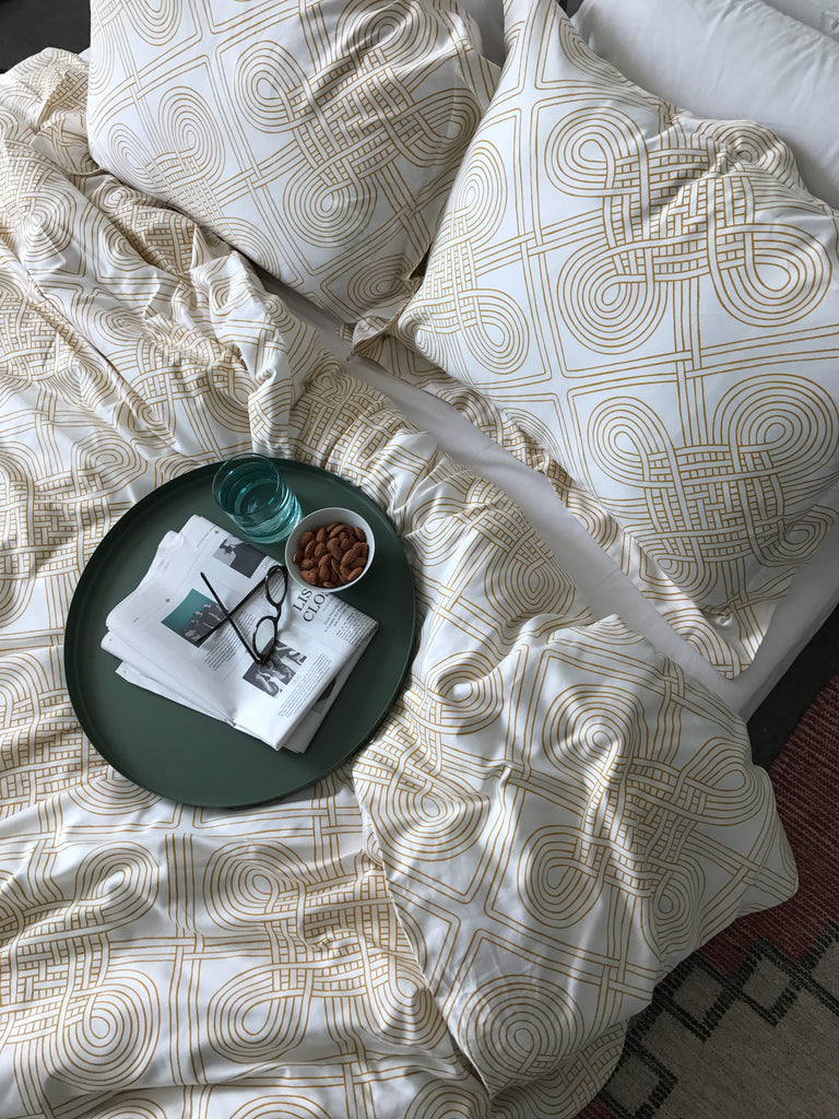
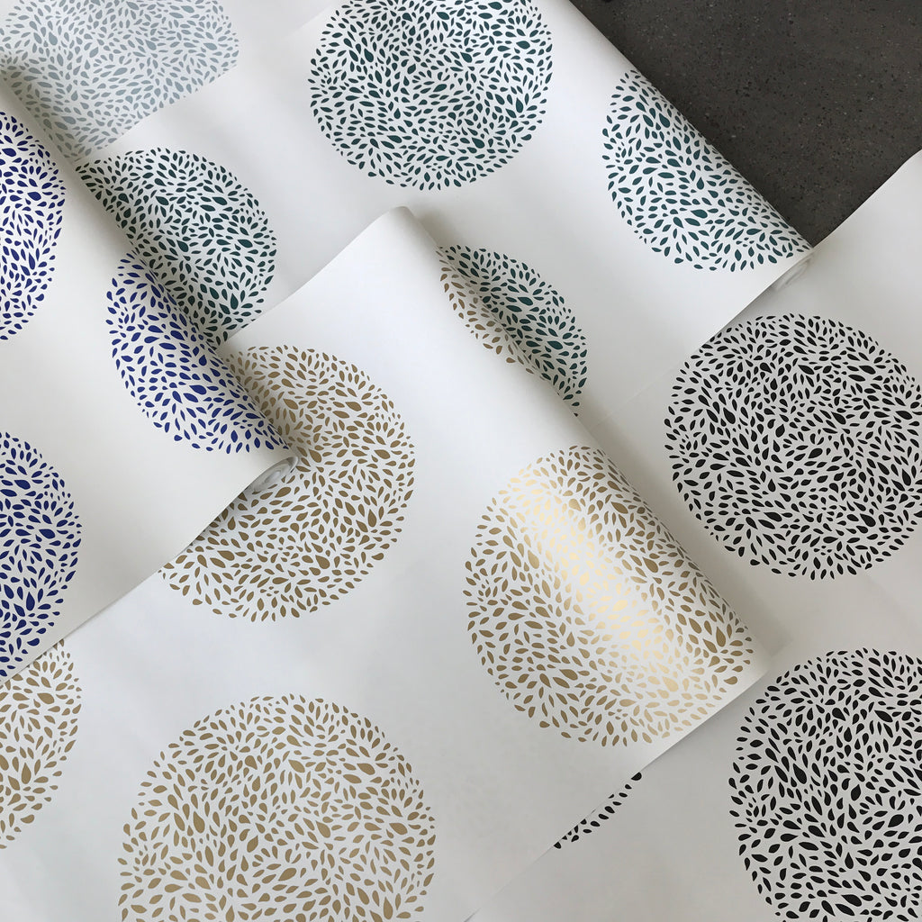 OS: First of all, thank you! It was an amazing experience to work on both collaborations. For Wit & Delight's collection, I was given a thorough inspiration deck, so I was able to hit the ground running. We also knew we wanted to have geometric and nature-inspired directions. I did a lot of sketching and experimenting and there was a number of patterns that didn't make the cut - it's all about trial and error.
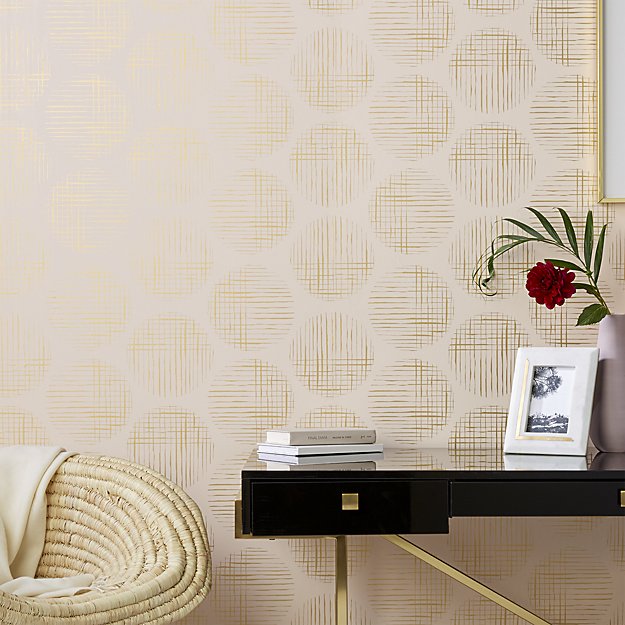 As far as tricks or processes - don't be afraid to experiment. I try to give every idea a shot, because you never know what may end up working. Sometimes, what seems to be a surefire winner in my head will not work out on paper and vice versa. Try different things - even an accident can reveal a new, better idea. For example, the CB2 pattern direction became apparent to me as result of clicking a wrong keyboard shortcut in Illustrator.
 H&W: What do you think pattern and repetition bring to the table, both in your work and in a home? Do you have any tips for working with pattern?
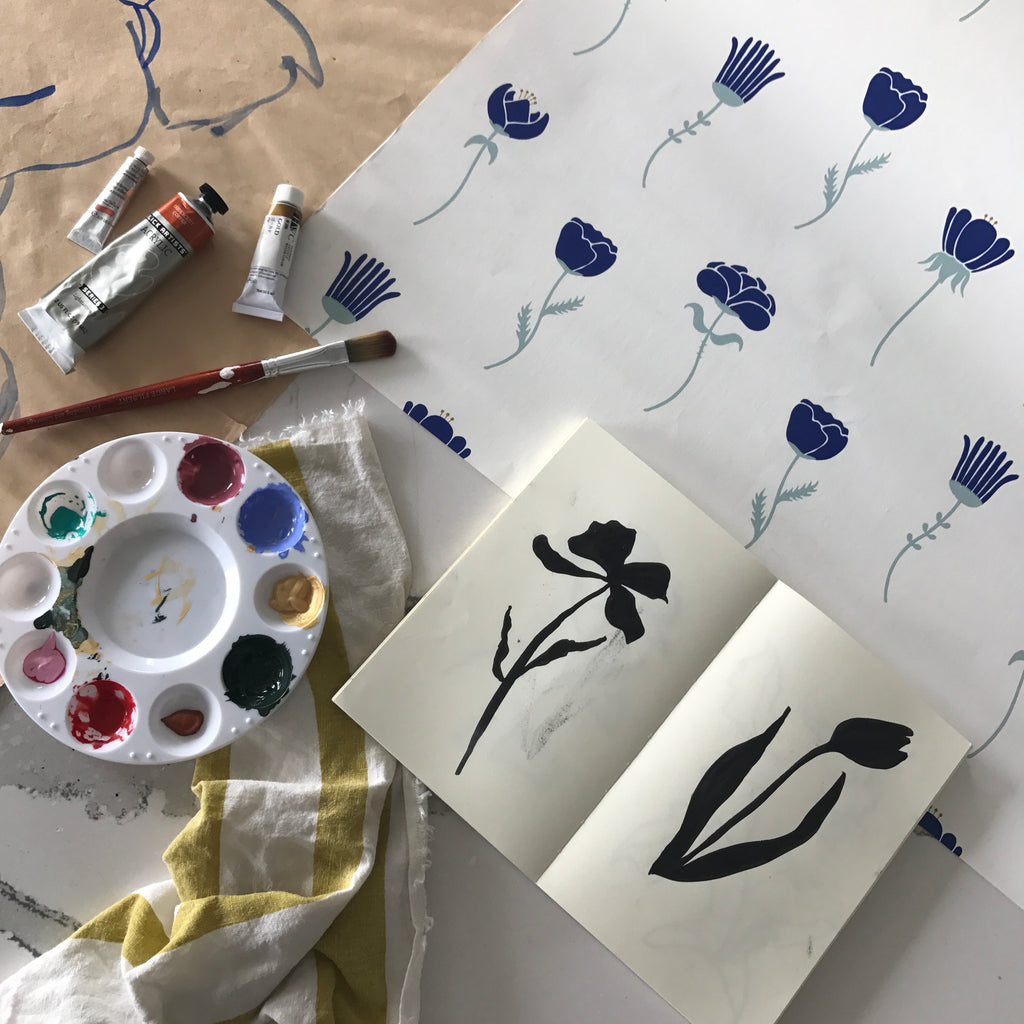
OS: Pattern is such a versatile way to exude different feelings as well as bring visual interest and texture. It can be a piece of art in itself. Large- versus small-scale design, geometric versus flora/fauna design, or even the same design in different colorways can appear worlds apart as far as the atmospheres that they create.
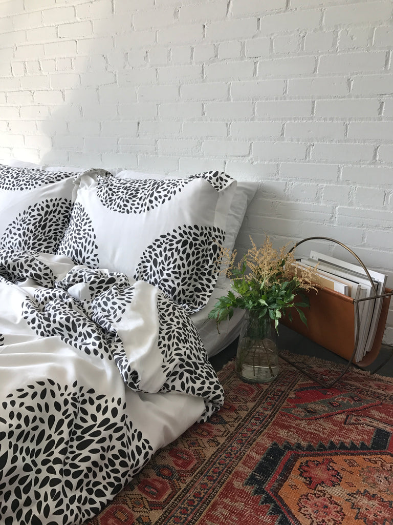
I am definitely an advocate for bringing pattern into your life (even though I painted our house walls white rather than hang wallpaper, I know!). A good way to introduce pattern is with less permanent items like throw pillows, blankets, rugs, or removable wallpaper tiles. That way, you can test out your pattern personality.
 H&W: As you know well, hygge is Danish for cozy. How do you find or create hygge in your life?
OS: I love that concept. We should seek out more joy and coziness in our lives. I've been really into audiobooks lately - I love to curl up on the couch, close my eyes, and get engrossed in a story. Other current hygge favorites include enjoying the incredible PNW fall before the rain comes (probably won't be true anymore at the time this is published, but there is something cozy about the rain, too); our new marshmallow cloud of a mattress; working on making our home more 'ours' with my boyfriend; sweaters; nature adventures; friend/food dates; and brown bread with salted butter on my recent trip to Ireland (but really, anything food-related).


