Pattern Players: Carmeon Hamilton
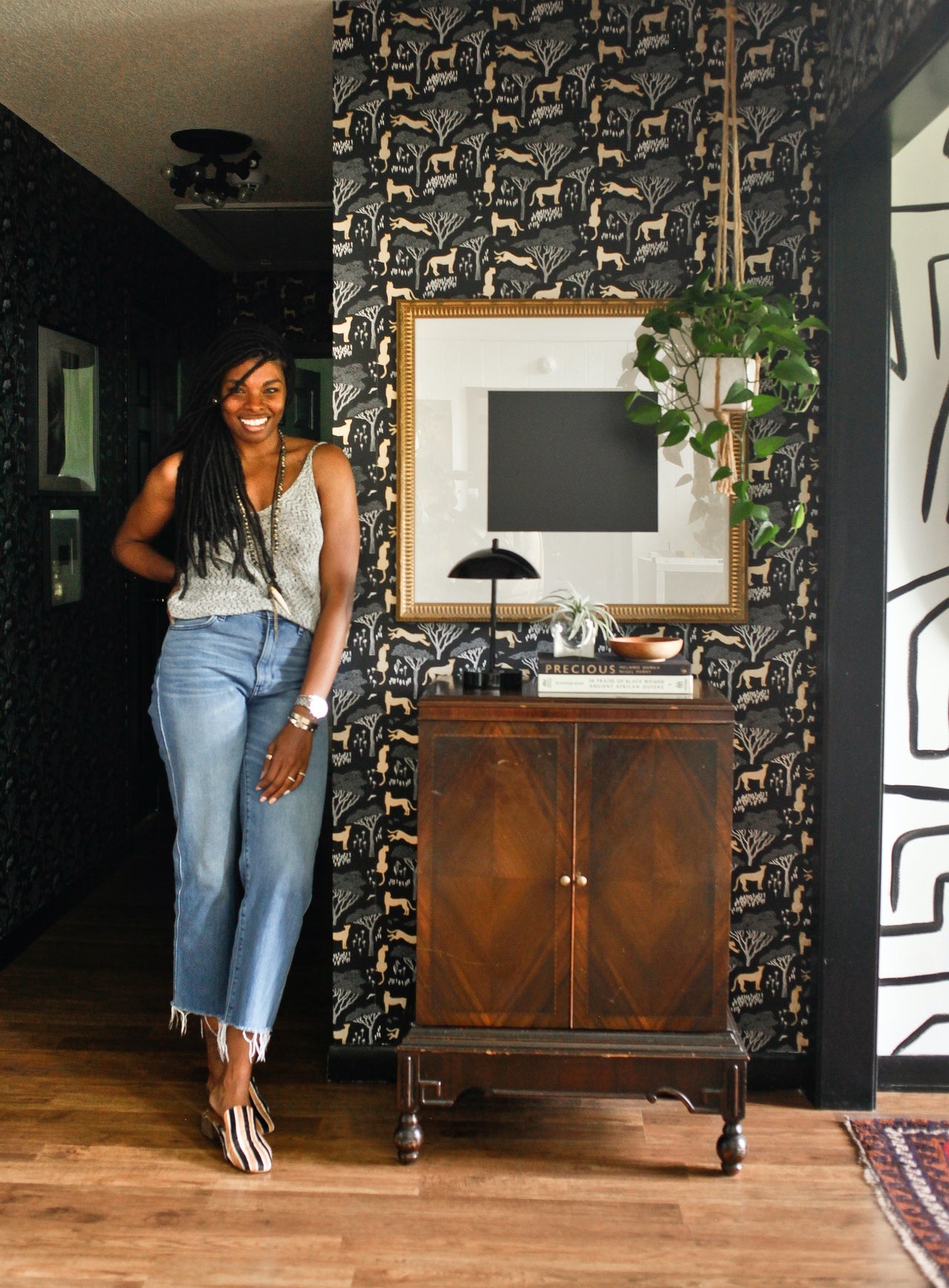
When we first came across Carmeon Hamilton of Nubi Interiors, we fell head over heels for her fearless approach to design. Whether its all-over pattern, a graphic hand-painted mural, or her no-holds-barred use of color, Carmeon's style makes us swoon. But it was her versatility—she's just as comfortable working with soft palettes as she is with bold ones—and her mix of old and new that made us forever fans.
We had the opportunity to partner with Carmeon on a hallway makeover in her home, and we were so excited to see what she would do with our Serengeti (Ebony) pattern. And just as expected, she did not disappoint. Carmeon turned this space into a major design moment that calls for a second, third, and even fourth look—there's nothing transitional about this hallway. Hooked yet? So were we... and we just had to learn more about this talented designer.
Tell us a bit about your background and how you came to interior design/start Nubi Interiors?
There are lots of twists and turns to how Nubi Interiors came to be where it is today, so I'll give you the short version. I finished college with a degree in interior design and immediately went to work in corporate healthcare design. Four and a half years into that job, I was laid off when the company dissolved the internal design department. Months later, needing a creative outlet and income, my husband encouraged me to start my own design business and Nubi Interiors was born. In spite of its birth, I still wasn't generating enough income, so I accepted a full time position in furniture retail and store design that led to a lead buying and creative directing position that I loved for almost five years. Even with the corporate position, I still acquired and maintained amazing relationships with clients and my business continued to grow. Last year, in August 2019, I was able to pursue Nubi Interiors full time.
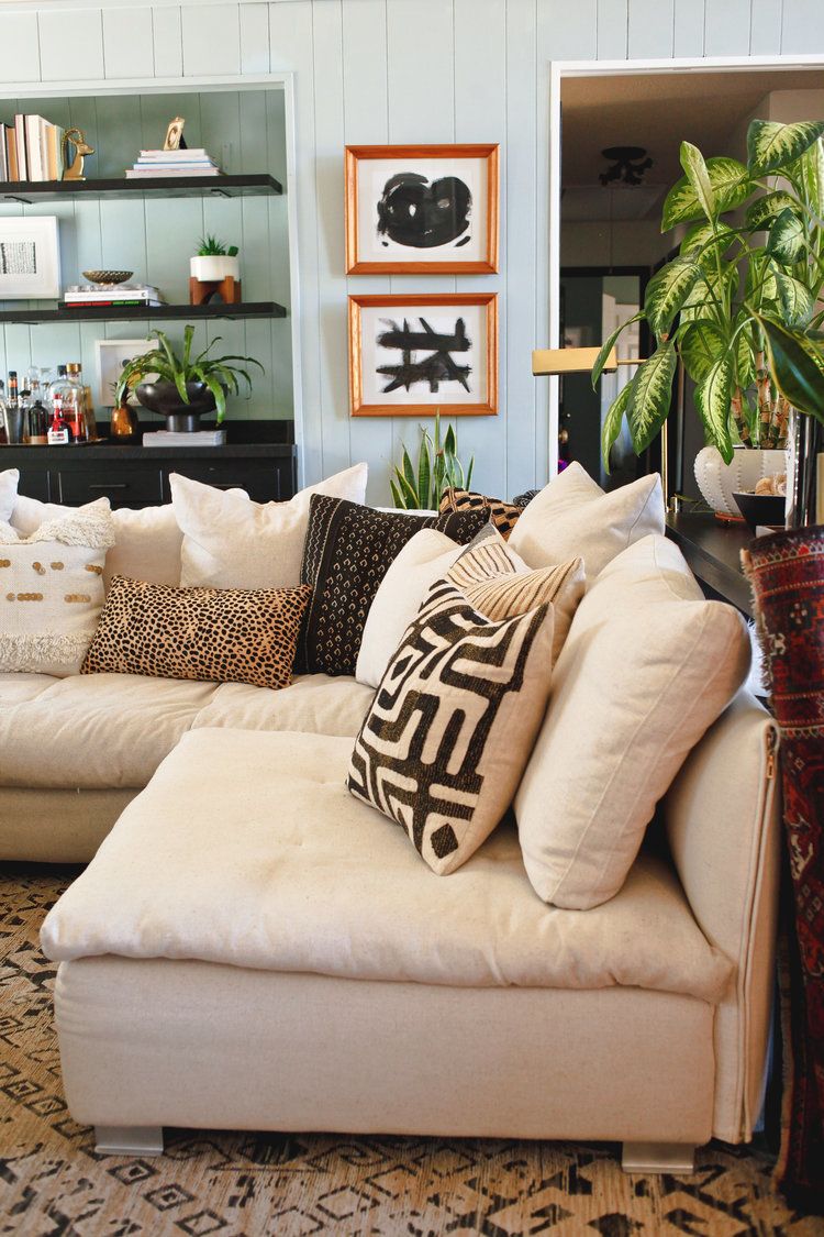
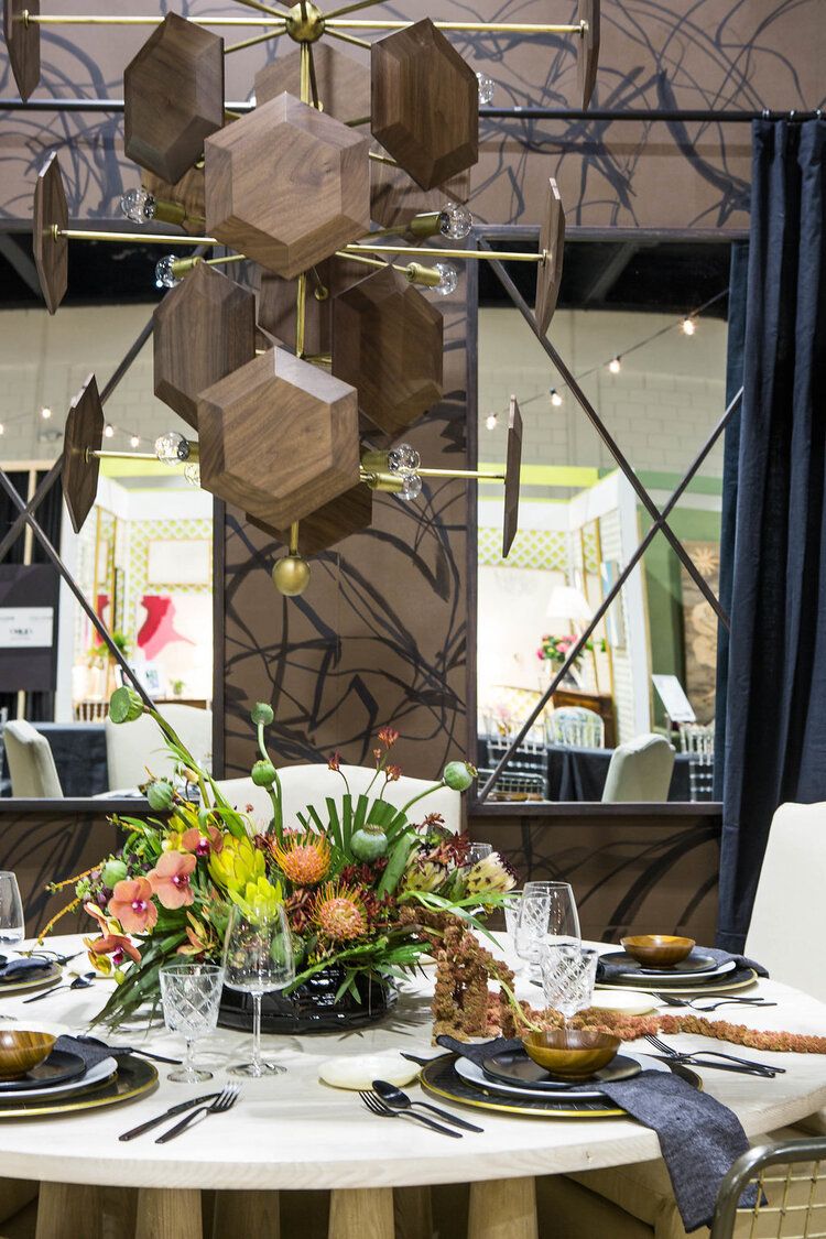
Your philosophy of "elevating the everyday" is very similar to hygge, which is the Danish concept of finding comfort in life's simple joys. In what ways do you elevate your everyday or add hygge to your world?
I find that simple things, such as nixing the paper plates and solo cups and eating dinner on a real, ceramic plate with real silverware and cloth napkins and drinking out of a real glass can really change the way you feel while eating that dinner—even if the dinner is as simple as pizza. Swapping out mundane everyday items for beautiful ones can really create a feeling of gratitude, which can immediately lift your mood; elevating those previously "mundane" moments to ones you now appreciate.
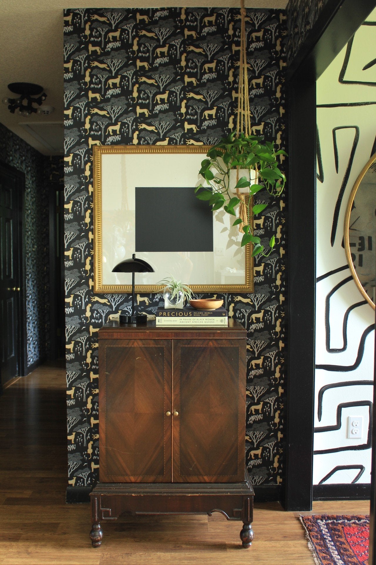
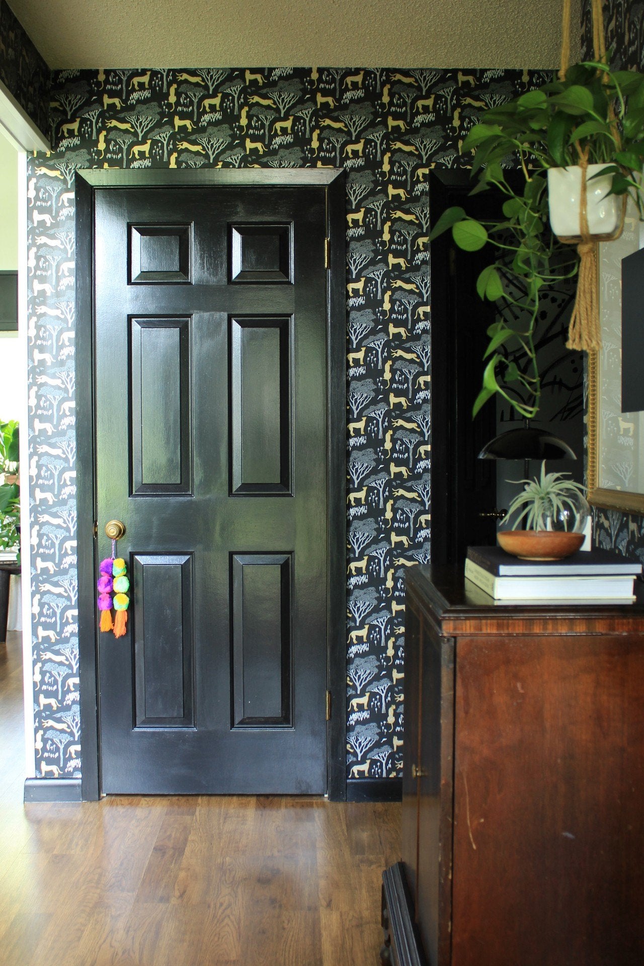
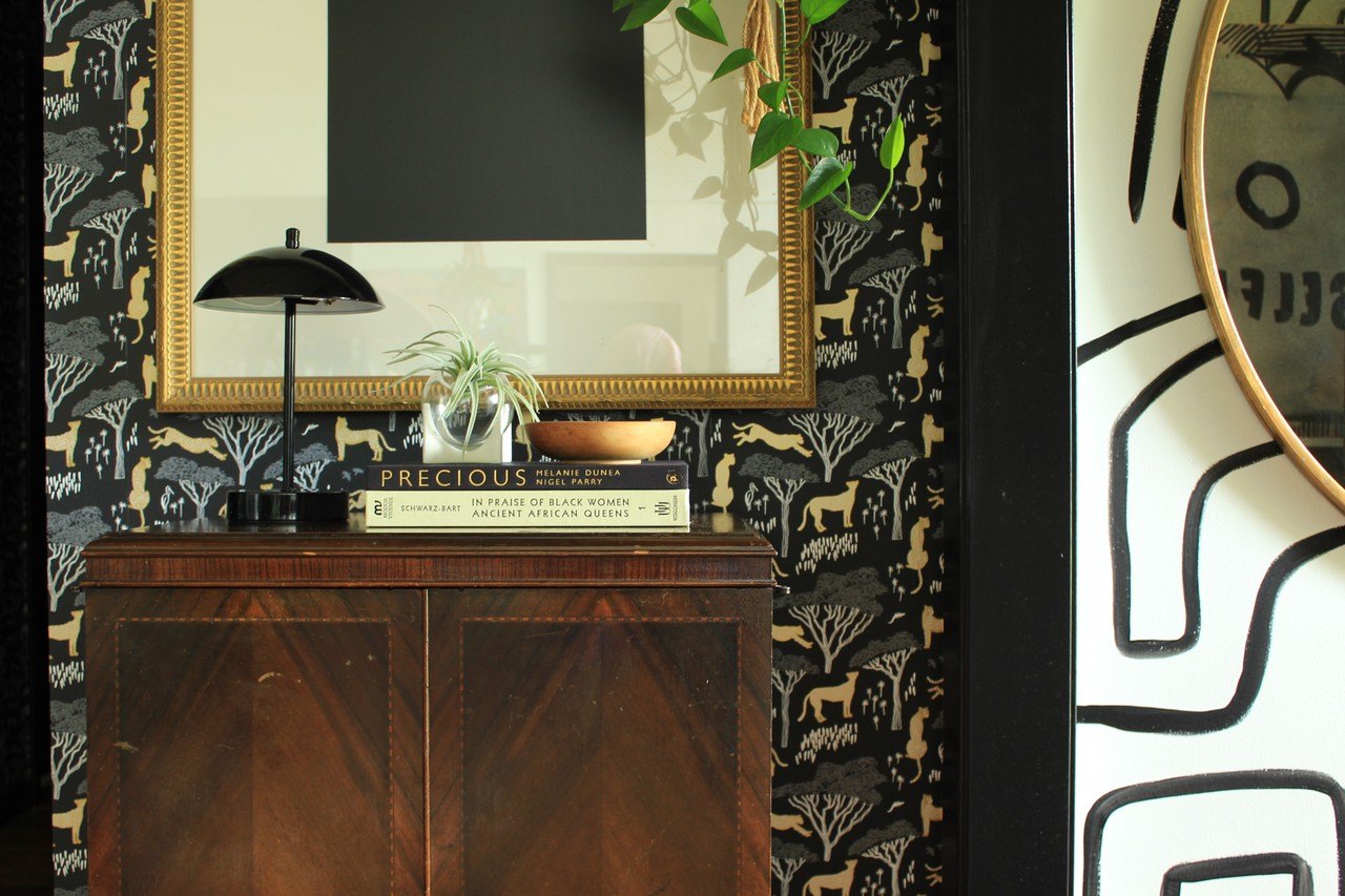
You recently did a hallway makeover in your home using Serengeti (Ebony). Why did you choose that paper?
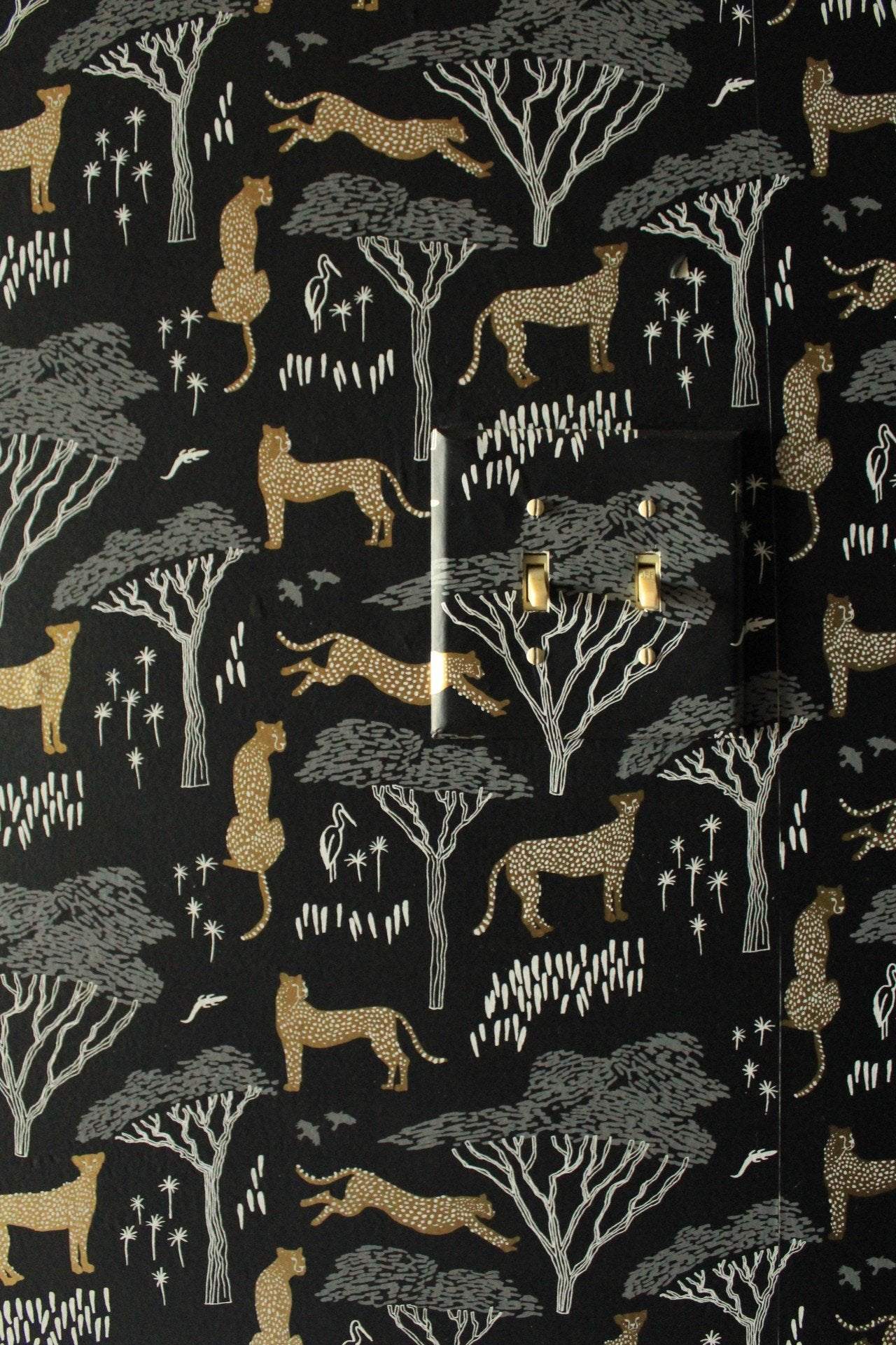
I knew I wanted something bold, something black, and something that felt like it could speak to the family that lived here. I picked out a few samples, but when they all arrived, our decision was clear. My whole family unanimously chose the Serengeti design by Julia Rothman in the Ebony colorway. It was bold with its graphic pattern and gold cheetahs. It had a background that was black and moody. The Serengeti scene was indicative of the landscapes of our African ancestors and just felt like home. (Pattern story: After artist, Julia Rothman, traveled to Uganda, she wanted to capture the vast and beautiful landscape she’d experienced. This design with cheetahs and birds scattered amongst the acacia trees was created to reflect the beauty of the African plains.) It was perfect.
What are your tips for bringing all-over pattern to a space like you did?
The key to bringing in any pattern is to make sure you're familiar with the concept of scale and proportion. Scale is the size of one object in relation to the other objects in a design or artwork. Proportion refers to the size of the parts of an object in relation to other parts of the same object. Patterns with a larger/oversized scale will feel more dramatic. Smaller scale patterns can feel more subtle. When searching for a pattern for my hallway, I knew I wanted something to compliment the bold, graphic, hand-painted mural work in my entry. The scale of the design in the entry is loose and oversized, so I wanted a tighter pattern to contrast and balance it.
We love your soulful mix of modern and vintage. Do you have tips for others hoping to do the same in their homes?
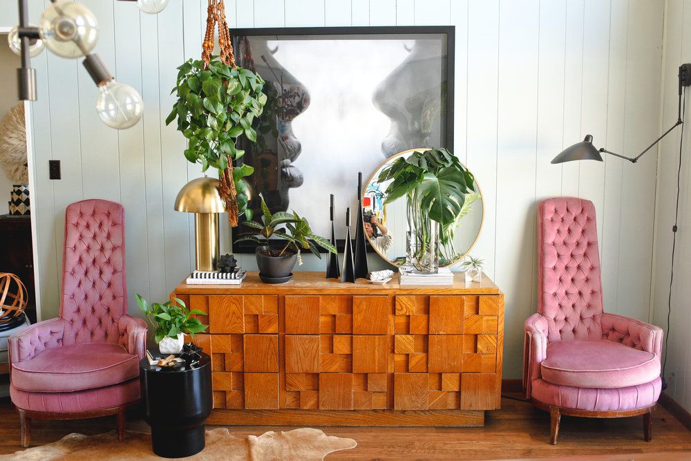
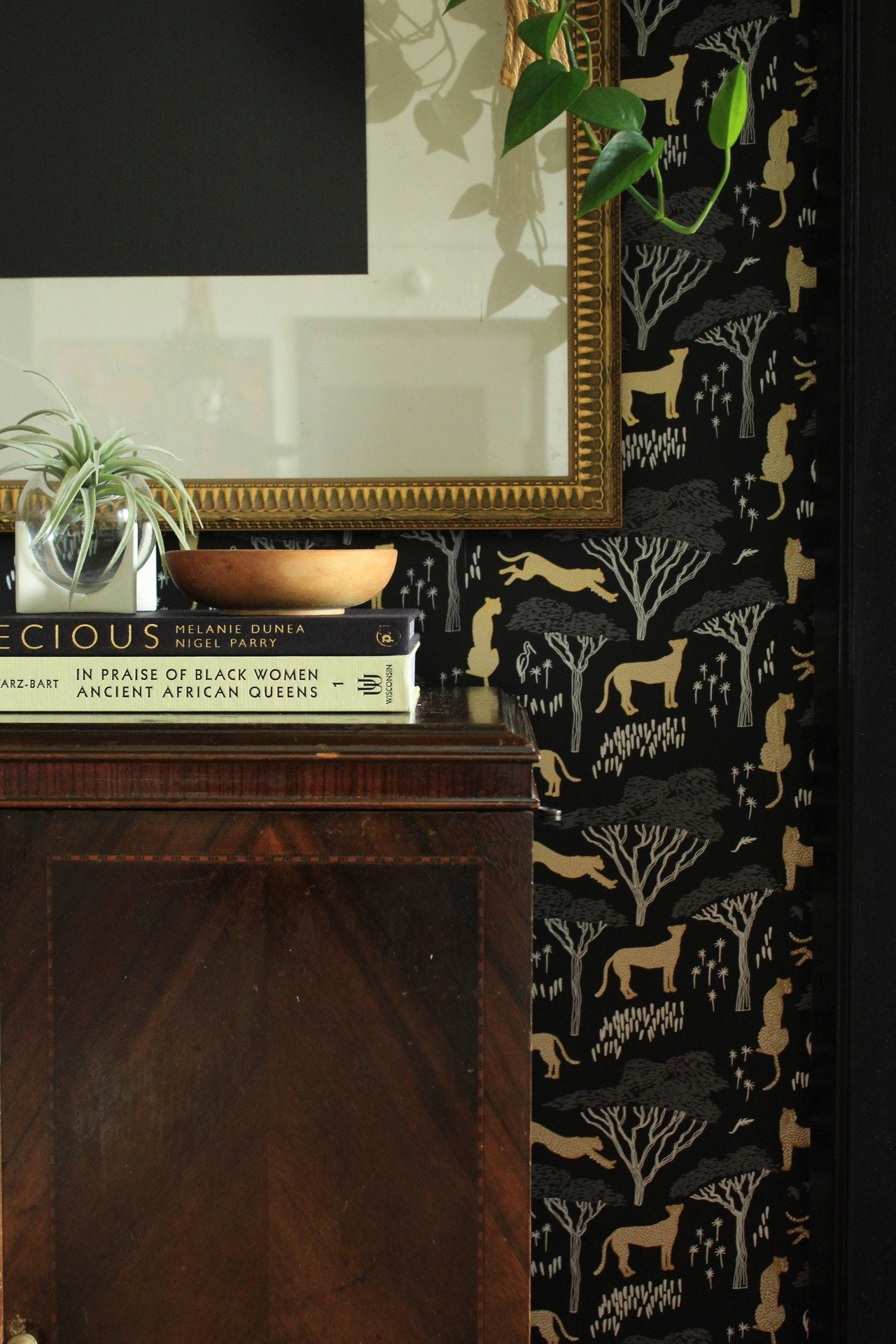
Vintage really has the effect of making a space feel lived in and is a great option for keeping waste out of landfills! To make a statement, consider the key furniture items for a space: the coffee table in a living room, the buffet in a dining room, the nightstands in a bedroom. Those items will immediately catch the eye, adding interest to the space.
We're big fans of making transitional spaces, like hallways, feel like rooms. How did you accomplish that in your space?
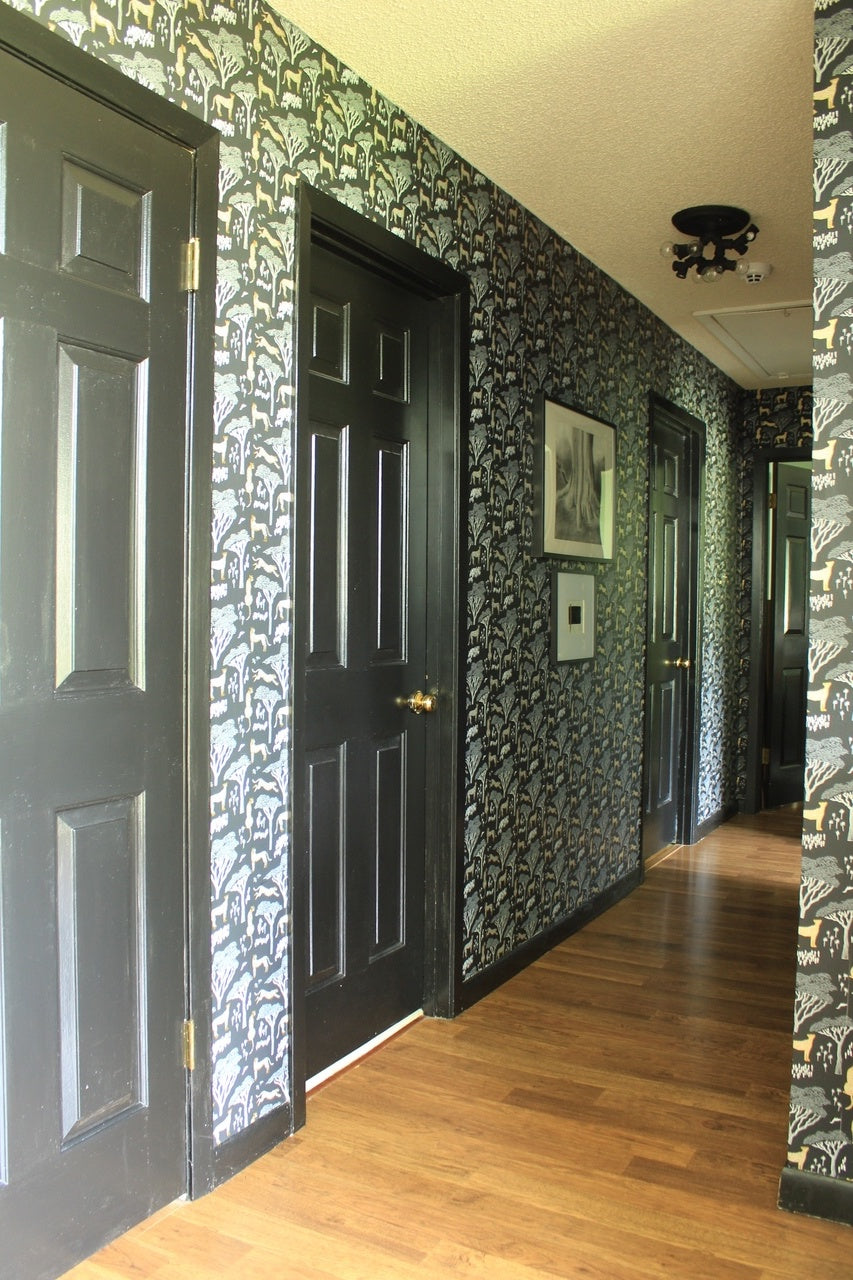
Transitional spaces are where you can have a lot of fun. They're spaces that are "used" or walked through multiple times a day, but aren't where you actually hang out, so the opportunity to go bold doesn't feel like a risk! I feel like for the 10 seconds you're in those spaces, it should be the best 10 seconds of your day. Taking a note from my book (or home), bring in a bold pattern wallpaper or paint it a color that you love, but haven't been able to use in any other space in your home. Display the art that is most special to you and your family. The possibilities are endless.
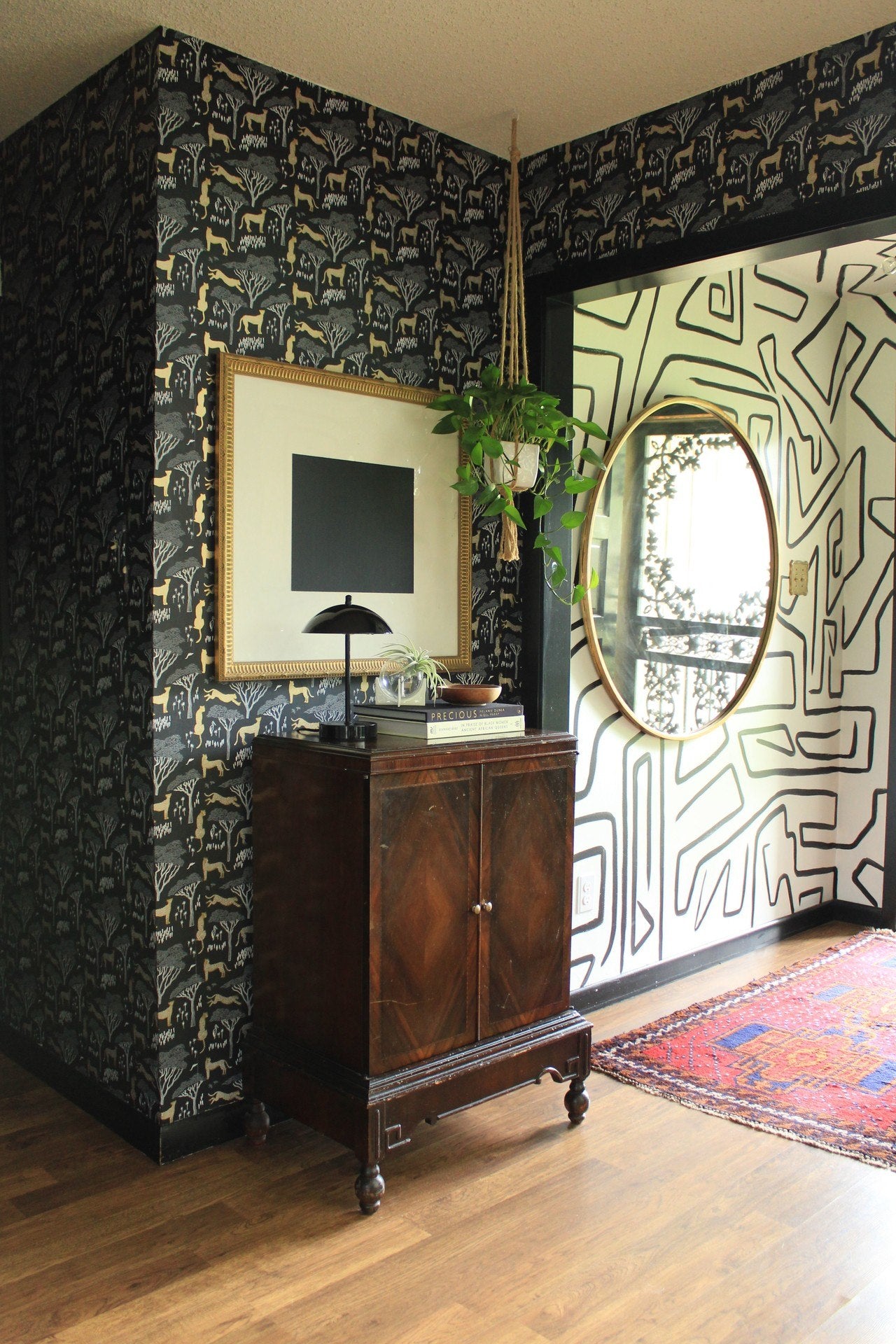
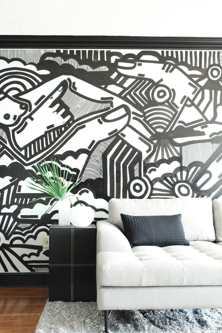
And lastly, we have to ask about the hand painted mural in your entry. What inspired you and what was that process like?
Thank you! It stemmed from falling in love with a wallpaper I couldn't afford (Kelly Wearstler's Graffitto). To this day it's still a favorite, due to it being the perfect pattern and scale that fits in almost any space or design style. Once I realized I wasn't going to be able to pull the trigger on the purchase anytime soon, I thought I'd break out my art supplies and try to create my own version. The process was really simple and pretty cathartic, actually. I got out my step ladder and picked a random spot on the wall to start. Once I started, it was pretty simple moving forward. I just made sure I maintained the scale I wanted by keeping the lines a safe distance apart. The rest was just organically finding the best directions for the lines. Outside of making sure there was enough paint on my brush, there really wasn't much to it!


