Meet the Maker: Go Behind the Scenes of Our Heath Ceramics Collection
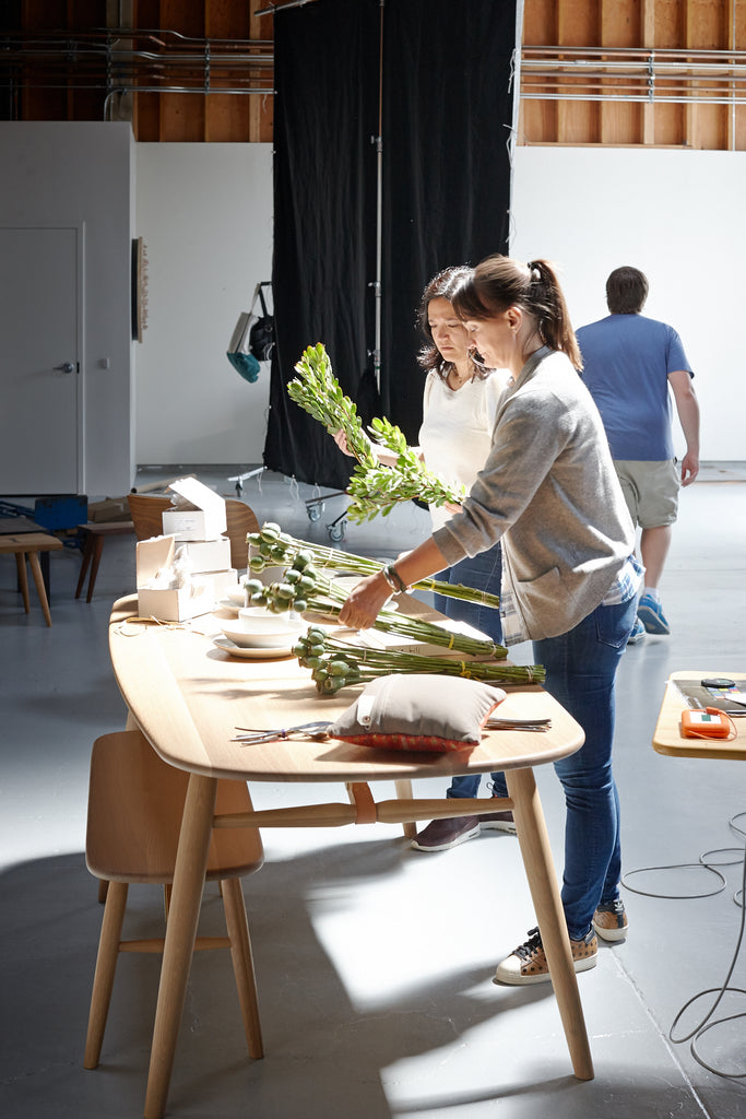
How do Hygge & West patterns come to be? This is a question we hear a lot, and while every collection is different, we thought we'd share a peek into what inspired our newest designs with Heath Ceramics.
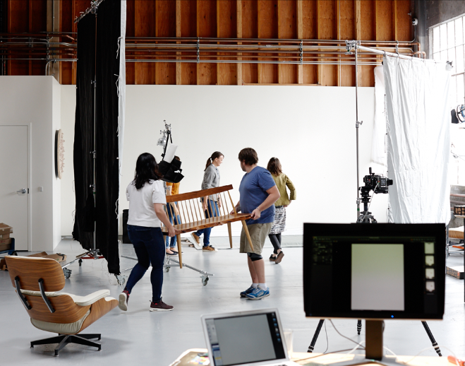
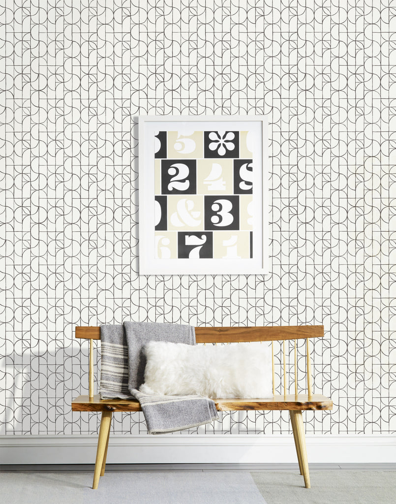
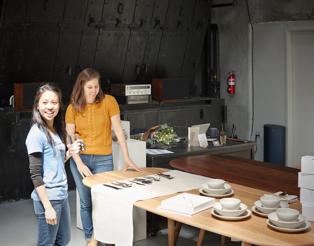
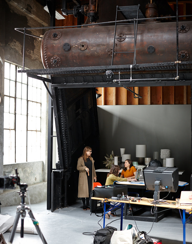
Heath Ceramics is an iconic California brand with a name that's synonymous with gorgeous, top-of-the-line tile and ceramics. Endlessly inspired by the shapes, colors, and designs of their tiles, we teamed up with Heath to see if we could translate their 3D aesthetic into a 2D form. And we quickly learned that our inkling was correct: tile and wallpaper are a match made in heaven. Below, is a little of what inspired the Heath designers and a look at our insanely fun photo shoot with the entire team:
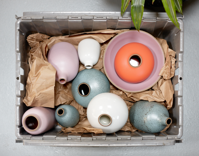
What inspires the Heath design team?
"We're inspired by someone who is a master at their craft or profession. We're inspired by seeing art, architecture, everyday objects from the present and past of all cultures and by new things that shake up our perspective. And we're all inspired by the work that has been done before us here at Heath."
What does hygge mean to Heath?
"We find hygge from our pets! From sweet cats that follow us around to 180 pounds of furry Newfoundland laziness... and anything that enables us to spend more quality time with them."
What are some of your most joyful moments?
"Some of our most memorable small moments are when we solve a design problem in a way that feels right, like the moment when we realized that for our designs to feel 'Heath' we needed to close the computer and pick up a paintbrush or pencil. That was absolutely perfect."
 What was Heath's process?
"The wallpaper [with Hygge & West] incorporates many of the values we hold dear in design at Heath. We designed the wallpaper with the big picture in mind: through our experience in designing and making Heath tile, we've learned a lot about how color, scale, pattern and texture work together to enrich and even form the foundation for the design of a room."
 What was Heath's wallpaper vision?
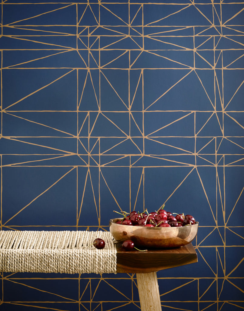
"From our signature clean graphical style (playing with some of the shapes and geometries were familiar with in designing tile patterns and letting new geometries reveal themselves), to our strong yet muted color palette (inspired by our glazes), and commitment to handcrafting borne out in our very hand-intensive design exploration process which included cut paper, brushes, paints but not computers and hand-drawn lines throughout the collection, the final designs very much retain their character of play, exploration and discovery."
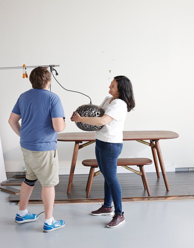
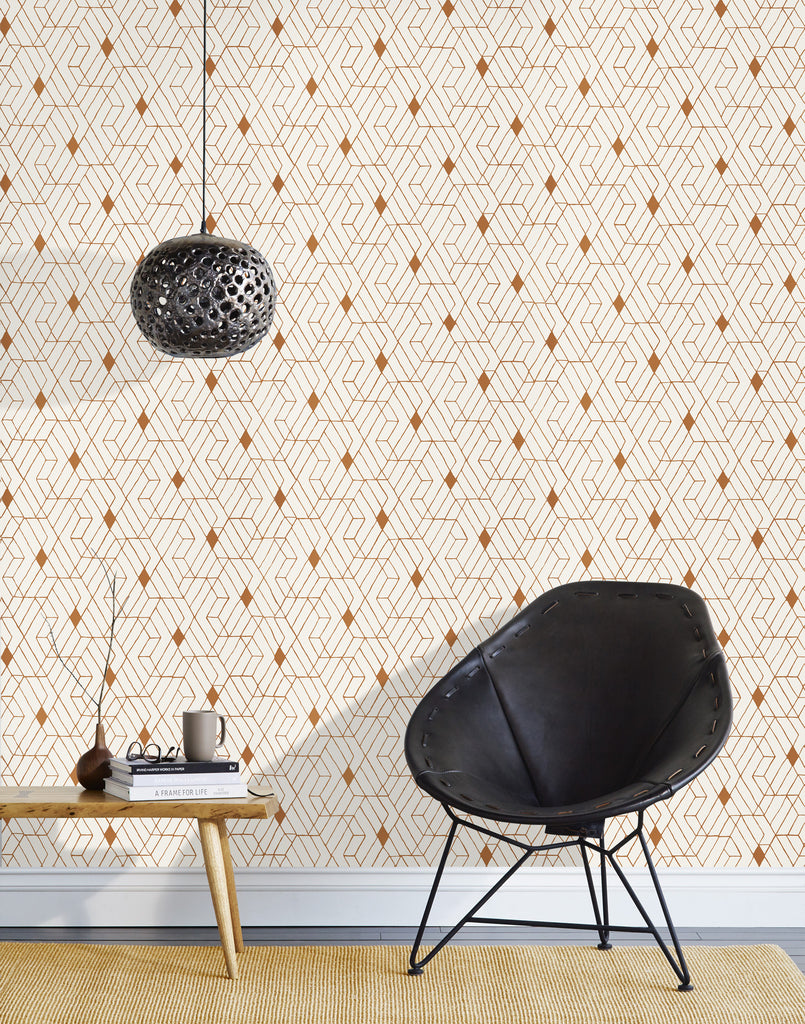 Working with Heath was an eye-opening experience for us. Getting to see, firsthand, how some of the most talented designers in the business work and what inspires them in their process - it inspired us, too. And experiencing the collection come to life during our photo shoot got us thinking...
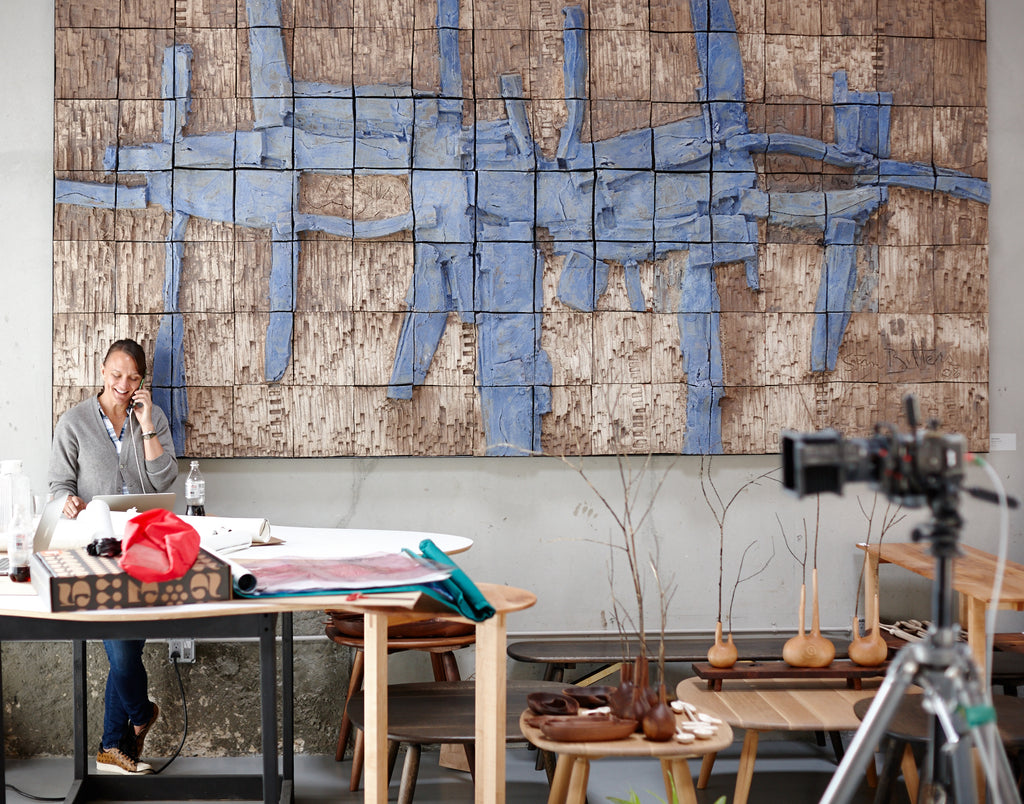 About our favorite part of the shoot process:
Aimee Lagos: It was really great to shoot at Heaths studio in San Francisco. We usually shoot in our photographers studio, so it was fun to be on location and it was also great to have access to all the incredible stuff in their shop for props! We could have probably done twice as many photos as we did because there were so many beautiful items at our disposal.
Christiana Coop: Same! It was really fun to be on location and have such easy access to so many gorgeous props to play around with!
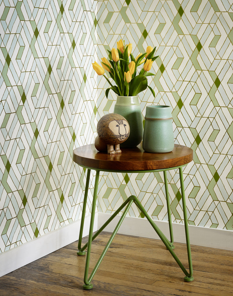 About what makes this collection different from others we've worked on:
AL: We're used to working with single designers so it was different to work with an entire team from Heath. It was really interesting to get insight into their design process.
CC: Because it was inspired by their tiles, it has a much more unisex feel than most of our other patterns. The colors were also inspired by their glazes and feel really unique to the collection muted, but still making a statement.
 About which pattern surprised us the most:
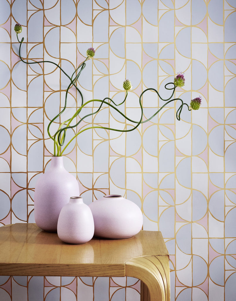
AL: For me, it would be Slice (Mist) which I wasn't completely sold on because I'm not a huge pink fan. But the final product is just gorgeous and I'm already trying to figure out where I can use that paper. It's always fun to see how papers come to life after looking at paint and Pantone chips as well as images on monitors for weeks (or months) on end. Opening a new batch of strike-offs and seeing the papers in person for the first time is one of my favorite things!
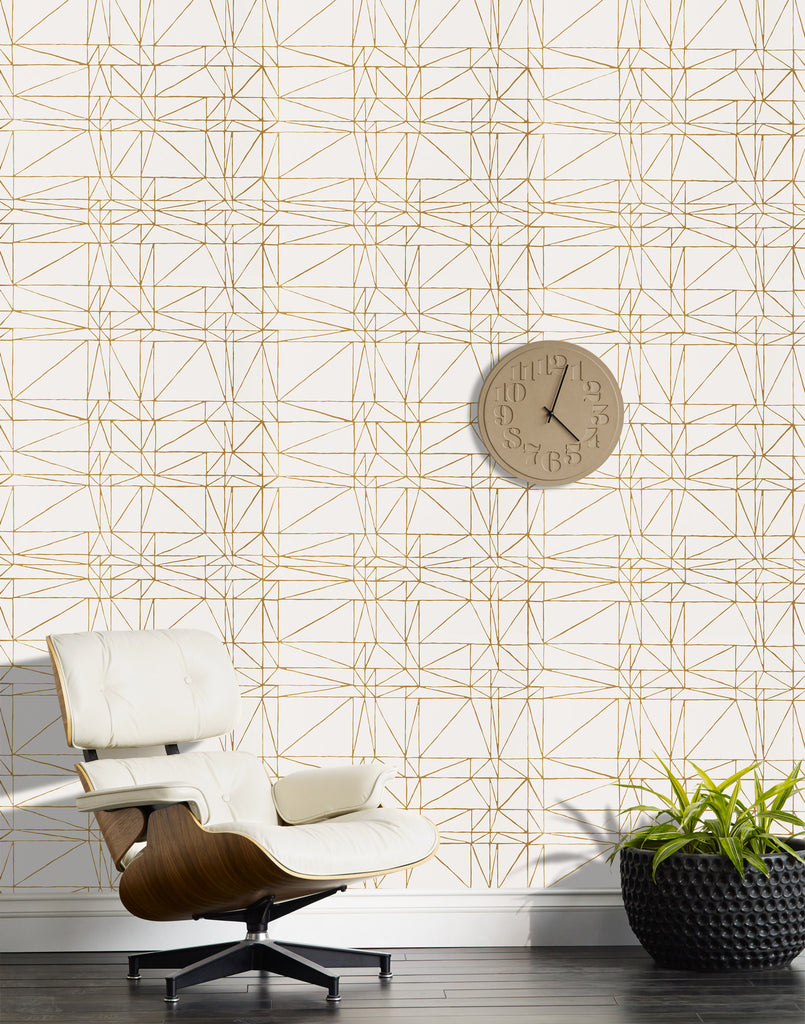 CC: I've been encouraging any friend who will listen to me to put up some Strike. At first I thought it felt a bit too simple (as I tend to lean towards as much pattern as possible), but I just really love how it looks on a wall and the hand drawn lines all the colorways too are so cool and I cant wait to see people start putting it up in their homes.


