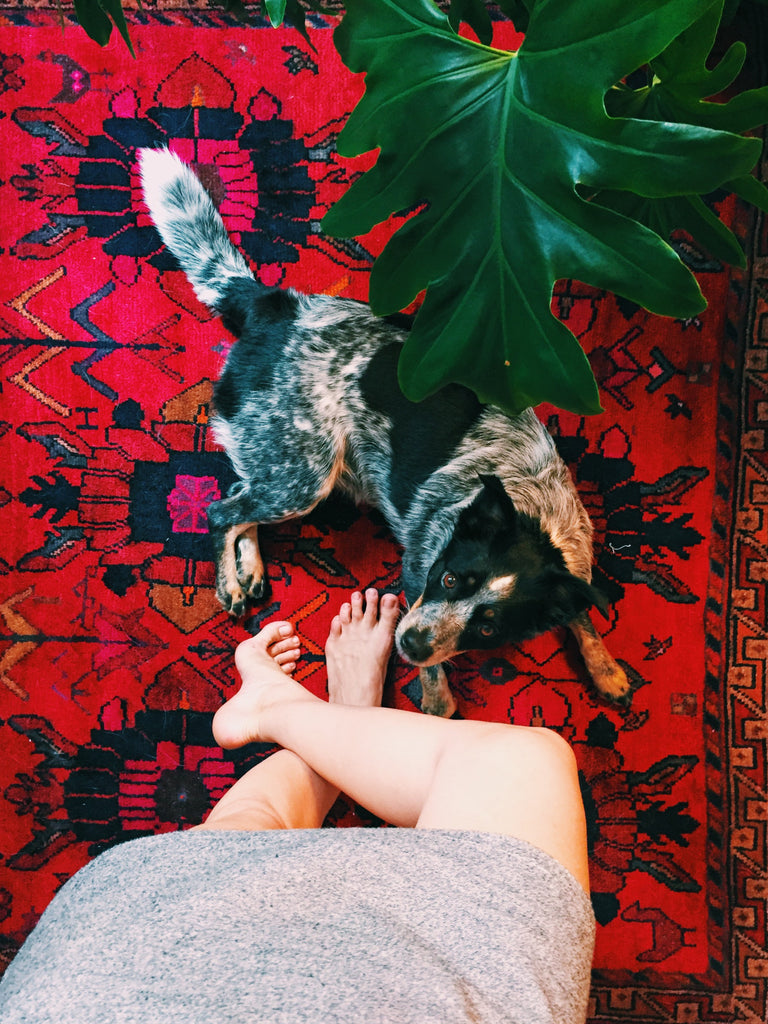
Sabrina Smelko, "Designer of Pixels and Places," on Pattern, DIY Renovations, and Design for TV

There are some people who are so wildly productive in their lives, and have created so much so quickly, that they seem to have figured out how to cram extra hours into their days. Sabrina Smelko is one of those people. Sabrina is a "designer of pixels, places, and things" and Creative Director of Wild and Light. From graphics to interiors, art to advertising, everything Sabrina designs has a sense of whimsy, light, and curiosity. And now, she's taken her playful aesthetic, passionate drive, and inimitable style to TV as co-host of HGTV Canada's Save My Reno.
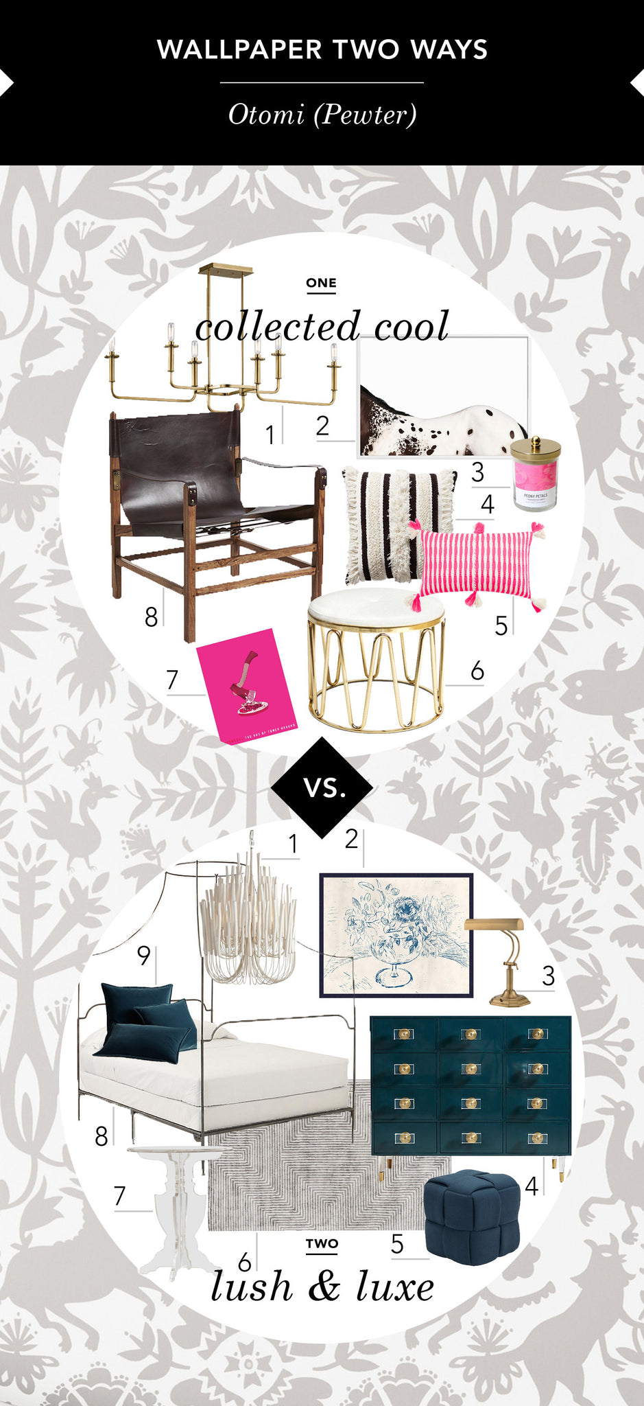
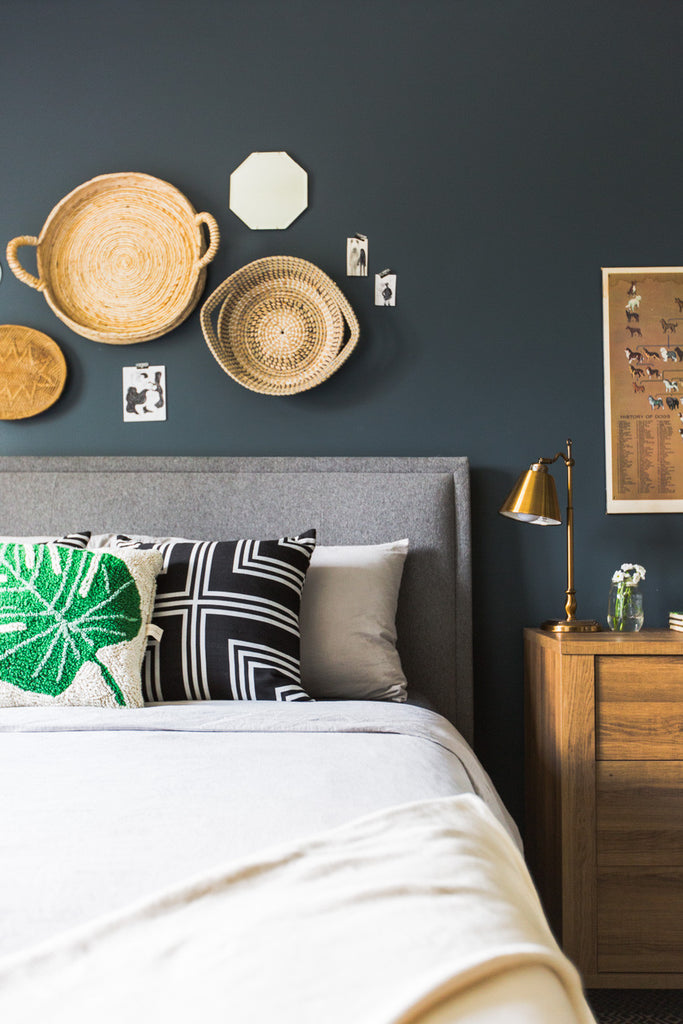
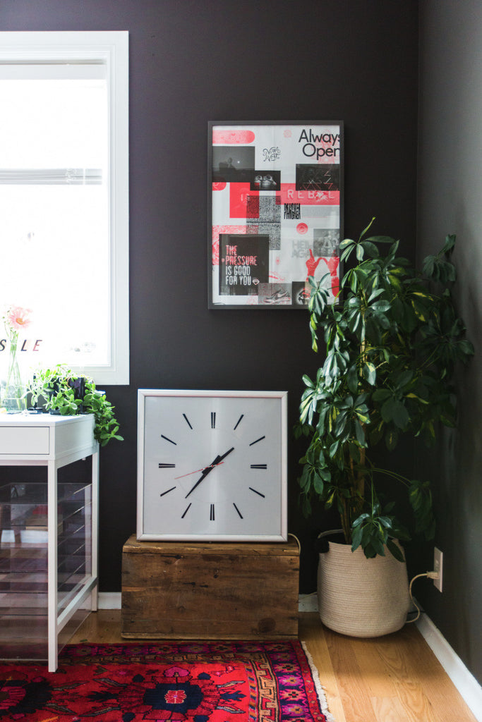
We asked Sabrina to show us how she would design two different spaces with the same Hygge & West wallpaper. The results are exactly what you'd expect - full of life, color, and, of course, pattern. Check it out below, and then continue scrolling to learn more about how Sabrina uses pattern in her professional and personal worlds, the latest on her home renovations, and how she hygges.
Hygge & West: What paper/colorway did you choose and why? Who is the person (or people) you imagine residing in each of the spaces you've created?
Sabrina Smelko: I chose Otomi (in pewter) because its both bold and versatile. I love the graphic nature it almost reminds me of a Scandinavian, illustrative toile.
The living space would belong to a vivacious creative-type whose style is unfussy and evolves a lot, but whom partners thrift store finds with pieces they ve been saving and holding out for. I imagine the bedroom belonging to someone older and more established. Perhaps they own a few felines and enjoy the finer things in life! So the first space is me now, and the second is me in 30 years?

H&W: As a designer of both pixels and places, pattern is a part of your every day. What inspires you both in your work in general and in your use of pattern in your professional world?
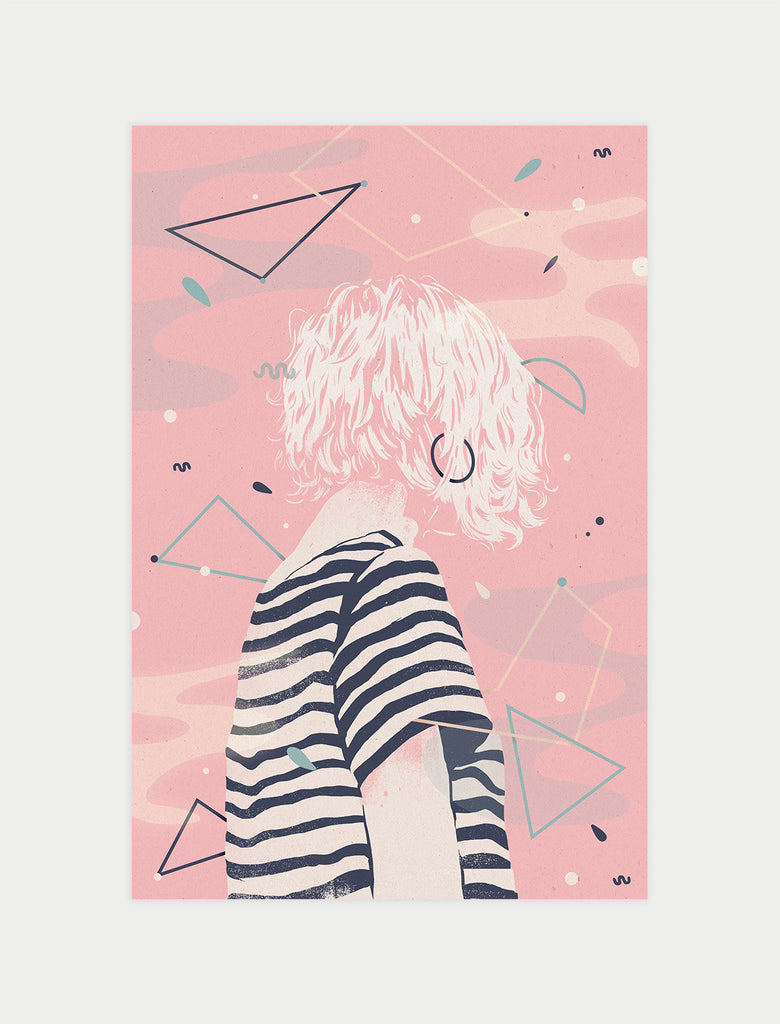
SS: I like to look to fashion, nature, culture, movies, art, and music for inspiration as much as I look within my disciplines. I think the more you dilute your sources, the more unique your voice will be. Be it patterns or brush strokes, anything can inspire anything. I once picked my palette for an art piece based on a photo of plated food in a cookbook.
H&W: What role does pattern play in your personal life? How do you use it in your home and what do you think it adds to your space?
SS: Pattern transcends style and I think of it more as art than anything. It can tie pieces together with common colours and add drama to otherwise boring spaces but it can also sit back and offer some subtle visual interest and texture. Theres arguably a pattern for any application: just adjust the scale, contrast, negative space, colour, etc.
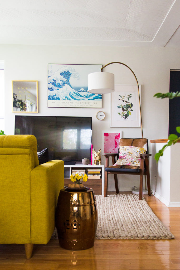
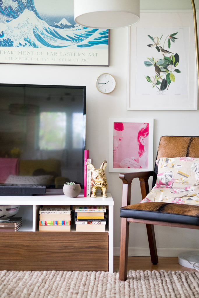
H&W: As someone who understands pattern on a deeper level because of the work you do, what tips do you have for incorporating pattern into a home, especially when other patterns are already present?
SS: I personally love mixing patterns, but the key to pulling that look off is making sure you maintain consistency and continuity. That can either be in the materials used, colours, motif, or even the subject matter. I also think it helps to choose patterns of differing scales. A tight floral pattern and a tight toile may look messy, but pair either of those with a large-scale ikat or massive polka dots and they look deliberate and divine together. Opposites attract!

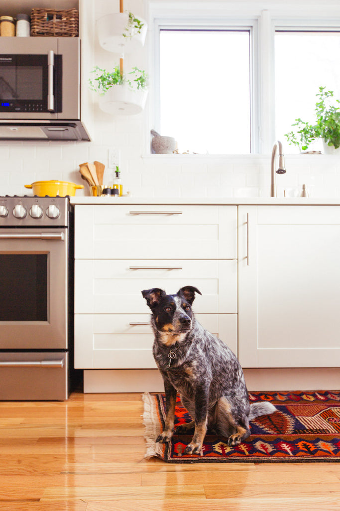
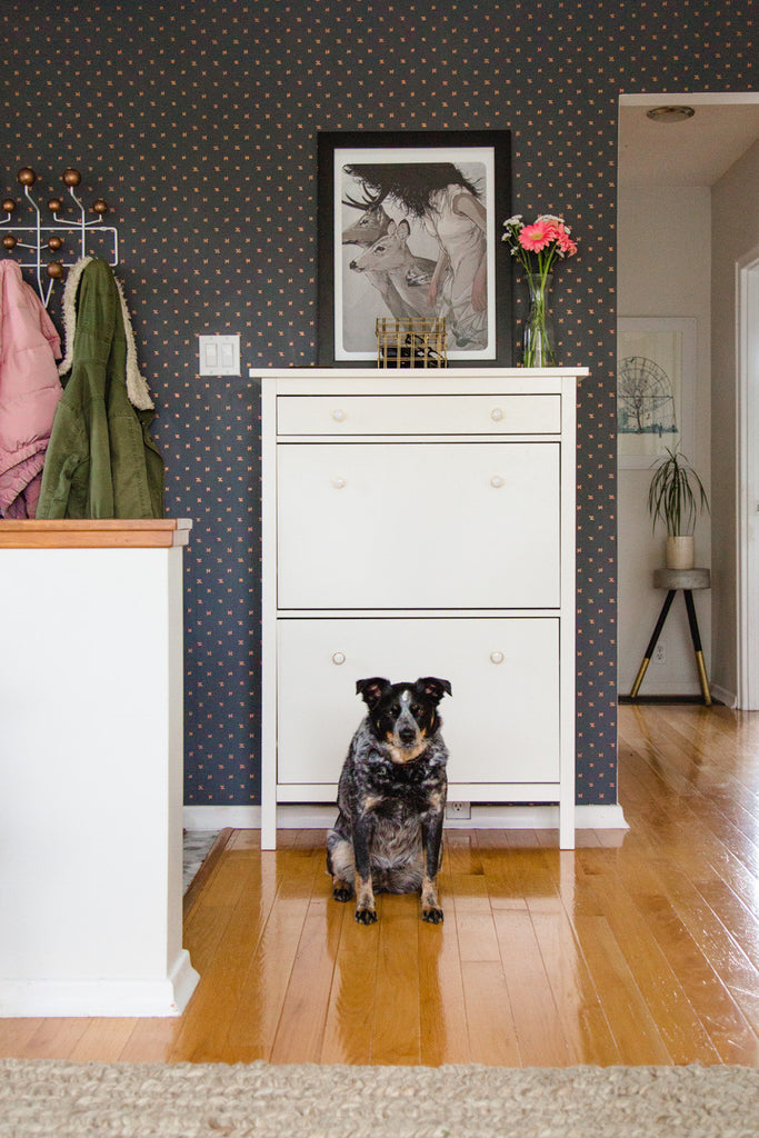
Sabrina's adorable pup, Piper, shows off her newly renovated kitchen.
H&W: We love following your renovation adventures as you slowly makeover your own home, room by room. What has been your proudest accomplishment so far? Your biggest challenge? Any lessons you've learned along the way?
SS: My proudest accomplishment has been pulling it off not having to sell! I bought my home at age 22 at an auction and felt way in over my head. I immediately had to sink $15,000 into a new roof, air conditioner, hot water heater, and windows, and I hadnt even started on the interior design yet. I think the fear of meeting monthly bills lit a fire under my butt to work hard and fast-track my career. With every leap of faith Ive taken in life, its paid off, so the lesson is: fear not. You only have one life, so just give it a shot!

H&W: You just shot your very first TV show for HGTV Canada (congrats!). How does designing spaces for television differ from designing homes for the real world?
SS: Thank you! Its been a wild, fun ride to say the least! For TV, you can go a bit bolder with design which I am a-okay with as my personal aesthetic is quite eclectic and layered. Its a show, after all, so the transformations have to be ka-pow! Often, that means decor is uber statement-worthy and colourful, rather than whats most practical. And timelines come into play more than ever! Typically, filming each renovation would begin and end within about four weeks, so choosing in-stock and quick-ship is necessary. In real life, if a project goes a week too long, or a certain item doesnt make it until the final week, thats cool. In TV, we schedule our shoot days around when we anticipate certain things will arrive and be done by. But too often, renovation reality hits, so everyone has to come together to make it work and problem solve on the spot. Design for TV is a lot more moving parts, but also a lot more team work!
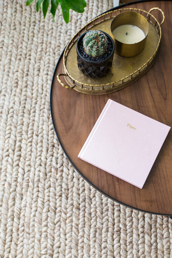
H&W: Hygge is the Danish concept of coziness. How do you find or create hygge in your world?
SS: Through the senses! I think lighting is one of the most notoriously overlooked components of designing a space. Were good at choosing a pretty fixture, but what I am talking about is creating atmosphere. Think about a lightbulb's temperature, brightness, etc. Installing dimmers is a quick fix, as is using at least two or three sources of light in any given space, putting you in control of the mood. Besides sight, smell for me plays a big role. At night, I throw on my dim, warm lamp and a good-smelling candle. Pair that with a blanket and your better half and pup, and thats my daily hygge.
RESOURCES:
Collected Cool: 1. Chandelier | 2. Art | 3. Candle | 4. Black & white pillow | 5. Pink pillow | 6. Stool | 7. Book | 8. Chair
Lush & Luxe: 1. Chandelier | 2. Art | 3. Lamp | 4. Dresser | 5. Stool | 6. Rug | 7. Side table | 8. Bed | 9. Pillow covers


