Pattern Players: How Haley Weidenbaum Combines Past and Present in Her "New Traditionalist" Style

When it comes to California cool, Haley Weidenbaum's interiors have it in spades. From easy, breezy color palettes, to daring pops of pattern, to clean-lined furniture that begs for kicking back with bare feet, Haley's designs have an effortlessness that's hard to emulate. We can only imagine that walking into any one of the spaces she's designed would instantly feel like coming home, and it's that intersection of comfort and beauty that makes all of Haley's work feel so welcoming and special. (Image credit: above photo by Lauren Pressey Photography]

Photo by Tessa Neustadt
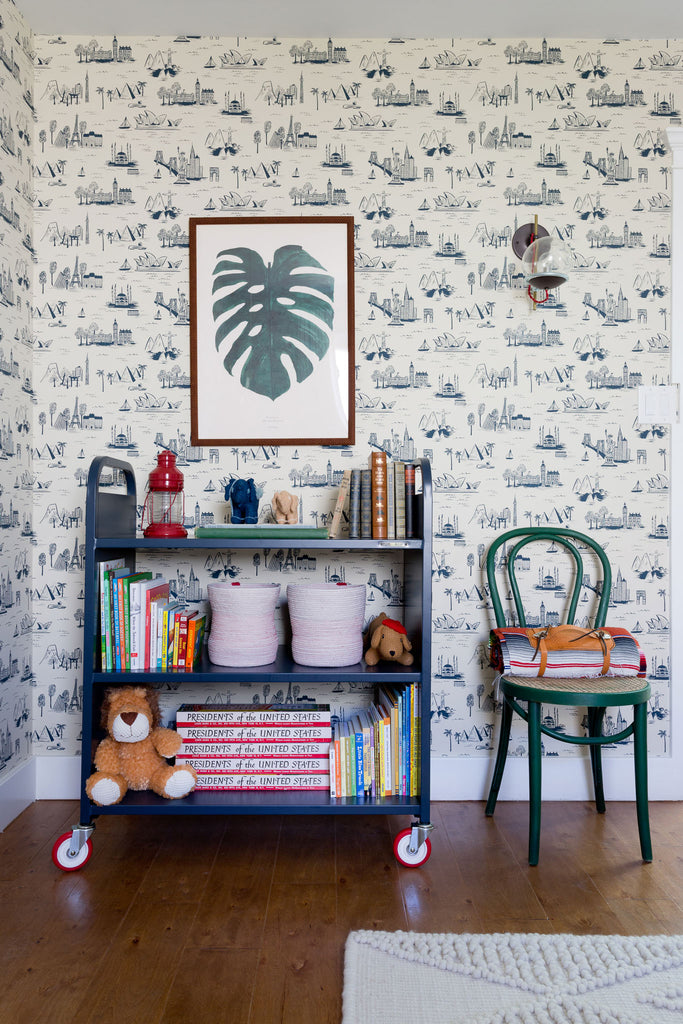
Photo by Amy Bartlam
Haley is also a dedicated Hygge & West customer who has used several of our patterns in both her personal and client homes to stunning results. What other gorgeous spaces could she design with her pick of H&W patterns? We found out just that, below, as well as learned a bit more about Haley's approach to design, how travel inspires her work, and her secret for creating hygge in the City of Flowers and Sunshine.

Photo by Jillian Sipkins
Hygge & West: Tell us a little bit about you and your business and how it came to be. How would you describe your aesthetic, and what inspires it?
Haley Weidenbaum: After going back to school to study architecture and interior design, I began my own design firm in 2013 and have been working closely with Homepolish to help manage my clients, build my brand, and run my business ever since. My main focus is on residential but my passion for design started in hospitality. I helped design and open Palihotel in Los Angeles before starting out on my own. While I could have stayed working at a larger design firm, I had an itch to start my own thing. I wanted to interact directly with clients, help make their design ideas come to life, and also own my company. All of these elements sounded both intriguing and empowering, which has been my drive since day one.

Photo by Jillian Sipkins
I’m drawn to all types of styles, but I like to call my design aesthetic new traditionalist. I really appreciate the designs of the past, but I like to reinvent those designs with subtle nuances particular to each client’s space. I also believe that a functional home is vital for a happy home, so with every client I cater to their needs and wants. This allows for each space to be unique and no two designs to be the same. You can see my work on my website.

Photo by Tessa Neustadt
H&W: On your website, you mention that you're a devoted traveler. How do the cultures and places you've visited use pattern and how do you translate that into the homes you design?
HW: Traveling is my biggest inspiration. When visiting new cities I always soak up and pay extra special attention to the the architecture and interior design. Understanding, learning, and exploring how buildings, furniture, paint, decor, etc. were utilized in different styles and different time periods opens my eyes and fuels and recharges my creativity. When using pattern and color, I always think about my trips and the places I have seen to draw on that as inspiration.


Photos by Jillian Sipkins
H&W: Your work has an effortless cool to it—you manage to create spaces that are neutral but also don't shy away from color and pattern. What are your tips for introducing pattern to more neutral spaces?
HW: I love pattern and color as much as I love a neutral palette, but I think too much of one thing is never a good idea. I balance colors and patterns to create a harmonious design. Balance is key so no one element is overpowering another. For example, if you were to use a striped rug I wouldn’t introduce stripe anywhere else in the space, but rather incorporate the colors within the striped rug in another area of the room. It’s important to connect the design elements but not repeat the same design, color, or pattern too often. When you achieve a cohesive and balanced design it makes a space feel curated, eclectic, and cozy.
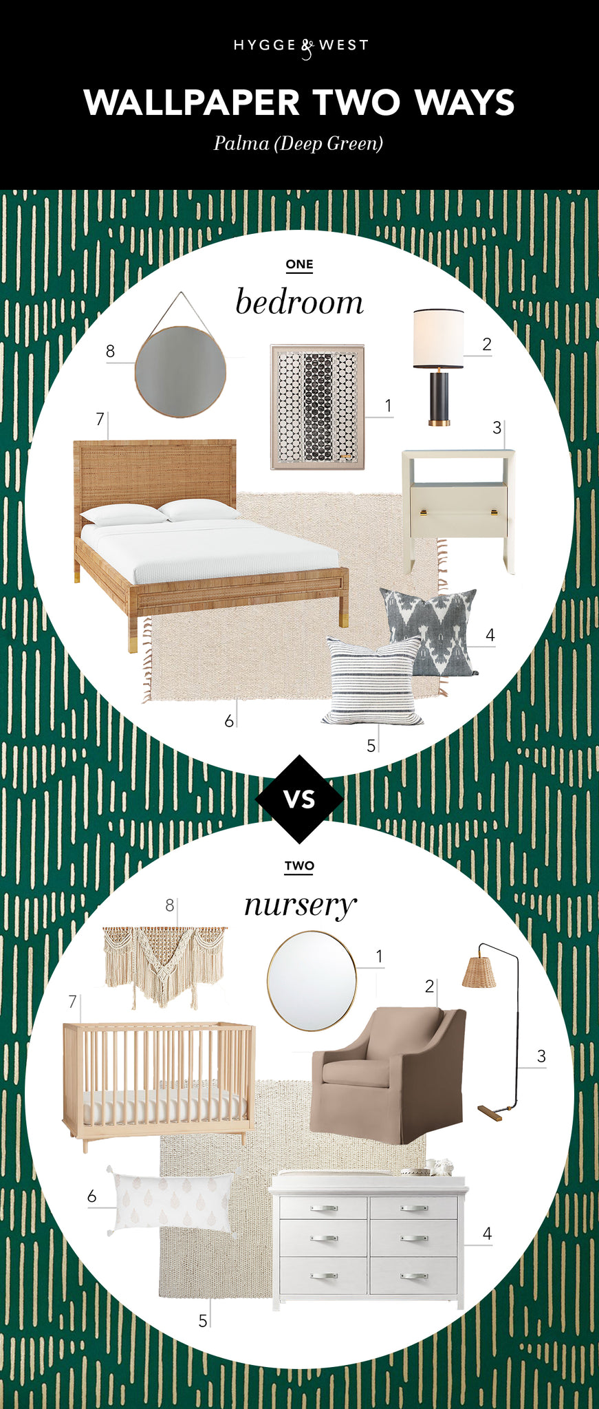
H&W: Which H&W wallpaper did you choose to style and why? Who are the people you imagine residing in each of these different spaces?
HW: I chose Lawson-Fenning's Palma in Deep Green. Green is by far my favorite color so this was a clear winner when I saw it. Plus it’s a new design collaboration with Lawson-Fenning, one of my favorite stores to shop at in Los Angeles! I decided to show the versatility of the H&W wallpaper and design one space for an adult female's bedroom and a second design for a baby girl’s nursery. I also love the challenge of using green, a more masculine color, in a feminine space.
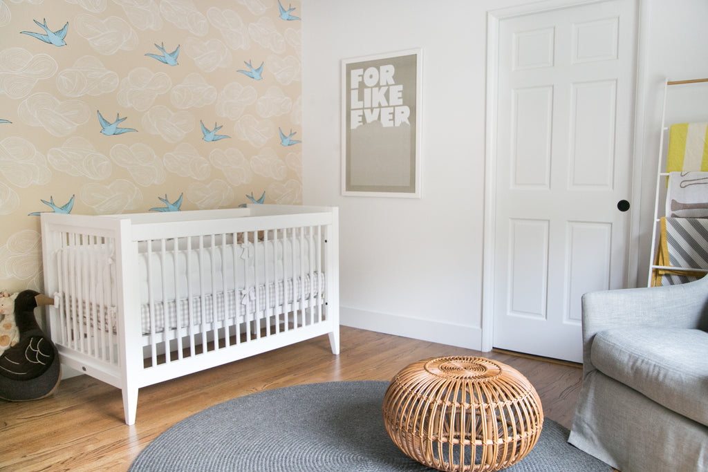
Photo by Jillian Sipkins
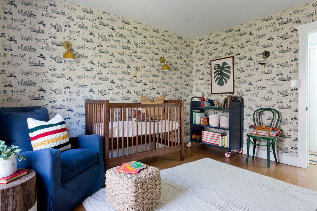
Photo by Amy Bartlam
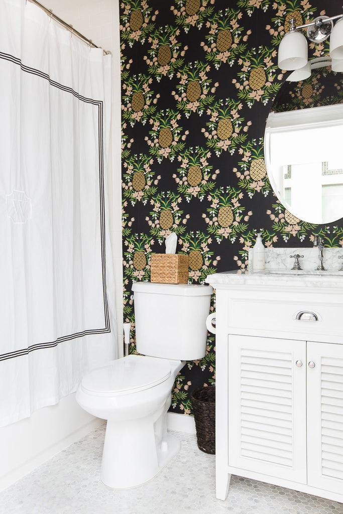
Photo by Tessa Neustadt
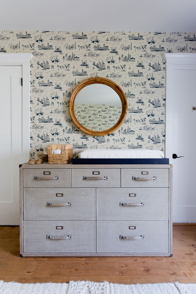
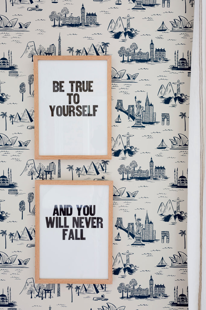
H&W: You've used several H&W patterns in your work—Queen Anne (Ebony), Cities Toile (Parchment), Daydream (Cream), and Pineapple (Ebony). What did each of these patterns bring to the spaces in which you used them?
Photos by Amy Bartlam
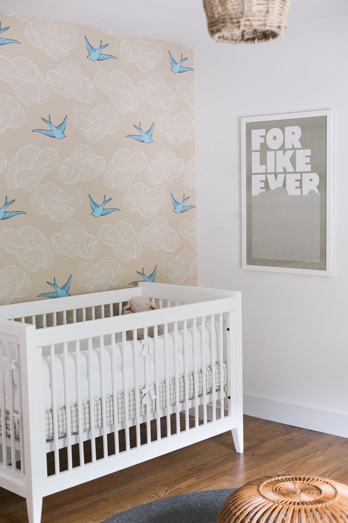
Photo by Jillian Sipkins
HW: Cities Toile (Parchment) is my husband's and my favorite wallpaper of all time. We can confidently say this because we used it in our son’s first nursery, but we moved homes, and we used it again! With this wallpaper, and all of the H&W papers, they have the perfect combination of whimsy and sophistication. If one is installing wallpaper they are taking a design risk or leap, but H&W provides wallpapers that are never too excessive or too trendy. All of the papers are classic, timeless, and polished, which is important when picking an element that is not easy or cost-effective to replace.

Photo by Jillian Sipkins
H&W: Hygge is a Danish concept that celebrates all things cozy and life's simplest pleasures. What brings you hygge in the cooler months?
HW: Living in Los Angeles, I strive for hygge despite our lack of cool weather and very little need for cozy blankets, warm fires, and hot chocolate. Instead, I use scent to bring hygge into my spaces. Funny enough, I returned from visiting Sweden for the first time and our hotel had the most wonderful fragrance throughout, which came through via candles, diffusers, and perfumes. Smartly, this hotel created a signature scent called "Ett Hem" (named after the hotel) and sold it in the lobby! I bought some and I am using it sparingly because I never want it to end.
RESOURCES:
Bedroom: 1. Art | 2. Lamp | 3. Nightstand | 4. Grey pillow | 5. Striped pillow | 6. Rug | 7. Bed | 8. Mirror
Nursery: 1. Mirror | 2. Glider | 3. Floor lamp | 4. Dresser | 5. Rug | 6. Pillow | 7. Crib | 8. Wall hanging


