Pattern Players: Shila Griffith on Why Interior Design Should Inspire, Not Intimidate

Designing your home doesn't have to be intimidating, but we get that it totally can be. With the sheer volume of choices available today, for everything from hardware to furniture to paint colors, it's no wonder why so many of us feel paralyzed when making decor decisions. That's where Shila Griffith of SG23 Design comes in.
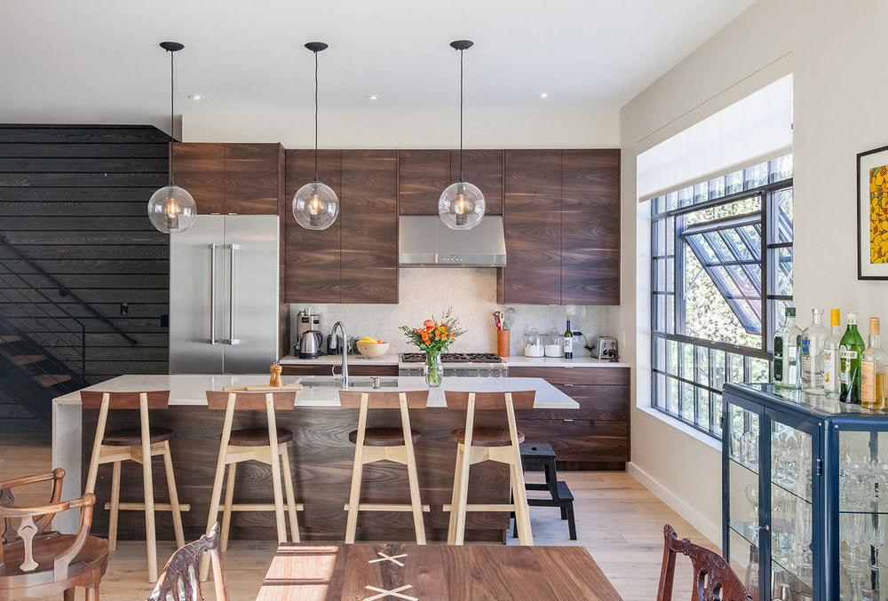
Shila's entire ethos is that design decisions should inspire, not intimidate, and she offers her services to walk interior design clients through the myriad choices out there. A bold self-starter with a keen design eye, Shila works with and empowers homeowners to uncover their personal styles and seamlessly translate them into beautiful, clean interiors that reflect their unique sensibilities. We caught up with Shila about her work and career, her approach to interior design, and of course, all things pattern.
Hygge & West: Tell us a little bit about your background and how SG23 Design came to be.
Shila Griffith: I knew I wanted to be an interior designer since I was 13. I studied interior design during undergrad and sustainable design for my graduate degree—both at Philadelphia University (now Jefferson). From there, I worked at a Pennsylvania architecture firm on extremely high-end, award-winning projects. My training there was incredible since I was only one of two designers with an interior design background. I was surrounded by talented architects and learned a lot more about structure, construction, custom cabinetry, and millwork, which kicked up my drawing skills a couple notches and also gave me a more holistic understanding of buildings. However, I missed interior design and the firm didn't offer those services. I worked on these projects up to a point, but I wanted to go further, and also select furniture, accent lighting, and interior materials and finishes.
H&W: How would you describe your aesthetic when designing interiors? What inspires you in your work?
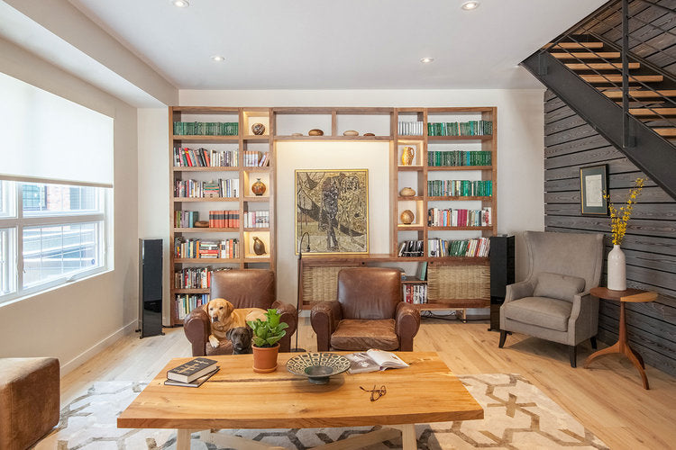
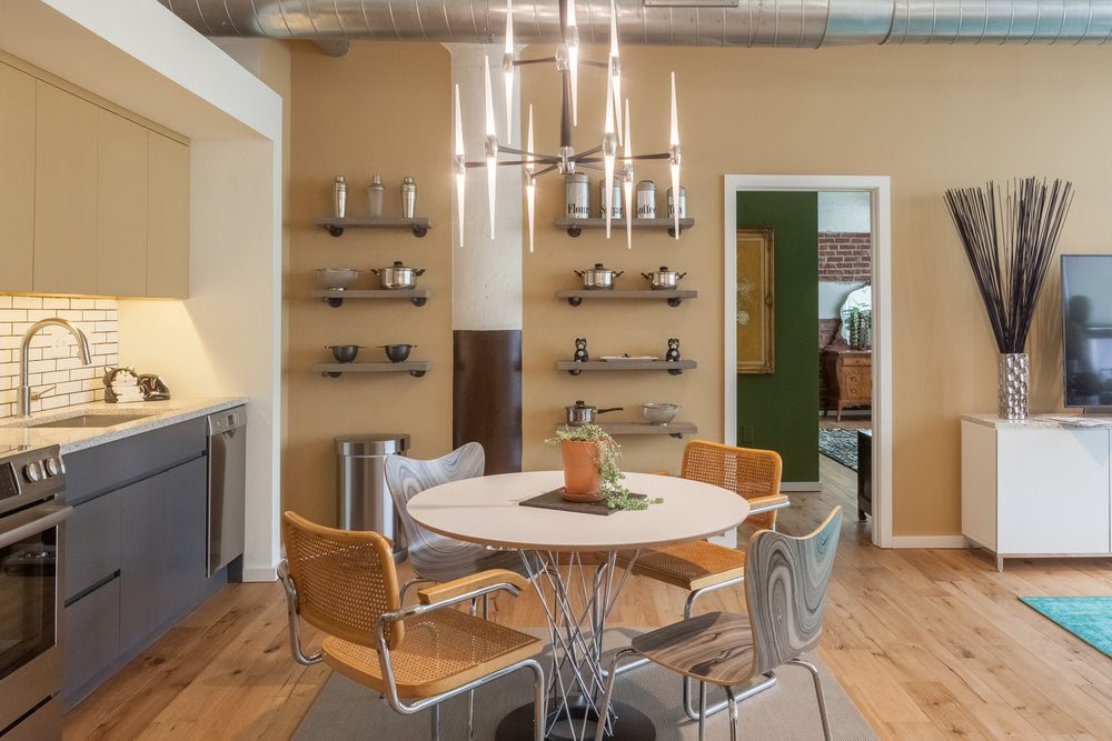
SG: This is an interesting question—I try not to let my personal aesthetic influence what is ultimately best suited for my clients, because they are the ones that need to live with the design. That being said, I get most excited about projects that thrive on a juxtaposition of modern versus vintage or antique. My favorite spaces tend to be those that have classic, beautifully detailed bones with modern furniture, lighting, materials, and finishes. It's also a bonus when clients aren't afraid of color!
I'm most inspired by traveling abroad. Both of my parents are immigrants so I started traveling abroad when I was quite young. When I have clients that also love traveling, I make it a priority to find ways to convey this in the space so that it tells more of a story.
H&W: On your website you talk about believing that "the opportunities of design should inspire homeowners, not overwhelm them." Why do you think designing a home overwhelms many people, and what are your tips for approaching the process as one full of opportunities rather than obstacles?
SG: I think that between seeing design online and on television, there are so many design ideas out there that homeowners don't know how to pin down what speaks most to them. Homeowners feel so stuck, they often postpone the project, do what's most trendy at that time to just get the project done, or step away from the project completely. None of these choices are really ideal since it doesn't allow homeowners to enjoy the full potential of the space.

Designing a home from a logistical standpoint can be quite stressful as well. I love working with contractors and craftspeople, but part of the reason is because I'm accustomed to it, and know what to expect. I often know what specifics these professionals will need before they even ask for it and if an issue comes up on site, I have no problem collaborating to troubleshoot. It also helps that I tend to have backup plans for my backup plans.
A homeowner that's never been through a renovation or construction process can easily feel overwhelmed because there are a lot of factors that they often aren't aware of until they are in the middle of the project. On top of that, when unexpected things come up during construction it's often translated into chaos and dollar signs for the homeowner, which doesn't always need to be the case.
H&W: You also do web design and branding. Are there any commonalities between web design/branding and interior design? What tidbits have you taken from the graphic design world and applied in interiors?
SG: Oh yes! All types of design have specific elements in common, such as scale, proportion, and color. When it comes to designing marketing collateral for clients as part of their brand identity package, I especially gravitate towards laying out booklets. It's a lot like space planning, except I'm placing words and images instead of interior walls, built-ins, and furniture.
Most don't realize it, but websites are a lot like construction or renovations as well. For a new website, you need to build a structure that is functional, user-friendly, and intuitive, then you intentionally work in aesthetics so the entire project is cohesive. With a website update it's a lot like a renovation—you identify what currently doesn't work and develop design solutions. You also need to evaluate what you are working with as far as structure and make adjustments as needed—if you remove a significant part of the structure your entire website can collapse, which is similar to a structural wall in a building.
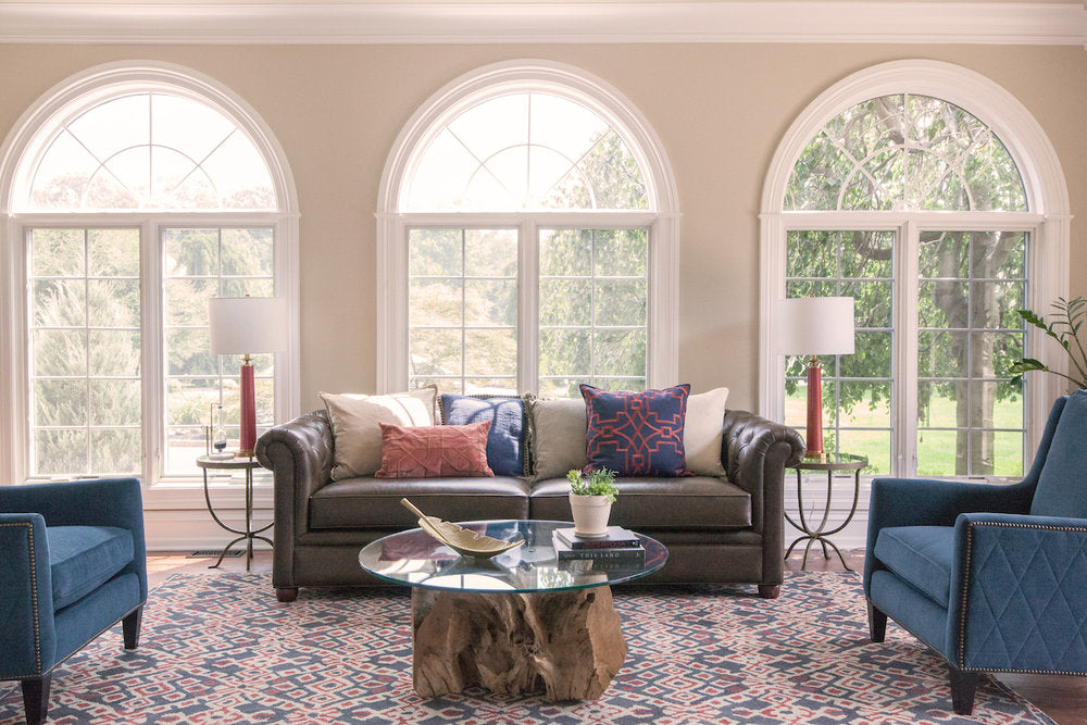
H&W: What role does pattern play in your work, both in interiors and graphic design? What are some of your favorite ways to use pattern in a home?
SG: When there's a pattern in a space or in print there's more of a narrative. If you have a navy blue wall, that tells a bit of a story, but if you have a wall with navy blue anchors, that can tell you so much more. You might assume that the homeowner likes the water, they might have a boat, perhaps they spent a lot of time at the beach as a child, they may have been in the navy at some point....
I like to use patterns to break up the monotony a bit. When everything in a space is solid it can feel visually heavy. I tend to use patterns as a backdrop or as a pleasant element of surprise in spaces or areas that aren't always open or readily visible.
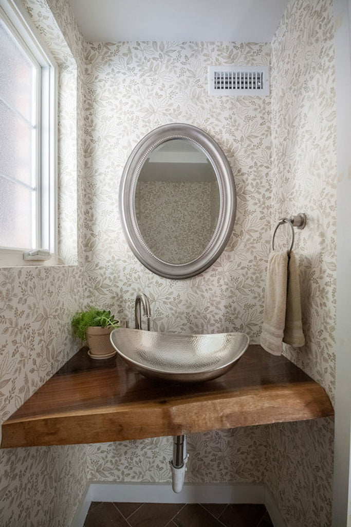
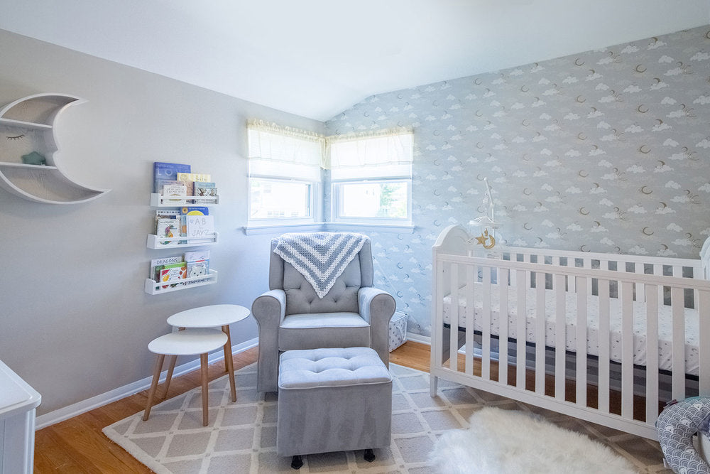
H&W: You used our Queen Anne (Taupe) in a powder room and Moons (Gray) in a nursery. What do you think each of these patterns brought to the spaces in which you used them?
SG: Queen Anne in the townhouse is a subtle reference to my clients history of living in the UK for several years! It's interesting to maintain a design concept in spaces without being too literal or theatrical.
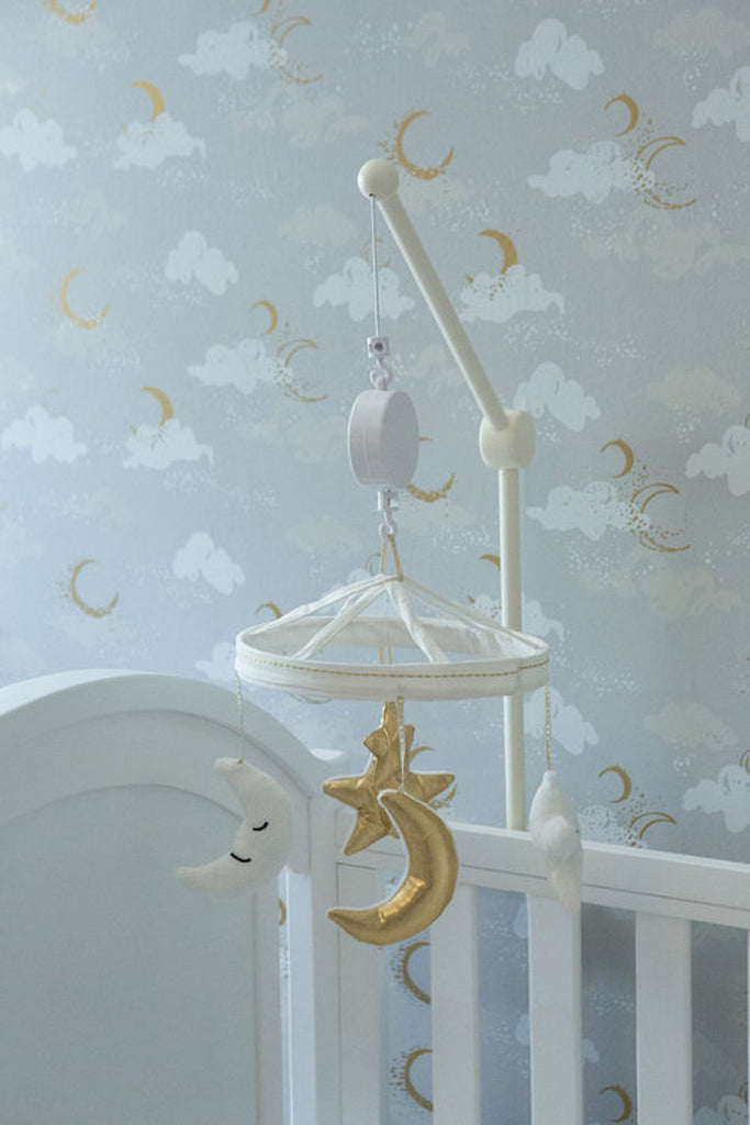
My client for the nursery had seen a blog post from over a year ago that was accompanied by a photo of Moons (Gray) as part of a flat lay. She feel in love with that wallpaper! So we actually designed the room around that wallpaper, which worked out perfectly. There are moons and stars throughout the room, which is so charming!
H&W: Hygge is a Danish concept of coziness that celebrates life's small joys and simplest pleasures. What brings you hygge in your life?
SG: Walks with my dog, naps while it's raining outside, listening to jazz, long talks with old friends, and baked macaroni and cheese.


