Meet the Makers: Illustrator and Graphic Designer Allira Tee Takes on the Animal Kingdom in Her Whimsical Wallpaper Collection
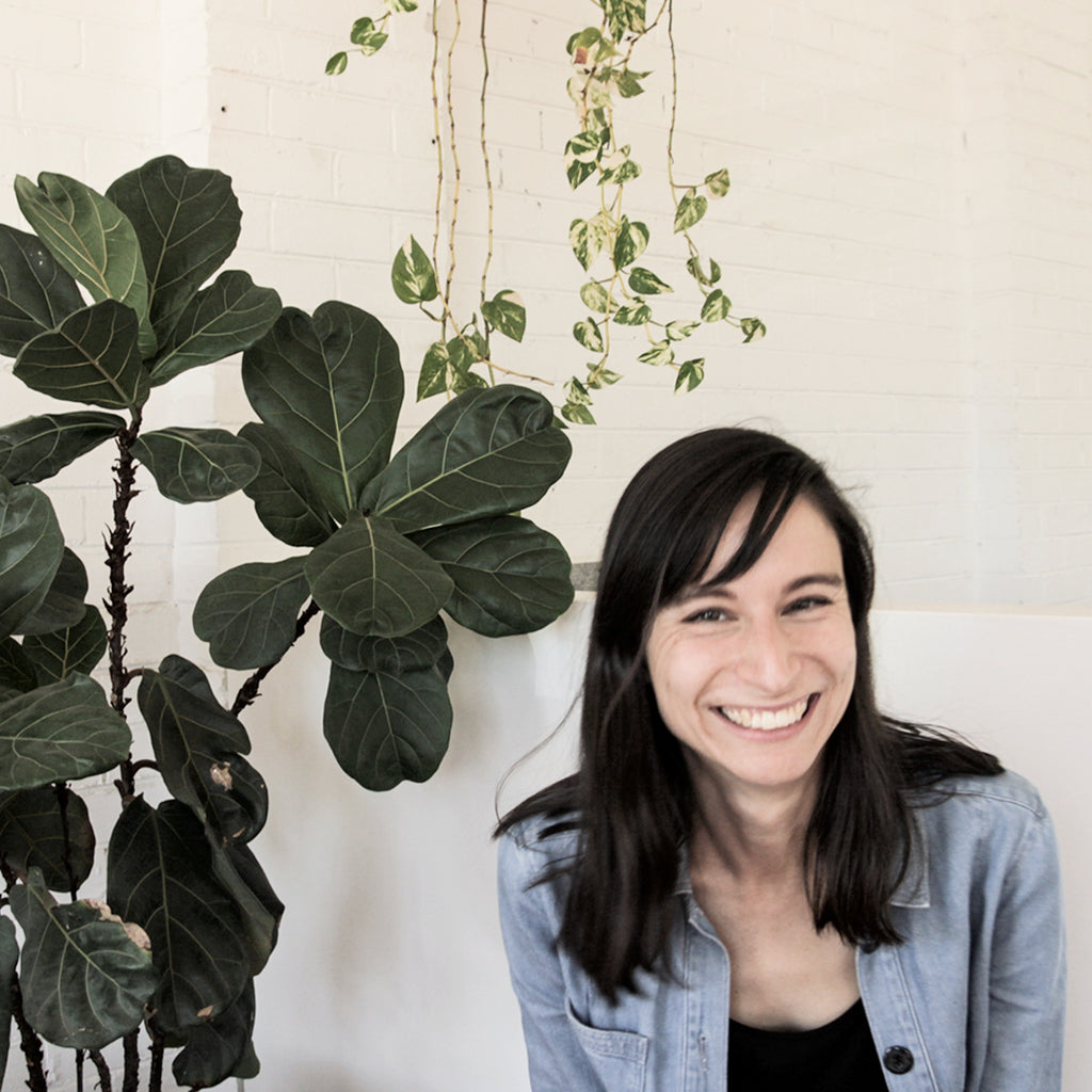
Fantastical foxes, mischievous monkeys, and flying fish—illustrator and graphic designer Allira Tee's work has it all. Based on the other side of the world in Melbourne, Australia, Allira's fanciful take on the animal kingdom, as well as everyday objects, evokes a childlike nostalgia that tugs on the heartstrings of both kids and adults alike. So when H&W decided to launch a new whimsical collection—including our first ever mural—we knew our final destination would be the land down under.
From her stunning color palettes and quirky subject matter, to her keen eye for pattern and composition, we knew from the moment we saw Allira's work that it was just destined for some lucky walls. We're absolutely delighted with how Allira translated her unique, spirited style into a collection that is just as at home in a cheerful child's room as it is in a sophisticated adult's space, and we can't wait to see how our creative customers use it in their own homes! Below, we caught up with Allira about the process behind the collection, what is was like working on the mural (and first for all of us!), and her no-fail recipes for hygge-ing up her world.
Hygge & West: Tell us a bit about your background and how you got into illustration and graphic design.
Allira Tee: I’ve always loved art and knew that I wanted to pursue a creative career. After completing high school, I studied Graphic Design at University. However, after a few years working professionally, I found it wasn’t fulfilling. I couldn’t figure out what I wanted to do at this point, so I kept working in graphic design.
I never thought a career change would lead me to illustration! It was a process that took several years and much trial and error. I travelled a lot and gained so much inspiration from living in London; I sat at my desk in London and just started drawing! Not long after this, I realised how much I loved it. It has only been in the last few of years that I’ve been doing illustration seriously, building my portfolio and working with clients. I continue to do graphic design work alongside my illustration and I find they complement each other nicely.
H&W: Much of your work is themed around nature and wildlife. What is it about those motifs that inspire you?
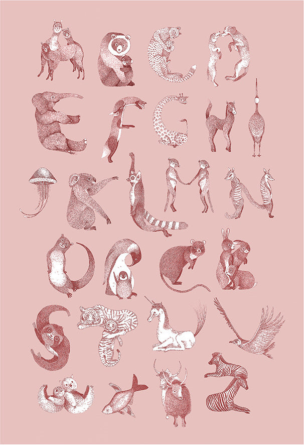
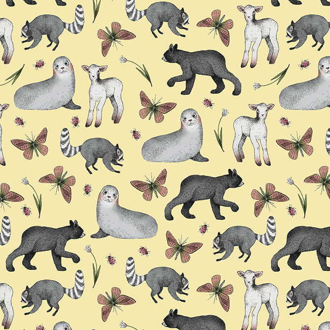
AT: I love people watching and am very interested in animals also. There are uncanny similarities between the two. Animals are so weird, funny, and strange, and take on a human dimension in my work.
A lot of my art is focused on animals as the primary subject because they are just so caring, loyal, and relatable. Animals and nature are consistently inspiring to me; I feel like I learn a lot from both and that’s probably what draws me to create work focused on these areas.
H&W: What does pattern mean to you? How is working with patterns different than creating a single scene, for example?
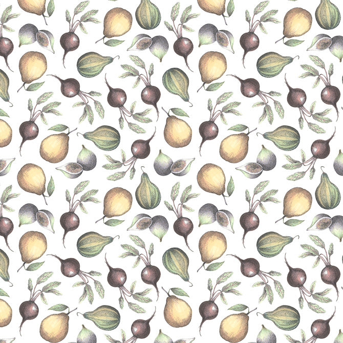
AT: Pattern to me means creating a strong story from a limited amount of motifs. I feel the stories that can be told through patterns are almost endless and I want my individual motifs to have enough character that they can tell stories on their own.
I love patterns because they can be applied to many things; a pattern could look great on wallpaper, textiles, and stationery, and it’s amazing to see the patterns in all these different formats.
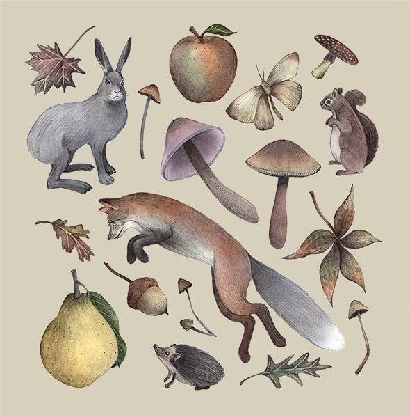
I find single scenes are much more labour intensive than patterns, but I love the challenge. For individual illustrations, I become completely absorbed in the drawing from start to finish. With patterns though, I can come back to a motif later. One single element within a scene can throw the whole illustration off kilter. The difference between pattern and scenes is that you can’t just get away with using a single element. The whole image has to work in unity.
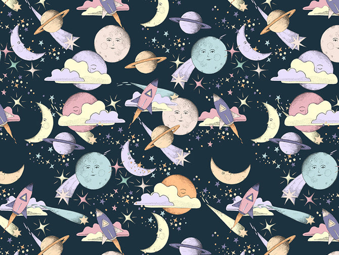
As I work by hand—only using the computer to add colour at the end—I have to constantly be attentive and avoid making too many mistakes, as they will show up in the finished work. My aim is to have the final product look as close as possible to the original drawing, so I put a lot of work into getting the scene right the first time.
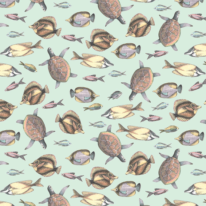
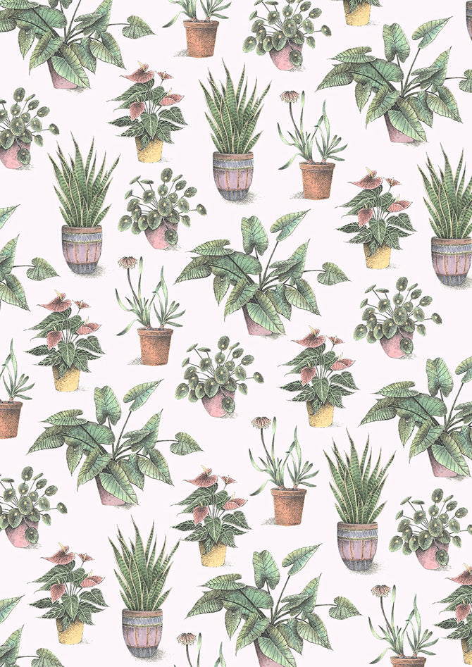
H&W: You tend to gravitate towards a softer color palette. What draws you to these colors and why do you think they work so well with your patterns?
AT: There is innocence in the characters of my illustrations and the softer colour palettes reflect and enhance this feeling. I hope my work conjures up feelings of nostalgia in people and colour definitely plays a role in doing this. My love of children’s illustration has also influenced my colour choices.
H&W: We're so excited to launch our latest collection with you! Tell us a bit about what inspired each pattern and colorway.
AT: I’m excited about the collection for Hygge & West too, they have been a dream to collaborate with!
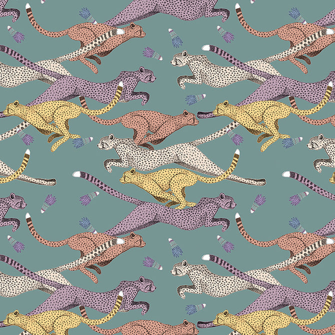
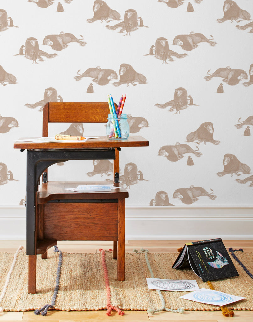
Most of my work starts with one drawing and if I think the concept is strong and I can expand on it, I will run with it. The Mighty pattern started out with the drawing of the meerkat scratching the lion's back. I found this relationship quite comical, so I started thinking of other scenarios for these characters; the meerkats being the lion’s minions, plaiting the lion’s mane, combing the mane, and so on! With the various motifs created, the pattern just came together.
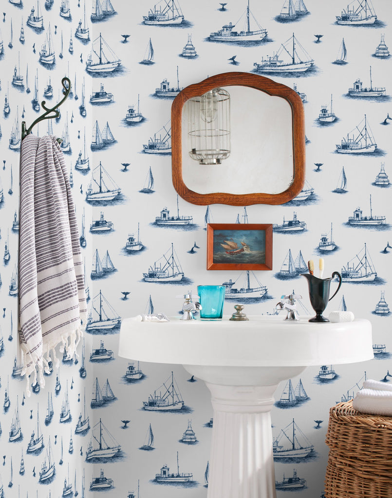
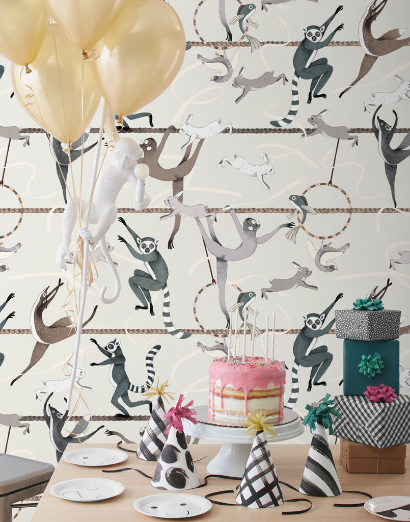
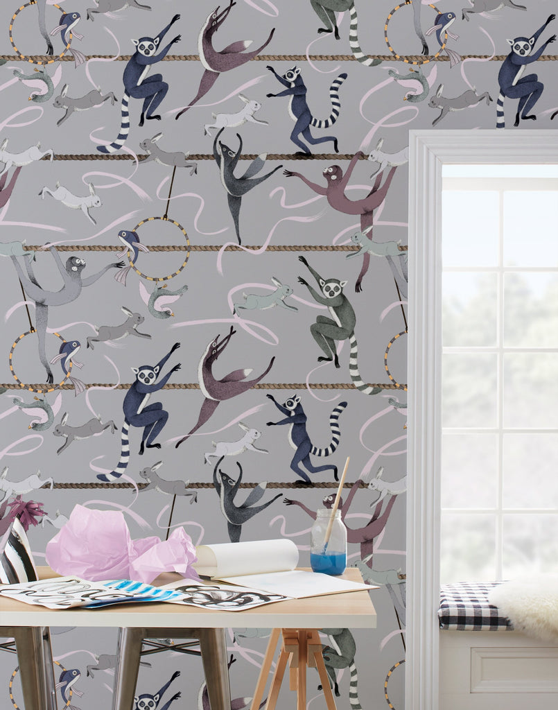
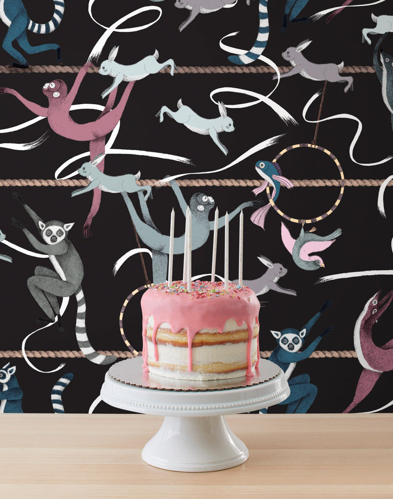
As for Balancing Act and Ahoy!, a similar design process played out. I would say it’s quite an organic process as to how it all comes together.
For the most part, my work consists of animals doing strange and funny things that would usually be associated with human behaviors. From the beginning, I have envisaged the wallpaper designs in baby and children’s rooms and bathrooms. So the softer colourways were chosen to reflect this vision. I hope the designs will spark imagination and happiness in both children and adults!
H&W: What was the design process for your collection? How is the process for creating wallpaper different from or similar to creating your past works?
AT: Aimee and Christiana have a wealth of knowledge and provided amazing direction for the wallpaper designs. They have a very clear vision of how they want the end product to look and although I am located in Australia—the opposite side of the world to Hygge & West—we communicated regularly, so it was not really any different to working with a local client!
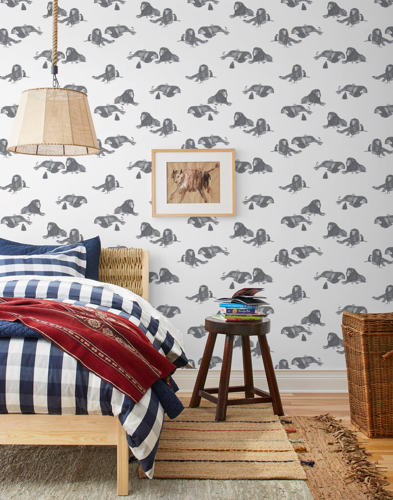
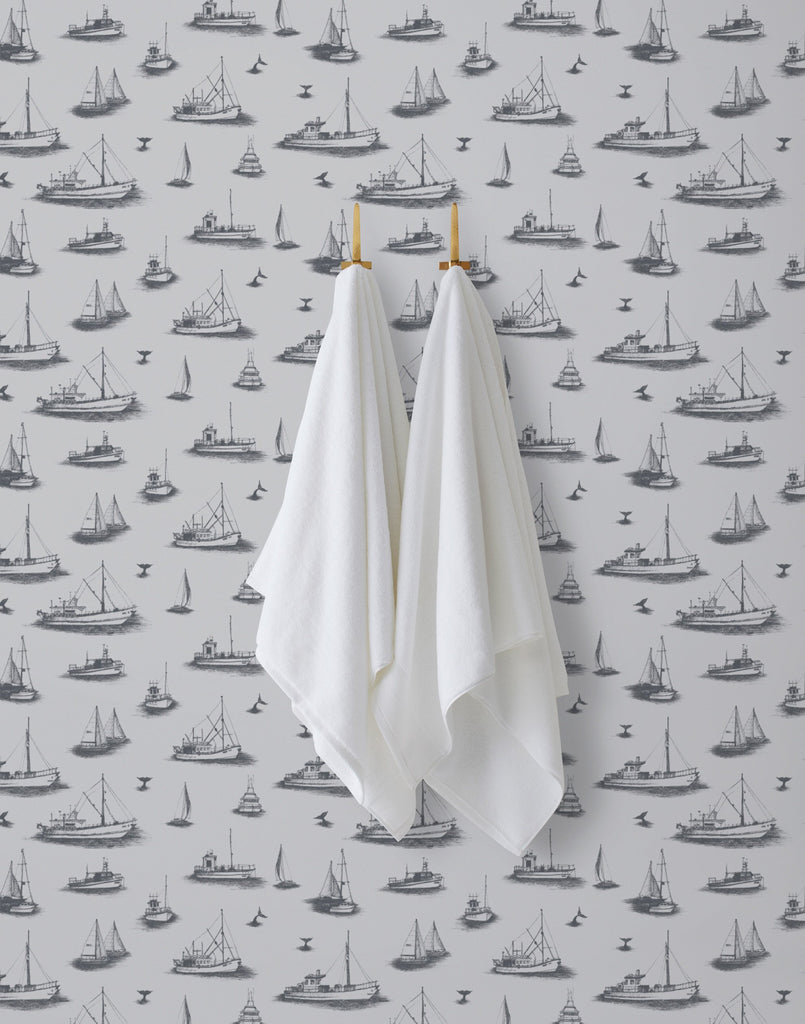
Once I had created the patterns, we reorganized the elements to work for this new format. My patterns in their original state were quite dense, as they are primarily used for stationary or fabric and this doesn’t always work with wallpaper. The Mighty and Ahoy! illustrations were moved around and reduced in size to create more negative space in the design. Then, once the layout was finalized, we began collaborating on colors, which I love; color brings the patterns to life and is what gives the work an individual personality!
We followed the same fluid process for the mural, beginning with initial sketches and feedback regarding scale. Once the concept was complete, I created the final illustration and colour was digitally added at the end. The mural was a huge file, I wasn’t sure if my computer would cope, but thankfully it did! Yay!
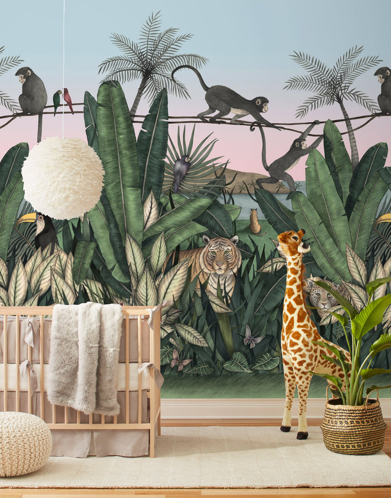
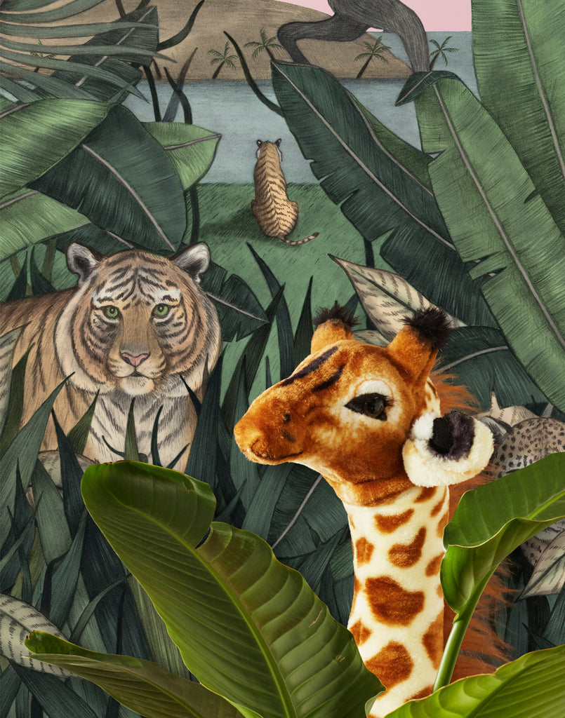
H&W: Your collection also includes our first ever mural, which we're thrilled about! What inspired this design, and how does designing a large mural compare to designing a repeating pattern or a smaller-scale artwork?
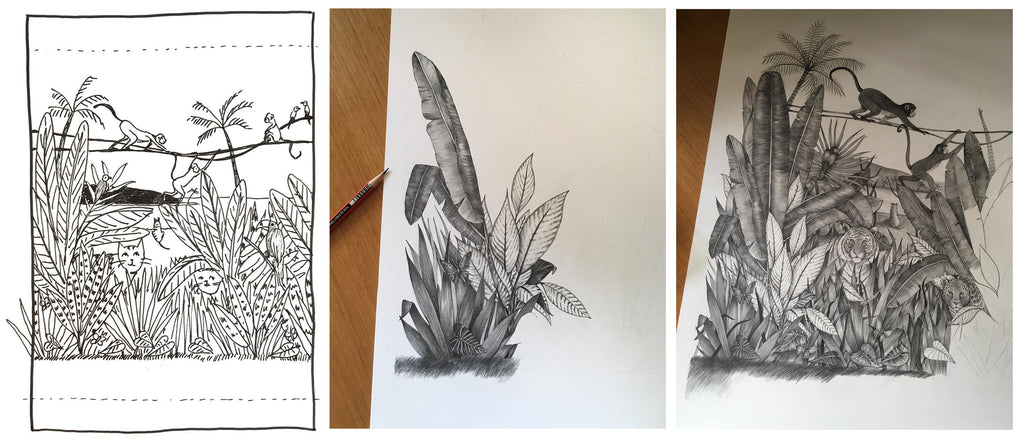
Allira's sketches for our first ever mural
AT: I was pretty chuffed when Hygge & West asked me to design their first ever mural. It is my biggest-sized work to date, so it was scary at first, but a lot of fun!
The design of the Bengal Sunrise Mural was inspired by some previous jungle-themed illustrations I had created with L’Affiche Moderne. It is quite different designing a large mural as the original drawing needed to be drawn small enough to work on but big enough to be increased in scale to the final size! Also using graphite for an illustration of this size was a challenge—it is not very forgiving to erase. Suffice to say, I was thrilled when I got it right the first time (phew!). The other tricky part of creating the mural was making it work as a repeat. I had to constantly make sure the elements were able to overlap and repeat on a scale that wasn’t jarring or obvious to the viewer.
H&W: 'Hygge' is a Danish concept that celebrates small joys and simple pleasures. What brings hygge to your life?
AT: Nothing can beat changing into my comfy home pants at the end of the working day! On the weekends, walks along the coast are great and if it’s cold, the fireplace is always a nice place to cosy up to as well!


