Pattern Players: Tilton Fenwick

It's no secret that here at H&W, we love pattern. In fact, love might be a bit of an understatement. We obsess, swoon, daydream, eat, sleep, and breathe pattern. It's why we do what we do... and it's also why we love Anne Maxwell Foster and Suysel dePedro Cunningham, the uber-talented duo behind boutique interior design firm, Tilton Fenwick.
Anne and Suysel have not only mastered the art of mixing patterns (and you can too with their tips below), but they've also made it their design signature, using unexpected designs in even more unexpected places (hello, ceilings and drawers!). In the Tilton Fenwick world, nothing is off-limits when it comes to adding a punch of pattern, and their whimsical work leaves us drooling time and time again.
We caught up with this designing dream team to chat pattern (naturally), their 'new traditional' aesthetic, and, of course, getting cozy.
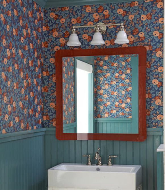
H&W: We love the way you used our Rosa (Indigo) paper to give a small bathroom an updated country look with a twist in Country Living's House of the Year 2014. Why did you choose this particular paper and colorway?
Anne & Suysel: We love the floral "granny chic" quality of the Rosa Indigo wallpaper and thought it was the perfect fit for the Country Living House of the Year. We used it in a small bathroom and applied wainscoting detail below the wallpaper to add to the country feel. It was definitely a showstopper and the floral pattern was the perfect fit for this house and our aesthetic.
H&W: How would you describe your design style? Where do you look for inspiration?
A&S: We were trained in very traditional design firms and that is where our aesthetic is rooted. We take that traditional base and like to add our own twist of more updated colors and patterns to create more "new traditional" interiors. We never shy away from color and pattern and always ensure comfort is the number one priority. Nobody wants to live in a museum. We are constantly inspired by fellow designer friends and favorite design blogs like Quintessence.
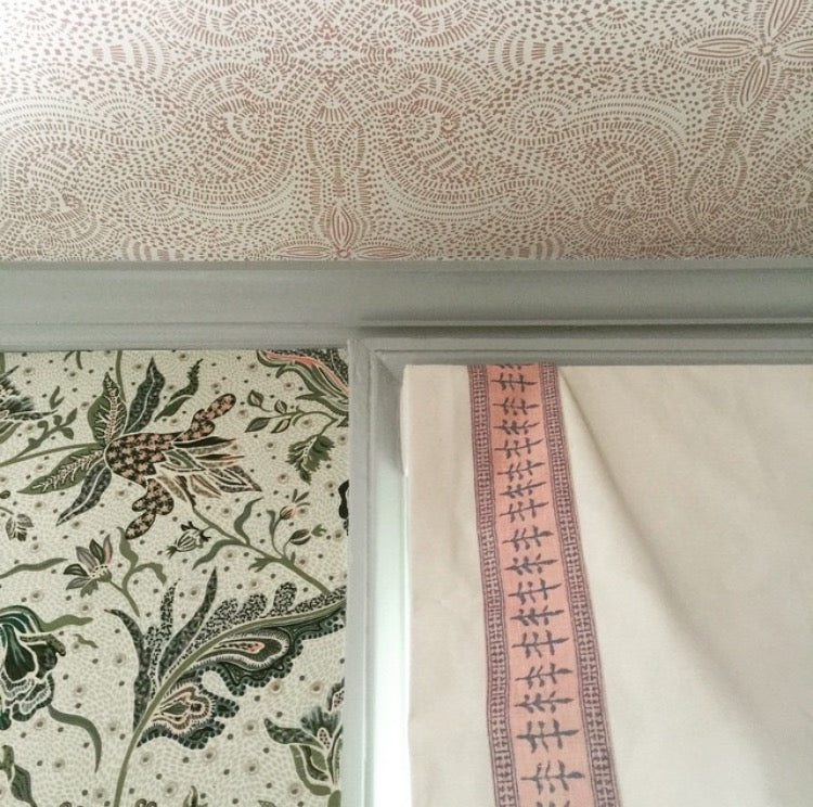
H&W: We heard that Anne's country house got a dash of Hygge & West... on the ceiling! Tell us a little about that design decision.
A&S: We put Andanza Blush wallpaper on the ceiling of Anne's country house in her daughter Gibbie's bedroom. We put our own fabric design for Duralee Fabrics on the walls (a traditional all over floral pattern) and contributed pattern by using the wallpaper on the ceiling separated by crown molding in a blue color. We never shy away from mixing patterns - we actually encourage it. And the subtlety of the ceiling wallpaper in the tonal Blush colorway worked perfectly in complementing the bolder print fabric on the walls without competing.
H&W: You two are pattern-mixing mavens. What are some tips people should keep in mind when trying to mix patterns at home?
A&S: We always want to make sure that the color story stays the same in all of the patterns we mix. We always add one or two unexpected colors to not make everything seem too "matchy matchy" but it is important to not go too crazy. The patterns should differ in scale and we try to mix in different textures as well, using woven fabrics (velvets and fabrics with more depth to them) alongside printed fabrics with more pattern and color.
H&W: Every designer has their own process, their unique design fingerprint, when tackling a new project. What's yours?
A&S: Our number one priority is for the client to be happy and comfortable in their home. If they have chosen us to design their homes with them, they obviously like our aesthetic. It is important for us to meet with them and hear from them how they use and live in the spaces. Do they entertain a lot? Are they movie watchers? All of those questions really help guide the layout and floor plan. The decorating is the fun icing on the cake.
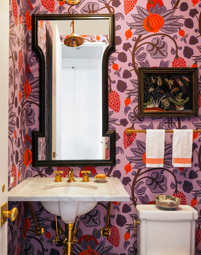
H&W: What's one pattern myth or rule you love to bust? (For example: small spaces can't handle large prints.)
A&S: We always love going crazy with pattern and color in small spaces. Powder rooms are our favorite rooms to design because we view them as mini jewel boxes where being bold with wallpaper creates an enveloped, special space.
H&W: As every wallpaper enthusiast knows, wallpaper isn't just for walls! What's the most unexpected (but wonderful) place you've used wallpaper?
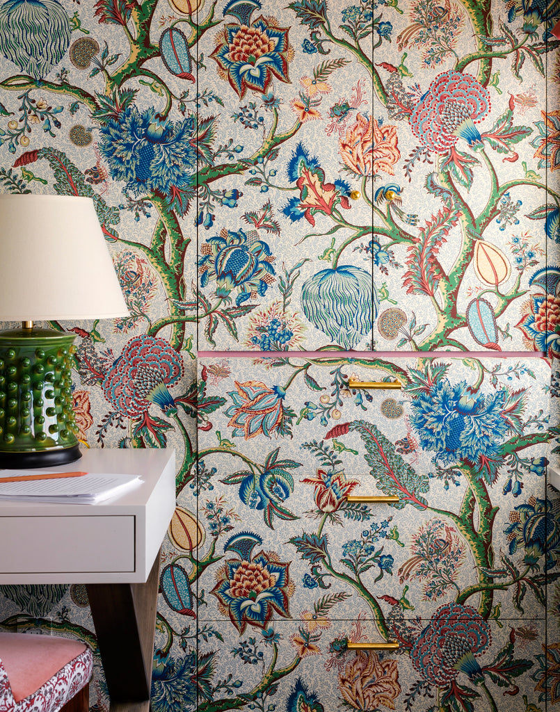
A&S: We have used wallpaper to cover up drawers that hide printers and other unsightly (but necessary) office items. The pattern on wallpaper makes the drawers blend seamlessly into the walls. Our wallpaper hanger is a genius with tricky walls and nooks and we test him on every project! And never forget to wallpaper the light switch plates!
H&W: At Hygge & West, we love all things cozy ('hygge' means 'cozy' in Danish, after all!), and as summer winds down and fall quickly approaches, we want to know: How do you get cozy?
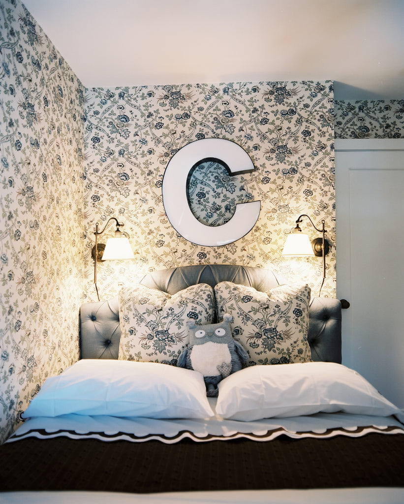
A&S: We both have country houses to escape from the city with our families. Both houses are obviously covered in wallpaper.
Suysel loves the little reading nook she created in her daughter's bedroom, filled with cushions and bookshelves. A dream for any 8-year-old girl with sunlight streaming in through the window!
Anne loves the family room in her house where the pattern on the walls was repeated on matching fabric upholstery. The room dates to 1815. With beamed ceilings and our intentional matching of patterns - walls and upholstery - it's a truly cozy family room.


