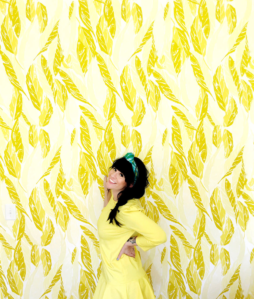
Pattern Players: Lifestyle Blogger and DIYer Elsie Larson Designs Boldly and Fearlessly
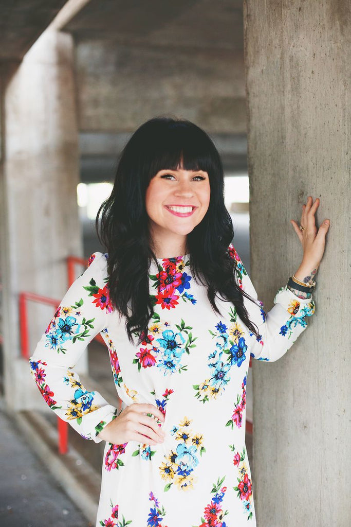
If you've ever read the wildly popular site, A Beautiful Mess (and if you haven't, stop everything and do it now!), or perused the color-happy ABM Instagram feed, then you know that founder and creative director Elsie Larson is not one to shy away from a bold statement. And that makes her our kind of girl!
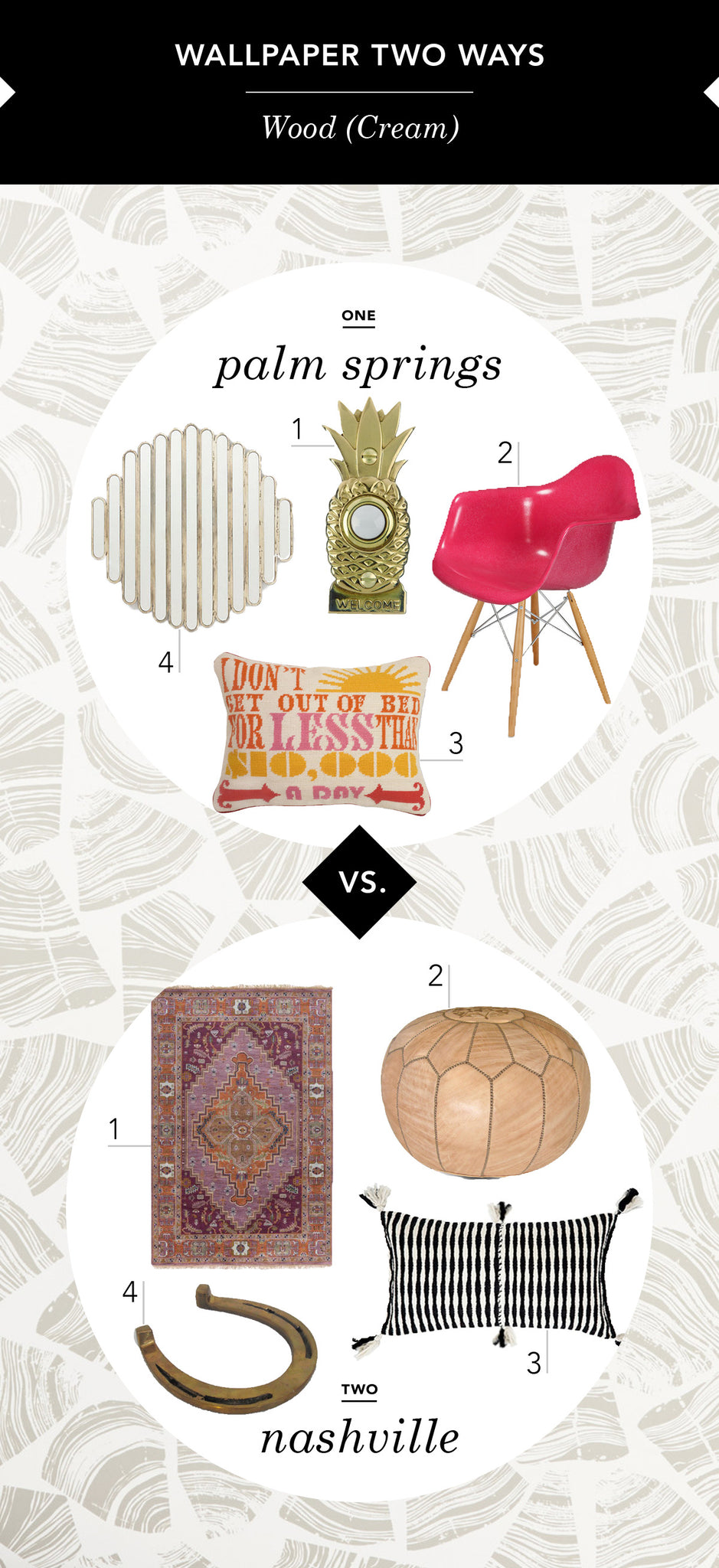
From pom pom pillows to dip-dyed napkins, Elsie (along with Emma, Elsie's sister and ABM co-owner and editor) makes color and pattern accessible to everyone, while her contagious cheer and can-do attitude take the fear out of straying from all-white-everything. With her eye for great design and affinity for the bright and shiny, we knew she'd be the perfect person to style one Hygge & West wallpaper two ways. We love the results and we know you will too (um, hello, perfect doorbell!).
Hygge & West: What paper did you choose and why?
Elsie Larson: I chose the Wood (Cream) paper designed by Askov Finlayson. It's so pretty and the perfect neutral texture to make a room more cozy and interesting, without being busy. I think it would be perfect for almost any room in the home.
H&W: Who is the person you imagine using each of the two spaces you've created here?
EL: I designed both spaces for two different sides of myself. I love Palm Springs and in my ultimate fantasy would call it home (maybe later on in life?). I adore the bright, happy aesthetic that is so proudly embraced in Palm Springs. I also designed one inspired by Nashville, the place I call home. There is definitely a more reserved, rustic style here. But that doesn't mean it has to be all barn wood, all the time! I love the fresh, cozy side of southern style... maybe a little Patsy Cline playing in the background?

Elsie and her sister, Emma.
H&W: You have an unmistakeable style that permeates everything you do with A Beautiful Mess. Tell us a little about your aesthetic and how you translate that into your home.
EL: Thank you! I design every room in our home for the life we want to live. It's very clear that some rooms are meant more for entertaining and some are meant for cozying up and relaxing. I am passionate about color (ALL color), but I believe that it's important to choose a cohesive color palette for each home because that makes it really easy to style an interesting, but not overwhelming space.
If I had to describe my style in a sentence I would say, "1960s-inspired with an extra dose of cozy." At least that's what I always aim for!
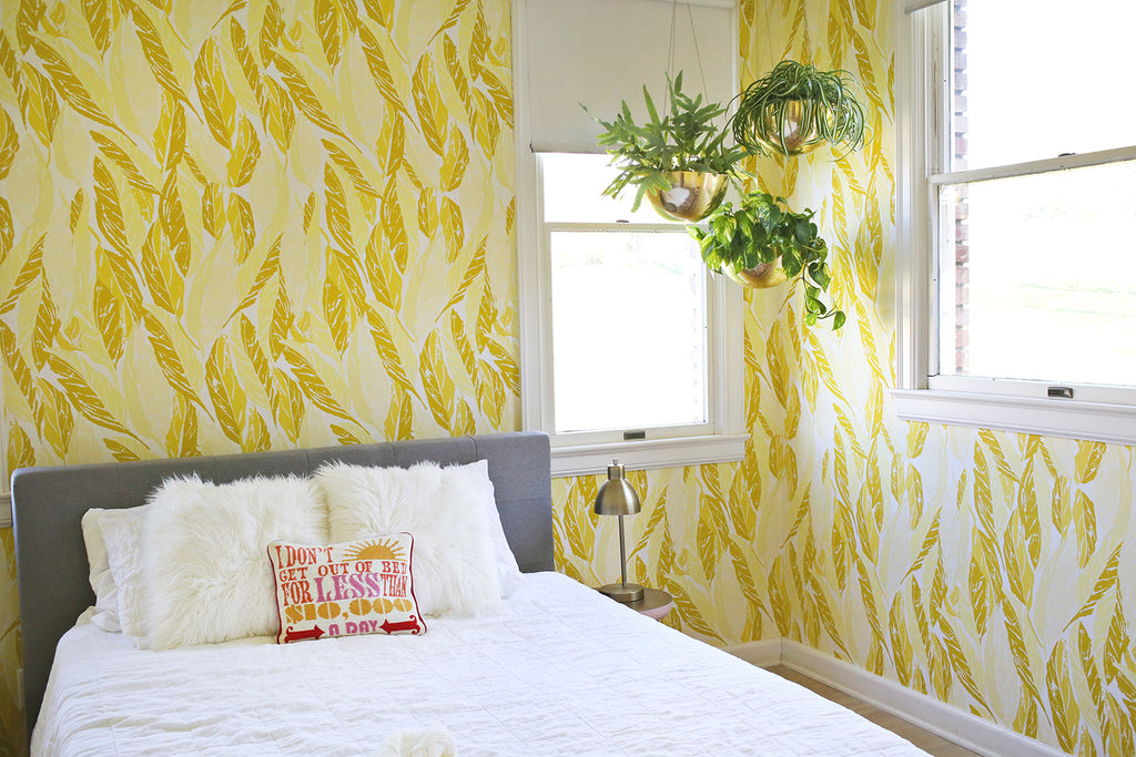
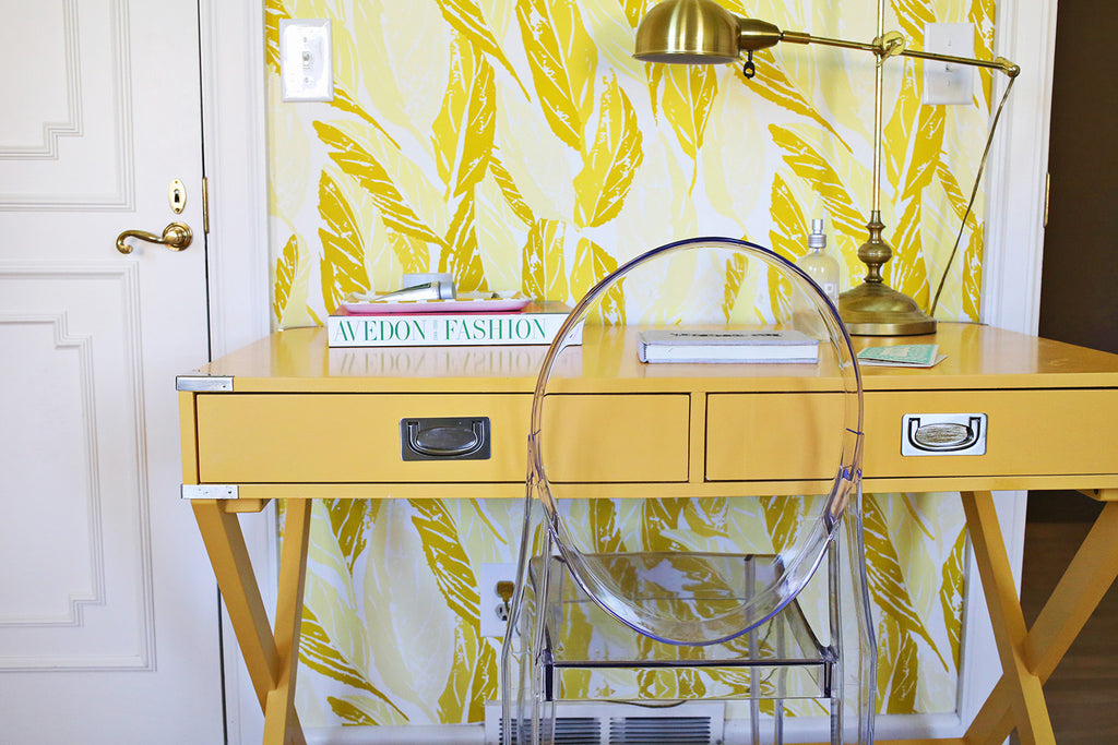
H&W: We love that you recently used Nana (Saffron) in a guest room! What made you choose this paper and what was the process like to design this room?
EL: After I initially decorated the guest room it was falling kind of flat. I feel like a guest room is a great opportunity to really push the boundaries of design because it's more like a hotel room, in a way, and not a room where we spend a ton of time daily. So, I took advantage of that perspective and decided to go all out. We papered all four walls in the Nana Saffron paper and it's just AMAZING. When you walk into the room it definitely makes a statement, but what I didn't expect is how much cozier and more complete it feels now. I have thought of myself as a "mostly all white walls" type person, but I'm re-thinking that now!
H&W: 'Hygge' is a Danish word that loosely translates to 'cozy.' How do you find or create a hygge in your life?
EL: Bedtime (and morning) rituals are something I am very passionate about. We recently banned laptops from the bedroom and, wow, what a big difference! I make my own pillow mist from essential oils and have been working on my sleepy time playlist, my heart will go yawn.
Creating a cozy home is a top priority, definitely above being stylish. I mean, it's almost always possible to do both... but if you HAVE to choose, always choose cozy.
RESOURCES:
Palm Springs: 1. Doorbell | 2. Chair | 3. Pillow | 4. Mirror


